

A spring wedding color palette comes together best when you choose one anchor color, one soft color, and one neutral or metallic so the whole celebration does not blur into pale pastels. For an intimate spring wedding, that simple rule gives one guest table, a compact ceremony, flowers, attire, invitations, and personal details a calm shared look.
Spring color planning gets tricky because natural daylight and fresh greenery already add color before any linen, dress, candle, or flower arrives. The goal is not to cover the venue with more decor, but to choose colors that look intentional against lawns, budding trees, garden beds, brick patios, white rooms, or vineyard rows.
These spring wedding colors are built for real decisions: bouquets, bridesmaid dresses, taper candles, napkins, stationery, table runners, ribbons, wax seals, and venue styling. Each palette includes an anchor, a softer layer, and a grounding neutral or metallic, so fewer details still feel connected.
Recommended Wedding Products


You Might Also Like These Blog Posts
- Summer Wedding Color Palette Ideas With Sunlit Personality
- Fall Wedding Color Palette Ideas Beyond Burnt Orange
- Winter Wedding Color Palette Ideas That Look Better by Candlelight
- Tropical Wedding Color Palette Ideas With Heat, Light, and Heart
- Halloween Wedding Color Palette Ideas for Gothic, Moody, and Fall Romance
- Valentines Day Wedding Color Palette Ideas Beyond Basic Red and Pink
Spring Wedding Color Palette Ideas That Don’t Feel Washed Out
The strongest spring wedding color ideas leave room for the season itself. Use green leaves, daylight, and blooming flowers as part of the design, then repeat the chosen tones in a few places guests actually notice: ceremony flowers, table linens, wedding party attire, paper details, candles, and one or two small accents.
Sage Green, Blush, And Cream
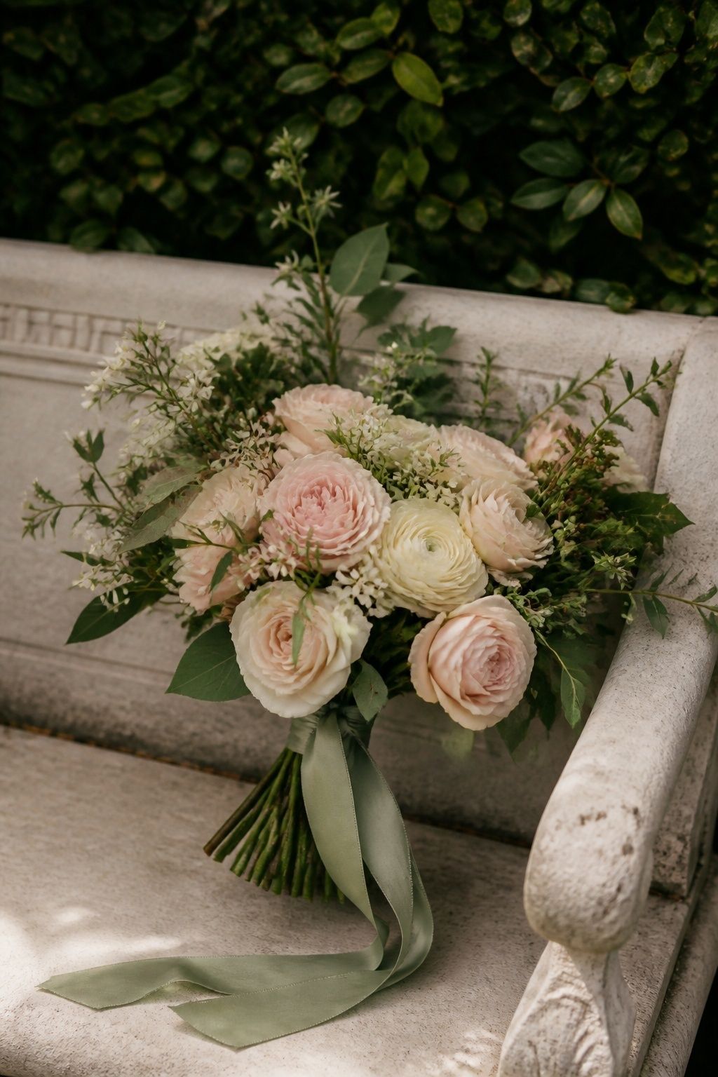
Sage green, blush, and cream is the easiest spring wedding color palette when the venue already has trees, hedges, or a garden view. Let sage anchor bridesmaid dresses, napkins, or a ribbon around the bouquet, then keep blush in garden roses, ranunculus, menus, or a soft lip color.
Cream keeps this palette from turning sugary. It suits backyard dinners, greenhouse ceremonies, garden brunches, and white-walled indoor venues because the colors look gentle without disappearing against natural greenery.
Butter Yellow, Soft Blush, And Sage
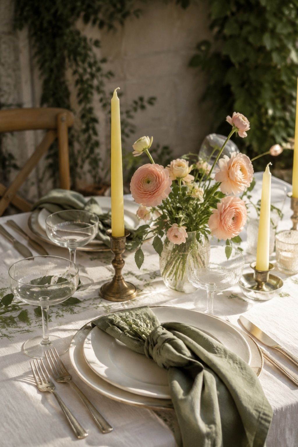
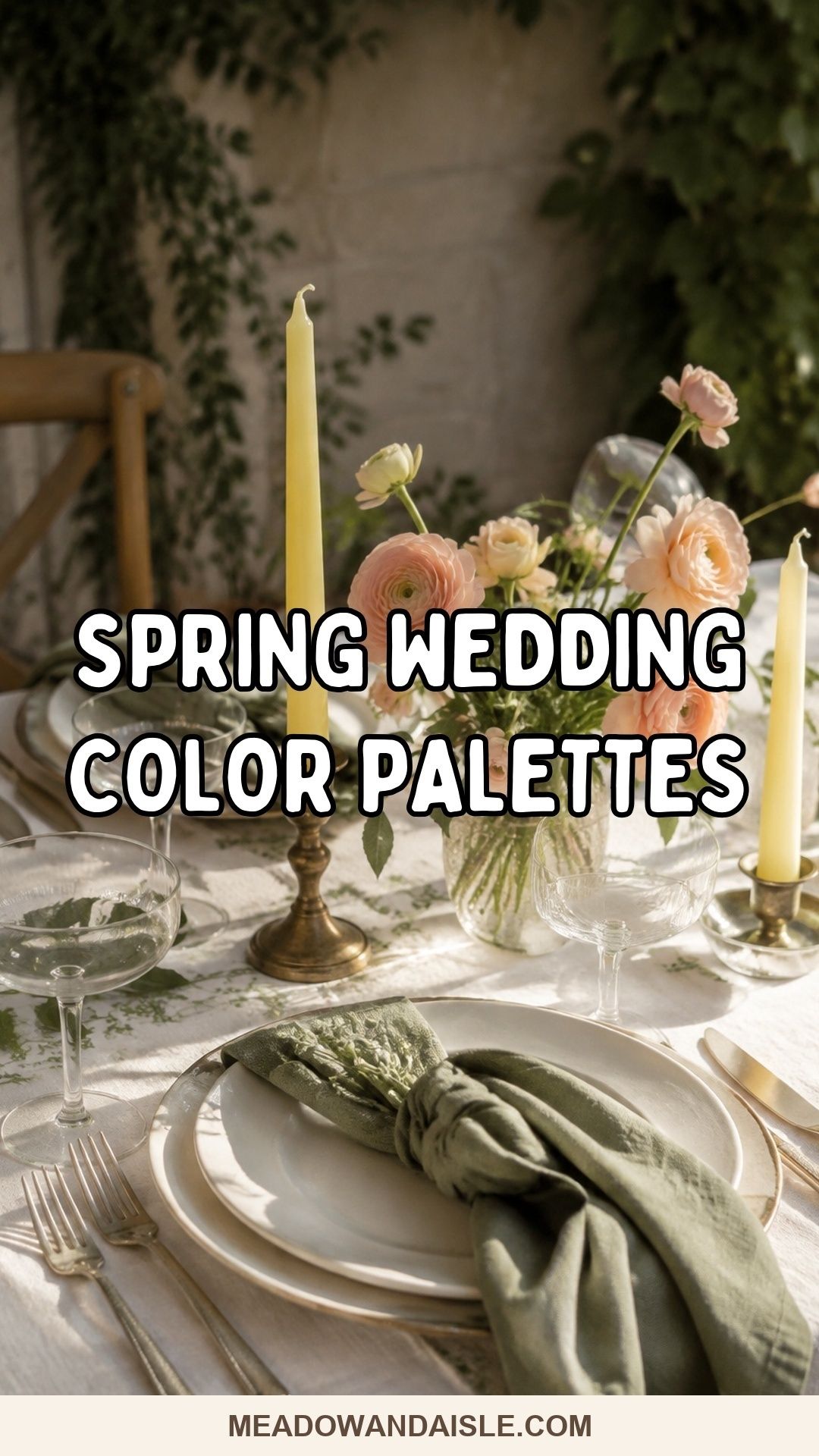
A butter yellow wedding palette feels sunny without becoming loud when sage grounds it. Use yellow in taper candles, small floral clusters, a cake ribbon, or cocktail napkins, then soften the tables with blush flowers and ivory plates.
This palette is lovely for brunch weddings and spring garden wedding colors because it photographs warm in morning or early afternoon light. Keep the yellow buttery rather than neon, and let greenery carry more visual weight than extra props.
Lavender, Warm Ivory, And Honey Gold
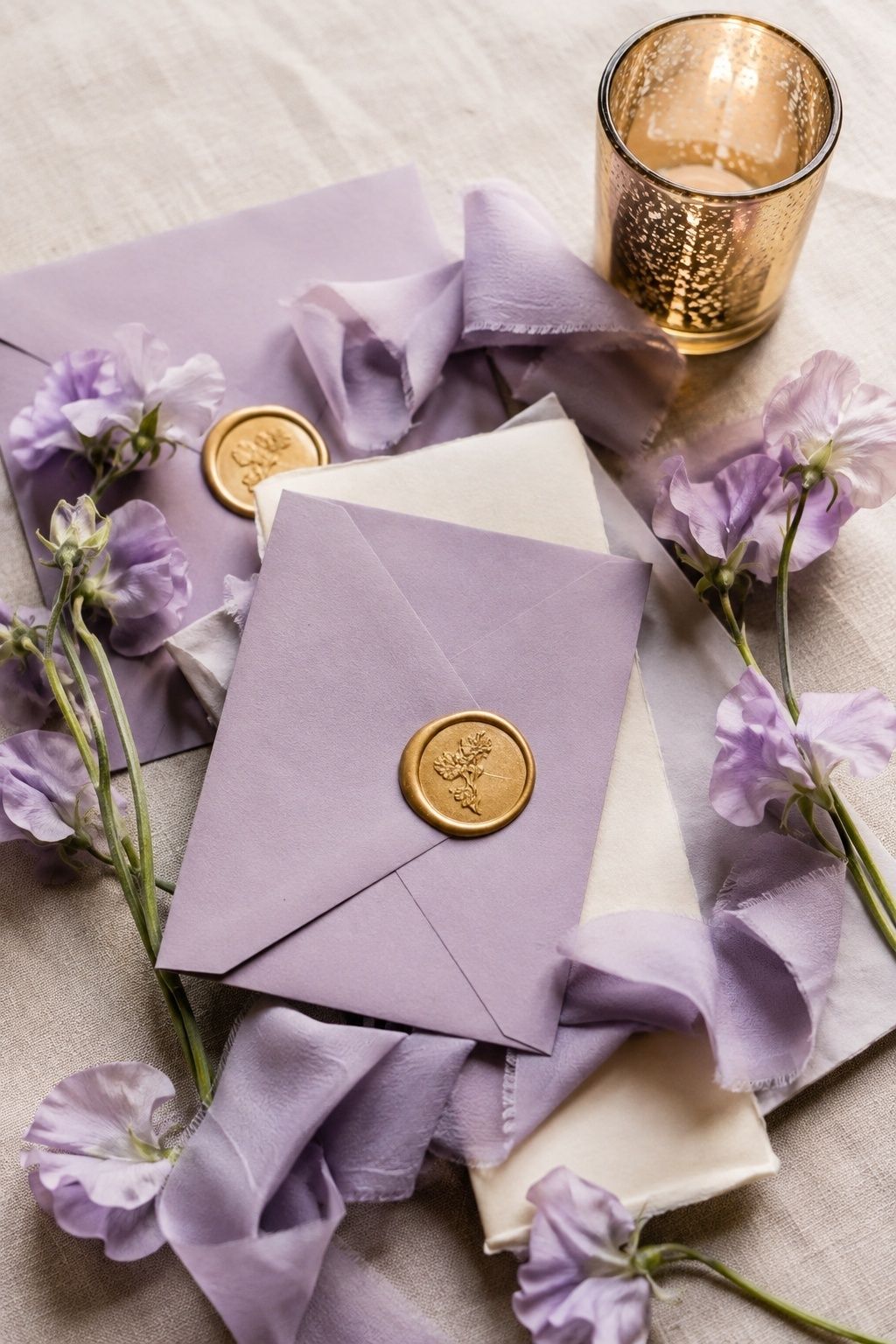
Lavender spring wedding colors look richer with warm ivory and honey gold instead of stark white. Use lavender in invitations, bridesmaid dresses, sweet peas, lilacs, or ribbon, then add honey gold through flatware, votives, wax seals, or framed table numbers.
The warm metal keeps lavender from feeling chilly. It fits garden venues, historic estates, and candlelit indoor receptions where soft purple flowers meet cream linen and golden light.
Dusty Blue, White, And Fresh Green
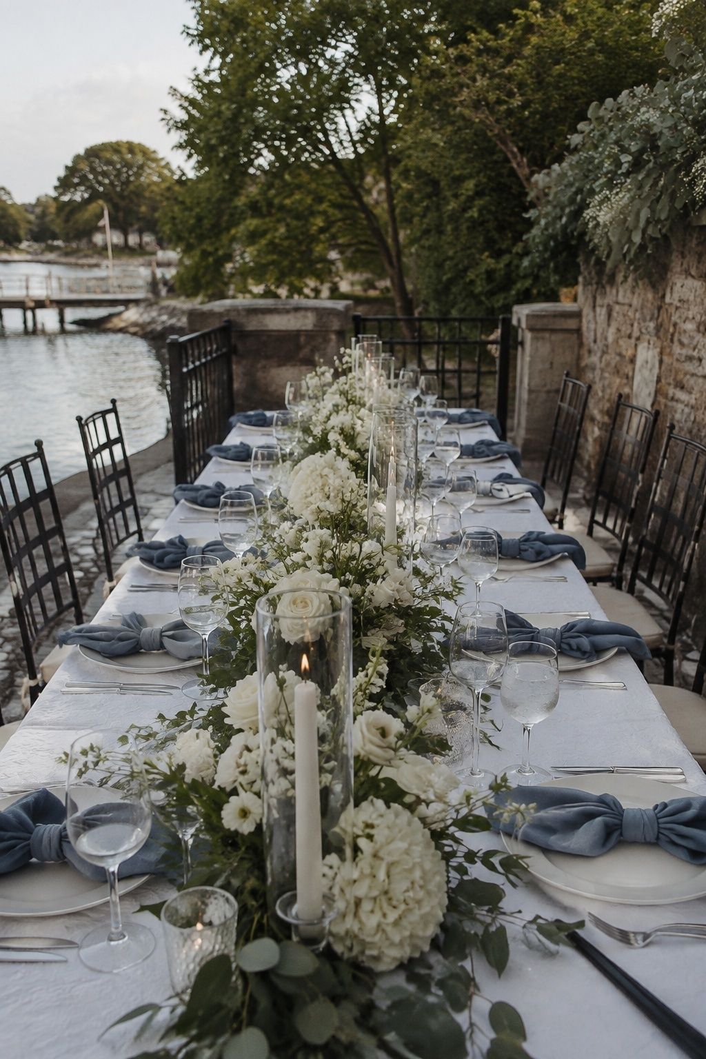
Dusty blue, white, and fresh green is a clean spring wedding color scheme for couples who love airy photos. Use dusty blue napkins, envelopes, bridesmaid dresses, or a subtle ribbon, then keep flowers mostly white with seasonal greenery.
This palette suits waterfront venues, white barns, chapels, terraces, and bright indoor rooms. Fresh green gives blue and white a living anchor in spring daylight.
Peach, Champagne, And Soft Rose
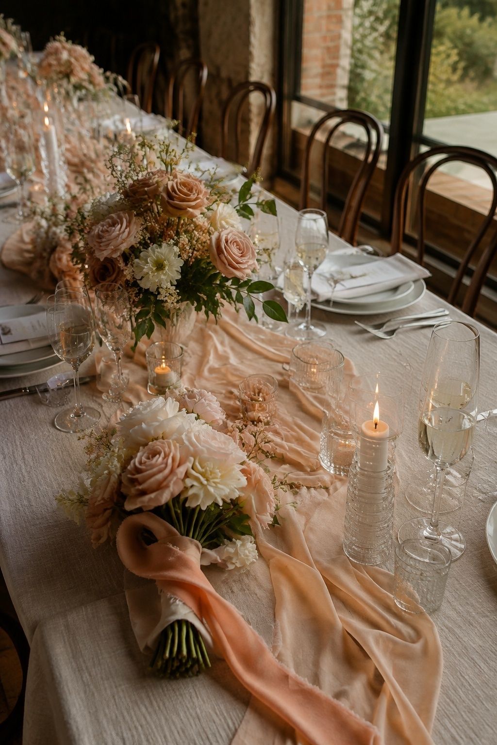
Peach, champagne, and soft rose gives spring florals a romantic glow. Use peach wedding ribbons, rose garden flowers, champagne table runners, and warm-toned stationery so the palette feels layered without adding many separate colors.
It suits vineyard weddings, restaurant receptions, and intimate dinner parties where candlelight and glassware already bring shine. Keep the linens neutral so peach and rose stay elegant rather than overly sweet.
Lilac, Cream, And Pale Green
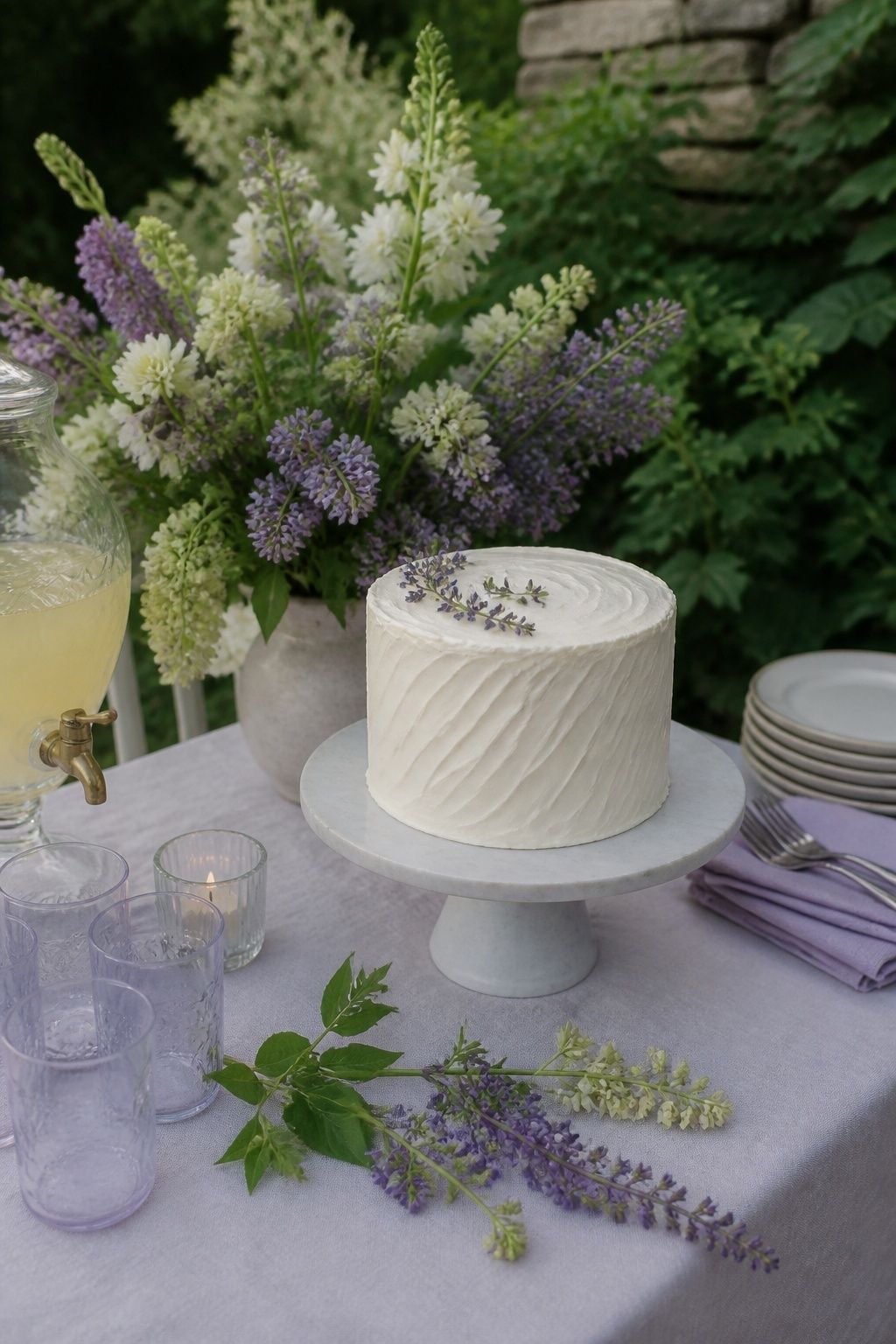
Lilac, cream, and pale green feels fresh when the purple is used with restraint. Choose lilac for invitation ink, a floral accent, bridesmaid dresses, or a petite cake detail, then surround it with cream linen and pale green foliage.
This is a strong option for garden ceremonies with lilacs, sweet peas, tulips, or early hydrangea. Pale green gives the palette a botanical base, which keeps lilac from looking thin or overly sweet.
Terracotta, Soft Peach, And Sage
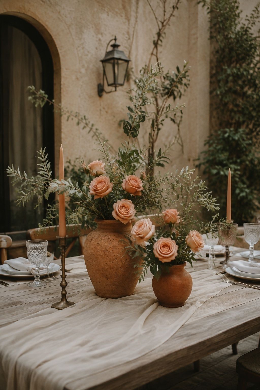
Terracotta brings earthiness to spring when it stays muted and balanced with soft peach and sage. Use terracotta in ceramic vases, a wax seal, a signature drink sign, or one floral accent rather than making it the whole story.
Sage and peach lighten the look for outdoor ceremonies, villa-style venues, desert gardens, and patios. Add cream linen or natural wood so the spring wedding color palette feels warm, not autumnal.
Coral, Apricot, And Warm Cream
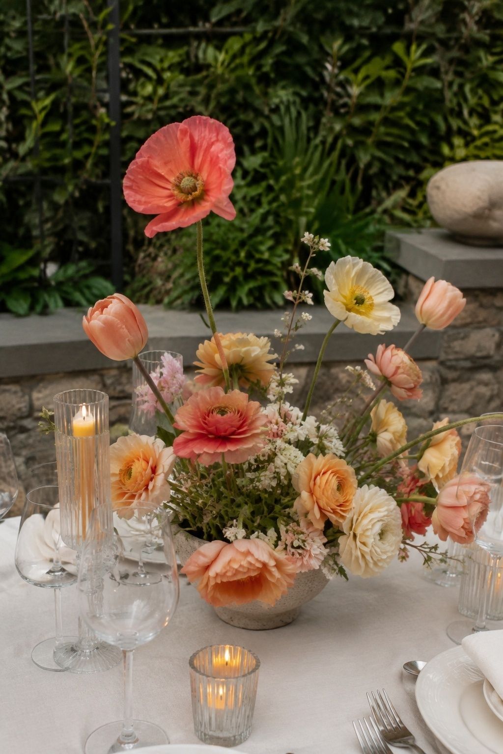
Coral, apricot, and warm cream gives spring flowers more energy than blush alone. Use coral sparingly in ranunculus, poppies, tulips, or a bright napkin accent, then let apricot and cream soften the table.
This palette shines at outdoor cocktail receptions, backyard weddings, and colorful garden venues. Keep attire neutral or sage-toned so the florals become the bright focal point instead of competing with every other detail.
Mauve, Greenery, And Champagne
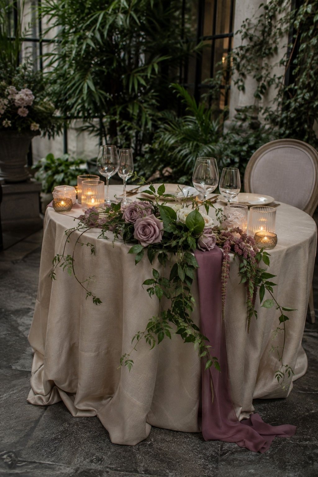
Mauve, greenery, and champagne is a grown-up spring palette for couples who want softness with depth. Use mauve in bridesmaid dresses, velvet ribbon, or roses, then keep greenery loose and natural around champagne linens or metallic accents.
The champagne layer makes mauve feel lighter for spring. It suits evening garden dinners, conservatories, and indoor venues where candlelight warms the floral tones.
Pale Yellow, White, And Garden Green
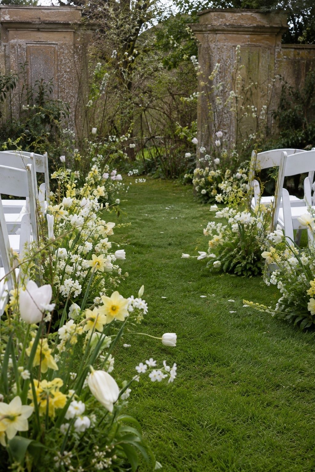
Pale yellow, white, and garden green feels cheerful in the most classic spring way. Use yellow tulips, daffodils, garden roses, taper candles, or a small stationery accent, then let white flowers and green stems keep the look crisp.
This palette fits morning ceremonies, tented lunches, and backyard receptions. Real foliage in the setting gives pale yellow a clear anchor in bright daylight.
Powder Blue, Buttercream, And Silver
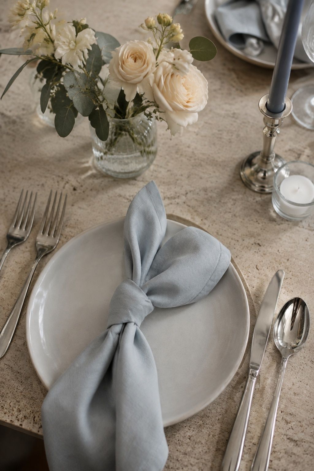
Powder blue, buttercream, and silver feels polished for chapel weddings, hotel terraces, and elegant indoor receptions. Use powder blue for napkins, ribbon, or attire, buttercream in flowers and cake details, and silver in flatware or candleholders.
The buttercream tone keeps blue and silver from looking too cool. The combination photographs cleanly against white walls, stone, glass, and pale wood, especially when greenery appears in small measured amounts.
Dusty Rose, Eucalyptus, And Ivory
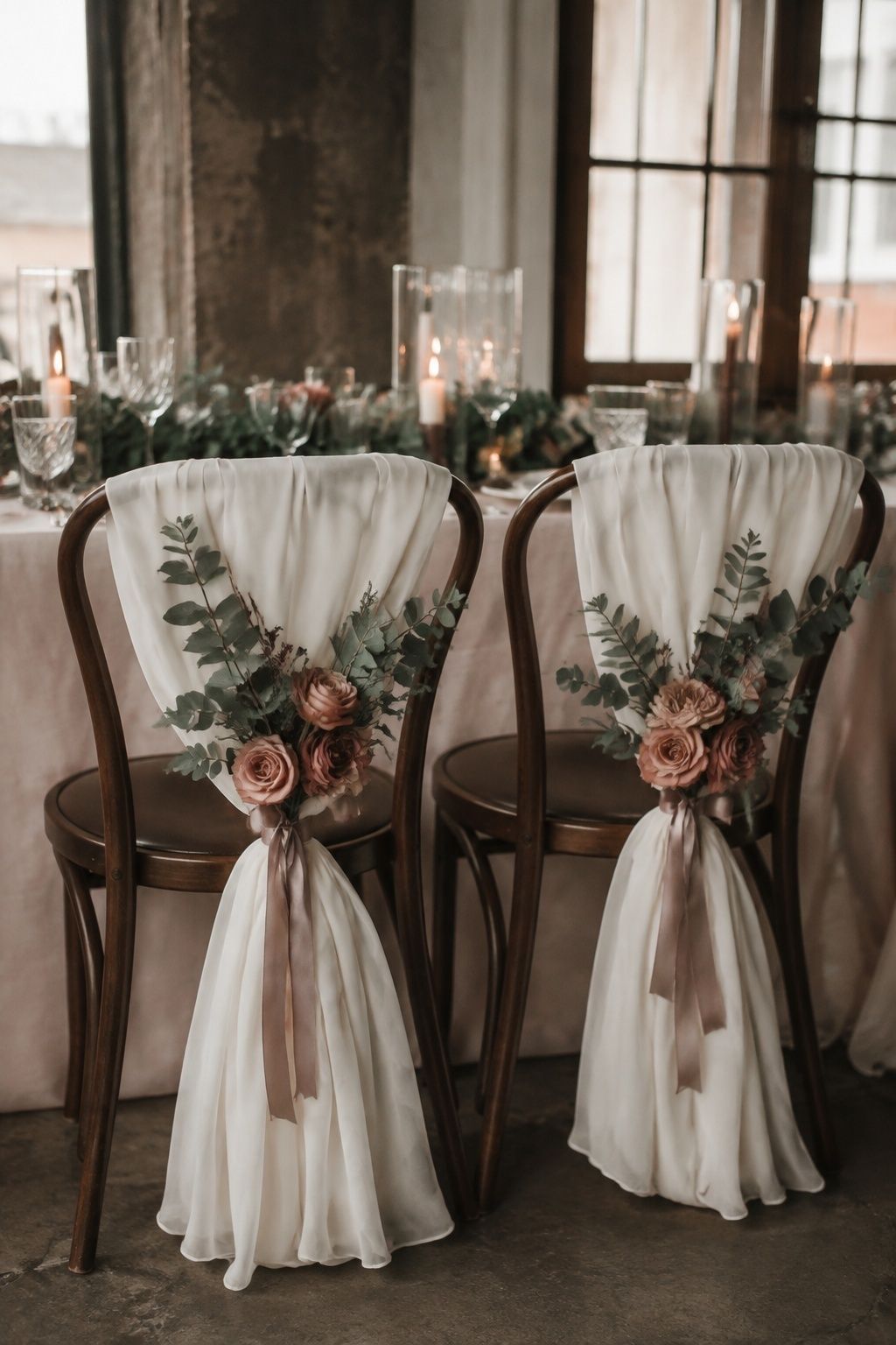
Dusty rose, eucalyptus, and ivory is a soft romantic palette with enough gray-green structure to avoid a washed-out look. Use dusty rose in florals, gowns, or stationery, then repeat eucalyptus in bouquets, bud vases, table garlands, or chair accents.
Ivory gives the palette breathing room on tables and ceremony backdrops. It fits barns, gardens, lofts, and small restaurant weddings where a few floral details must carry the whole room.
Mint, White, And Peach
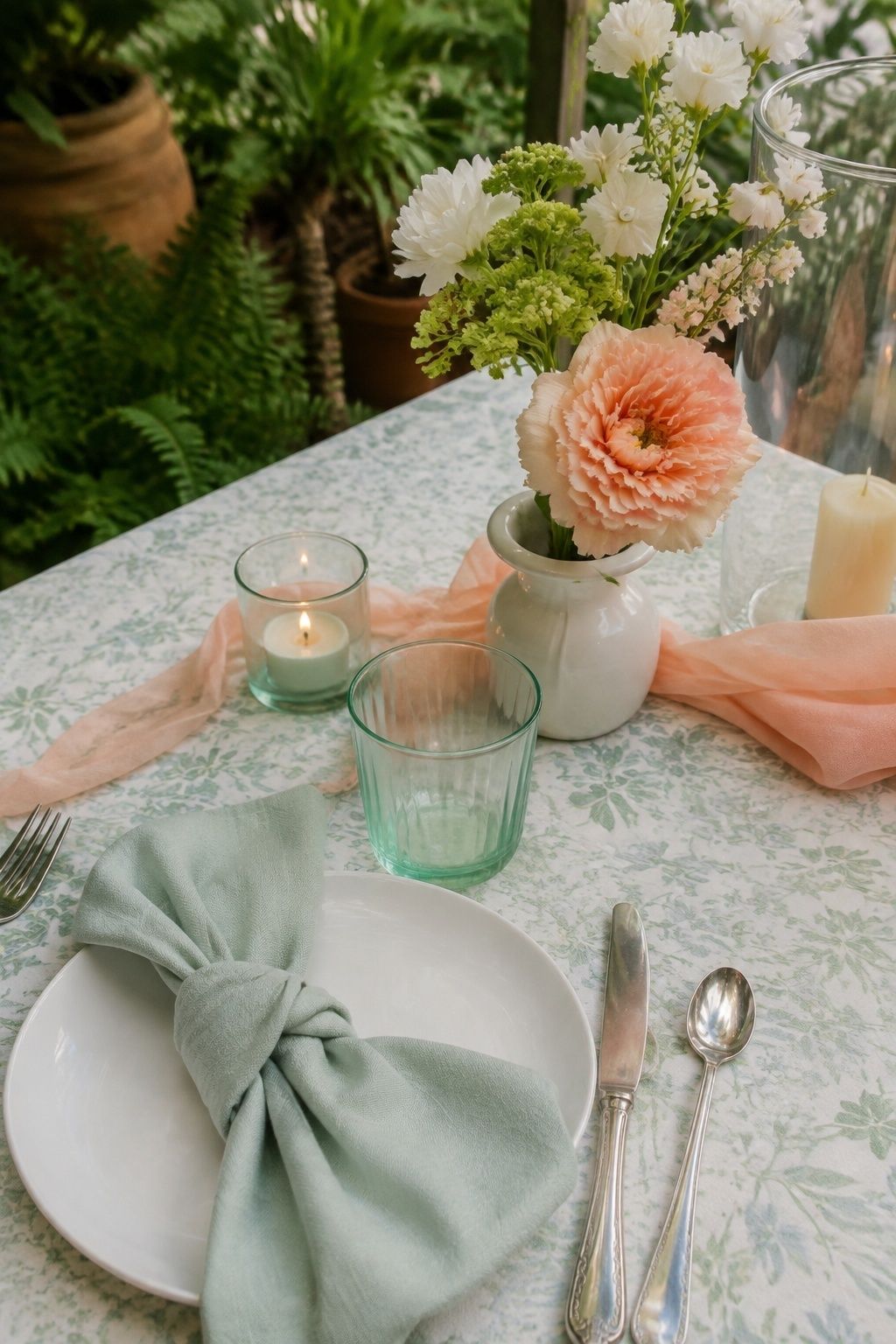
Mint, white, and peach feels crisp and youthful when mint stays clean rather than candy-colored. Use mint in paper goods, a bridesmaid dress mix, glassware, or napkins, then bring peach through flowers and ribbons.
White keeps the palette fresh for garden ceremonies, spring brunches, and greenhouse receptions. Add natural greenery so mint looks intentional against the venue rather than floating separately from the setting.
Champagne, Ivory, And Rose Gold
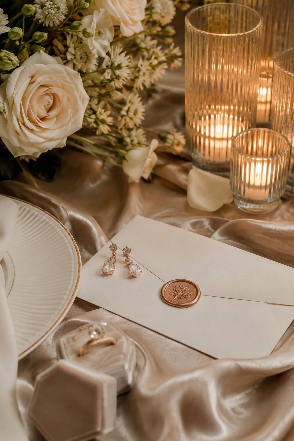
Champagne, ivory, and rose gold is a neutral spring wedding color scheme with warmth and shine. Use champagne runners, ivory flowers, rose gold wax seals, votives, or jewelry details for a soft monochrome look.
This palette suits city hall dinners, restaurants, hotels, and evening receptions where texture matters more than bold color. Add one floral tone, such as blush or peach, if the room feels too beige in photos.
Soft Plum, Lavender, And Cream

Soft plum, lavender, and cream gives spring purple more dimension. Use plum as the anchor in one place, such as shoes, a ribbon, a signature cocktail garnish, or a few floral stems, then let lavender and cream take over the lighter details.
The trick is balance: plum brings depth, but cream and lavender keep the palette seasonal. It fits moody garden weddings, estate venues, and candlelit dinners that still want a spring flower story.
Fresh Green, White, And One Bright Floral Accent

Fresh green, white, and one bright floral accent is the simplest spring wedding color palette for couples who want the venue to lead. Choose one accent, such as coral, yellow, lavender, or peach, then repeat it in the bouquet, menu card, cake flowers, or a single table detail.
This is especially strong for tiny weddings because the palette stays cohesive without decor in every corner. Greenery and white create the base, while one bright accent gives every photo clear seasonal color.
FAQ
What is a good spring wedding color palette?
A good spring wedding color palette has one anchor color, one soft color, and one neutral or metallic. Sage, blush, and cream is a classic choice, while butter yellow, soft blush, and sage feels warmer for brunch or garden weddings.
What colors are trending for spring weddings in 2026?
Spring wedding colors trending for 2026 include sage, lavender, butter yellow, dusty blue, peach, soft rose, champagne, fresh green, and warm ivory. The strongest versions pair a gentle color with a grounding neutral or natural green.
What colors go with sage for a spring wedding?
Sage pairs well with blush, cream, butter yellow, peach, ivory, dusty rose, lavender, champagne, and soft terracotta. For spring, keep sage paired with light flowers and natural textures so it feels fresh instead of heavy.
How do you choose spring wedding colors?
Start with the venue, daylight, and flowers available during the season. Choose one main color, one softer companion, and one neutral or metallic, then repeat those tones in flowers, linens, attire, stationery, and table details.
What spring wedding colors photograph best outdoors?
Sage, fresh green, ivory, cream, dusty blue, lavender, peach, butter yellow, coral, and champagne photograph well outdoors. Avoid very dark winter tones as the main palette unless they are balanced with cream, greenery, and light spring flowers.
Final Thoughts
The best spring wedding color schemes do not ask every detail to be colorful. Pick a grounded anchor, add one softer tone, repeat a neutral or metallic, and let the season add its own greens, flowers, and daylight.
For a small wedding, this approach keeps the design cohesive without filling every corner. A bouquet, a table runner, a few candles, invitation details, and wedding party attire are enough when the palette is clear from the start.
Choose colors that make the venue, flowers, and daylight feel connected before adding anything else. Keep one color grounded in the setting and let the smallest accents carry the seasonal lift through spring palettes and soft color.
Last update on 2026-10-03 / Affiliate links / Images from Amazon Product Advertising API