
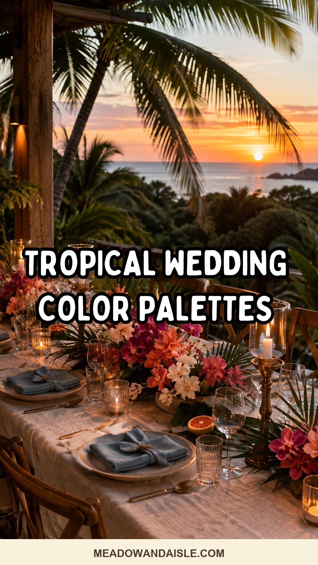
Tropical wedding color palette ideas work best when one calm base, one confident main color, one bright accent, and one natural texture repeat through the flowers, linens, attire, stationery, and table details.
A tropical wedding palette should feel alive without making every surface compete for attention. Beach light, jungle shade, sunset warmth, orchid flowers, citrus fruit, ocean water, and palm leaves all offer beautiful direction, but an intimate wedding needs those colors edited into a rhythm guests can understand at a glance.
Think of color as atmosphere first and decoration second. A few repeated tones on napkins, bouquets, menus, ribbons, candles, and attire will usually feel more refined than using every vivid shade the destination offers.
Recommended Wedding Products
No products found.
No products found.
No products found.
No products found.
No products found.
You Might Also Like These Blog Posts
- Summer Wedding Color Palette Ideas With Sunlit Personality
- Tropical Wedding Inspiration Ideas for a Lush Day That Still Feels Like You
- Fall Wedding Color Palette Ideas Beyond Burnt Orange
- Winter Wedding Color Palette Ideas That Look Better by Candlelight
- Spring Wedding Color Palette Ideas That Don’t Feel Washed Out
- Tropical Wedding Guest Dress Ideas That Stay Cool and Still Look Polished
Tropical Wedding Color Palette Ideas For Sunlit, Salt-Air Celebrations
The strongest tropical wedding color schemes begin with restraint. If the ceremony is beside the water, the ocean is already part of the palette. If dinner is under palms, green is already present. If portraits happen near sunset, orange and pink will appear naturally in the light. Your job is to choose which colors deserve repetition and which ones should remain part of the setting.
For a small wedding, that restraint matters even more. A long table for twelve does not need six saturated colors, oversized leaves, patterned linens, neon drinks, and bright flowers all at once. Choose a tropical wedding color palette that gives each guest-facing detail a job: one shade for softness, one for romance, one for contrast, and one texture that makes the whole setting feel grounded.
| Palette mood | Best setting | Small-wedding restraint |
|---|---|---|
| Ocean tropical wedding colors | Beach vows, boat dinners, seaside terraces | Keep linens pale and repeat blue through stationery or glassware |
| Coral tropical wedding colors | Garden resorts, sunset receptions, flower-forward dinners | Use coral in flowers and one tabletop detail, then let cream rest the eye |
| Jungle wedding color palette | Palm groves, villa courtyards, rainforest venues | Pair deep green with candlelight, wood, and one flower color |
| Island wedding color palette | Destination weekends, beach clubs, private villas | Repeat natural textures so bright colors feel intentional |
Ocean Blue, Ivory, Sand, And Warm Gold
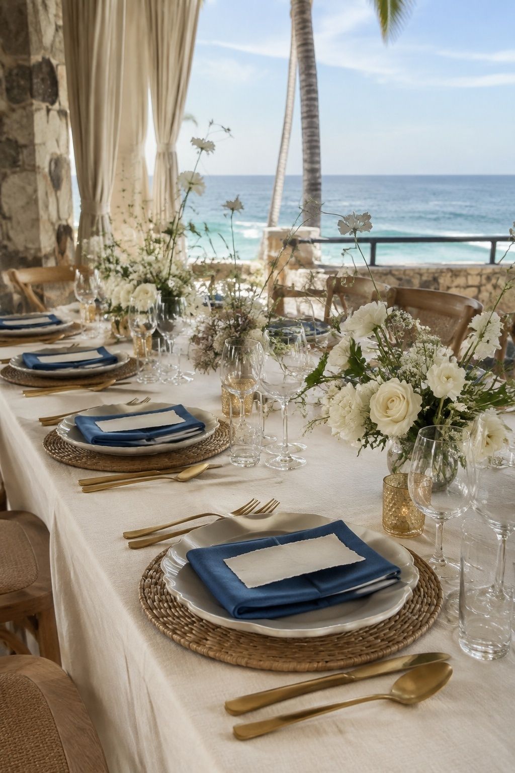
Ocean blue, ivory, sand, and warm gold create a beach tropical wedding palette that feels polished instead of themed. Let ivory carry the ceremony fabrics, sand appear in chargers or woven mats, and ocean blue show up in menus, ribbons, or glassware. Warm gold keeps the palette from feeling chilly, especially when the reception moves from bright beach sun into a softer dinner hour.
For a small celebration, use ocean blue in fewer but clearer places. Blue napkins at every setting may be enough if the water is visible nearby. Add gold flatware, shell-toned stationery, and white flowers with a few loose green stems so the palette feels breezy, not nautical.
Coral, Palm Green, And Coconut White
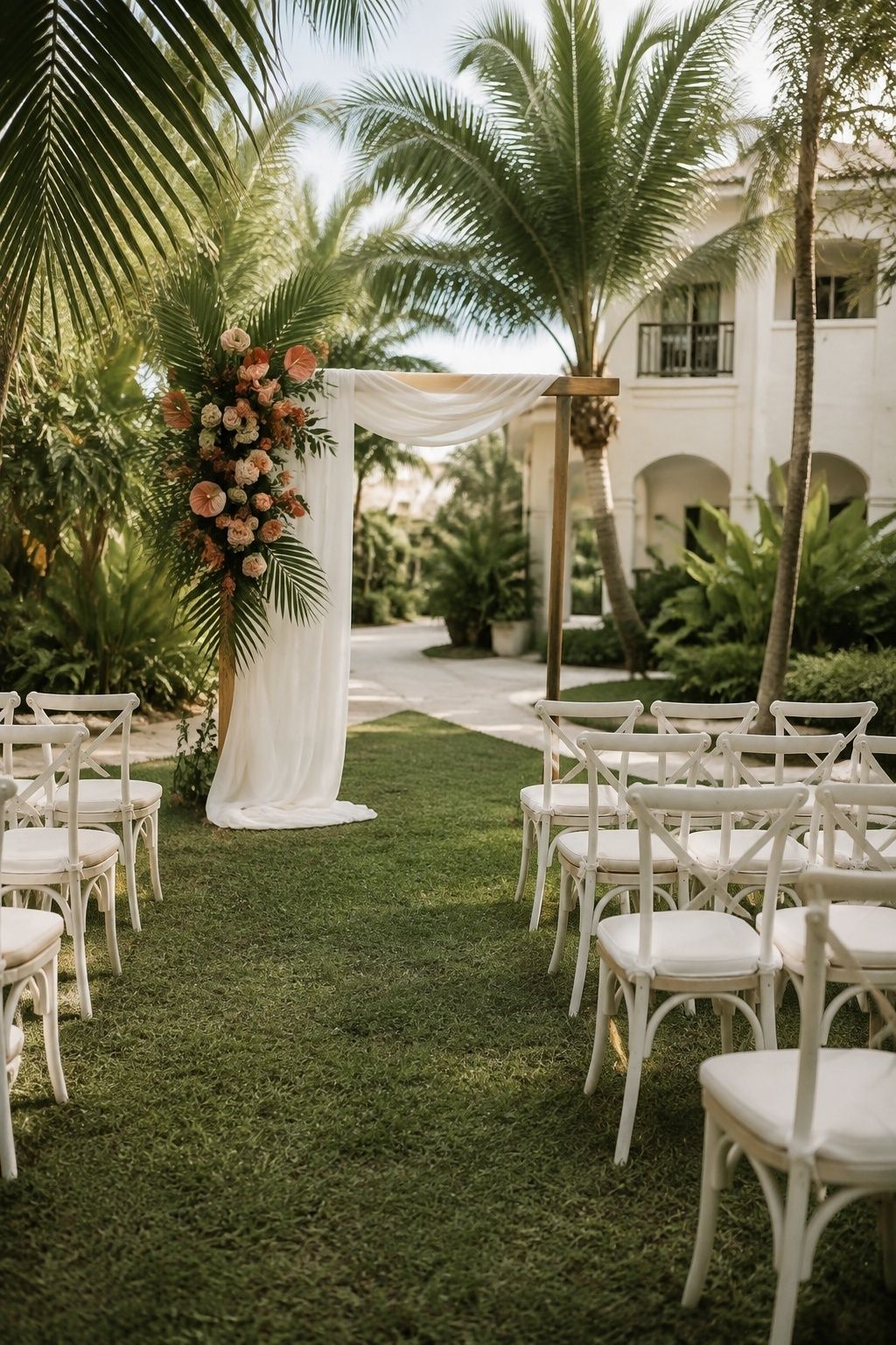
Coral, palm green, and coconut white are classic tropical wedding colors because they feel cheerful without needing many extra accents. Coral works beautifully in bougainvillea, roses, ranunculus, anthurium, or napkin details, while palm green gives the palette structure. Coconut white should do the quiet work through linens, ceremony chairs, taper candles, or the cake table.
This is a lovely direction when the couple wants color in photos but still wants the dinner table to feel calm up close. Choose one coral floral moment, repeat palm green through leaves or place cards, and keep the rest of the table creamy enough for conversation, food, and candlelight to breathe.
Terracotta, Blush, Cream, And Deep Green
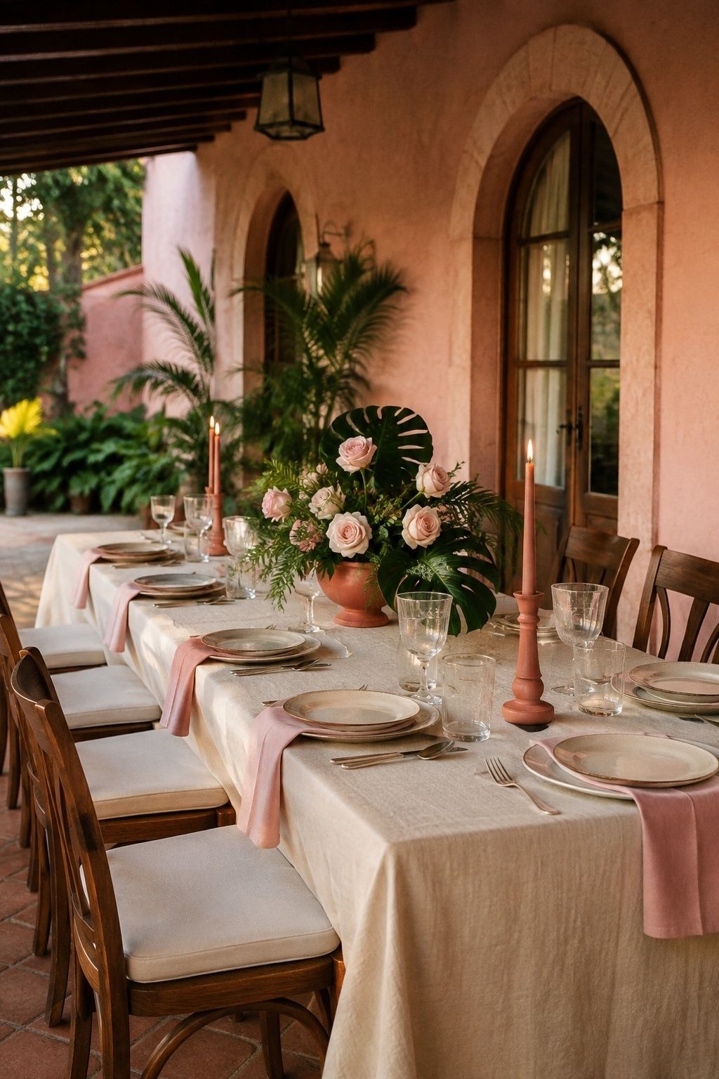
Terracotta, blush, cream, and deep green make a tropical wedding colour palette feel earthy, romantic, and a little sunbaked. Terracotta is beautiful for ceramic vessels, printed details, bridesmaid dresses, or warm-toned flowers. Blush softens the look, cream keeps it wedding-forward, and deep green ties everything back to palms, monstera leaves, or lush resort landscaping.
Use this palette when the venue has stucco walls, clay tile, tropical gardens, or sunset light. For an intimate wedding, avoid stacking terracotta linens with terracotta flowers and terracotta stationery. One clay-toned foundation plus blush flowers and deep green leaves will feel richer than repeating the same warm color everywhere.
Turquoise, Lime, White, And Natural Rattan

Turquoise, lime, white, and natural rattan feel crisp, playful, and unmistakably tropical. Turquoise gives the ocean energy, lime adds citrus brightness, white keeps the palette clean, and rattan makes the colors feel relaxed rather than slick. This combination suits beach clubs, poolside welcome dinners, barefoot ceremonies, and small destination receptions with a breezy mood.
Because turquoise and lime are both high-energy colors, let one lead and the other flicker. Turquoise menus with lime place cards, white flowers, and rattan chargers feel more refined than using both colors equally on every surface. Natural texture is the quiet anchor here.
Orchid, Magenta, Tangerine, And Gold

Orchid, magenta, tangerine, and gold are made for couples who want a vivid tropical wedding color palette with heat and drama. This palette shines in flowers, cocktail-hour details, welcome signage, and a reception table that catches golden hour. Orchid adds elegance, magenta brings romance, tangerine adds warmth, and gold gives the whole scheme a wedding finish.
Use cream or pale blush as a hidden stabilizer, even if it is not one of the headline colors. Without a resting shade, this palette can overwhelm a tiny dinner table. Try vivid flowers with neutral linens, gold votives, and one tangerine stationery detail so the color feels passionate instead of crowded.
Sage, Sea Glass Blue, Ivory, And Driftwood
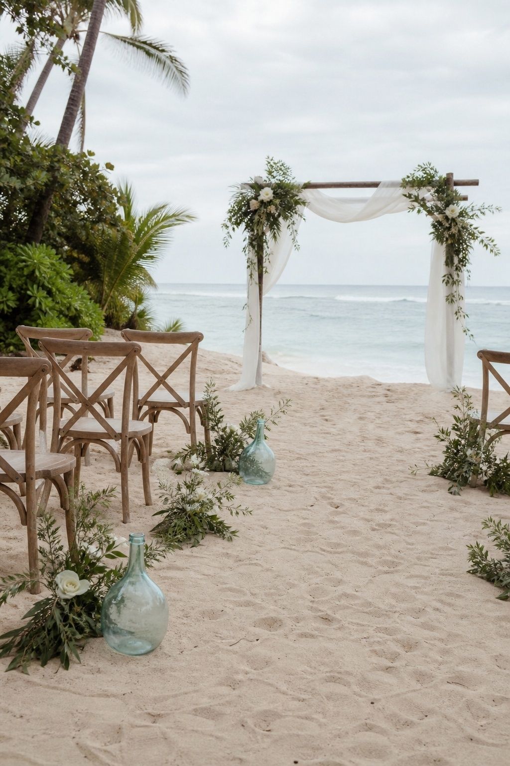
Sage, sea glass blue, ivory, and driftwood create a gentler version of tropical beach wedding colors. This palette is beautiful for couples who want the destination to feel peaceful, airy, and romantic rather than bright. Sage connects to leaves and herbs, sea glass blue nods to water, ivory softens the ceremony, and driftwood gives the reception a natural base.
For a small wedding, this palette is easy to repeat without feeling repetitive. Use ivory linens, sage taper candles, sea glass place cards, and driftwood-toned chairs or chargers. It works especially well when the view is already colorful and the decor needs to support the landscape instead of compete with it.
Emerald, Teal, Black, And Candlelight
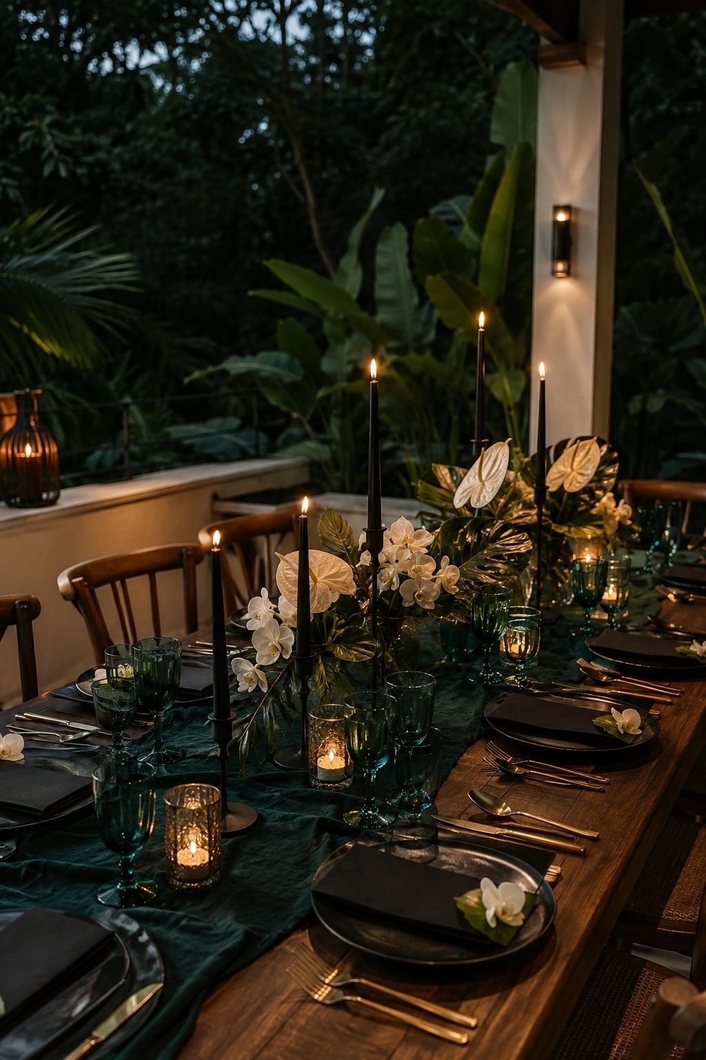
Emerald, teal, black, and candlelight make modern tropical wedding colors feel moody and elegant. Use this palette for evening receptions, jungle-edge villas, indoor resort dining rooms, and candlelit terraces where the tropical feeling comes from depth rather than brightness. Emerald and teal carry the lushness, black sharpens the design, and candlelight keeps it romantic.
Keep black precise. Matte black menus, taper holders, or chairs can look chic, while too much black cloth may feel heavy in a humid destination setting. Add ivory flowers, glossy leaves, brass details, and warm candles so the palette still feels alive around faces and food.
Mustard, Coral, Ivory, And Tropical Green
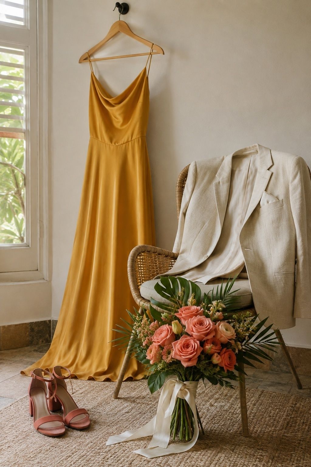
Mustard, coral, ivory, and tropical green feel warm, joyful, and slightly retro. Mustard is beautiful in napkins, bridesmaid fabric, printed borders, or taper candles. Coral keeps the palette romantic, ivory gives it softness, and tropical green keeps the whole look connected to palms and broad leaves.
This combination is strongest when the couple wants a sun-drenched mood without going fully orange. At a small wedding, use mustard sparingly because it changes quickly under indoor reception lighting. Test it beside coral flowers and ivory linens before ordering a full set of napkins or dresses.
Papaya, Peach, Cream, And Olive
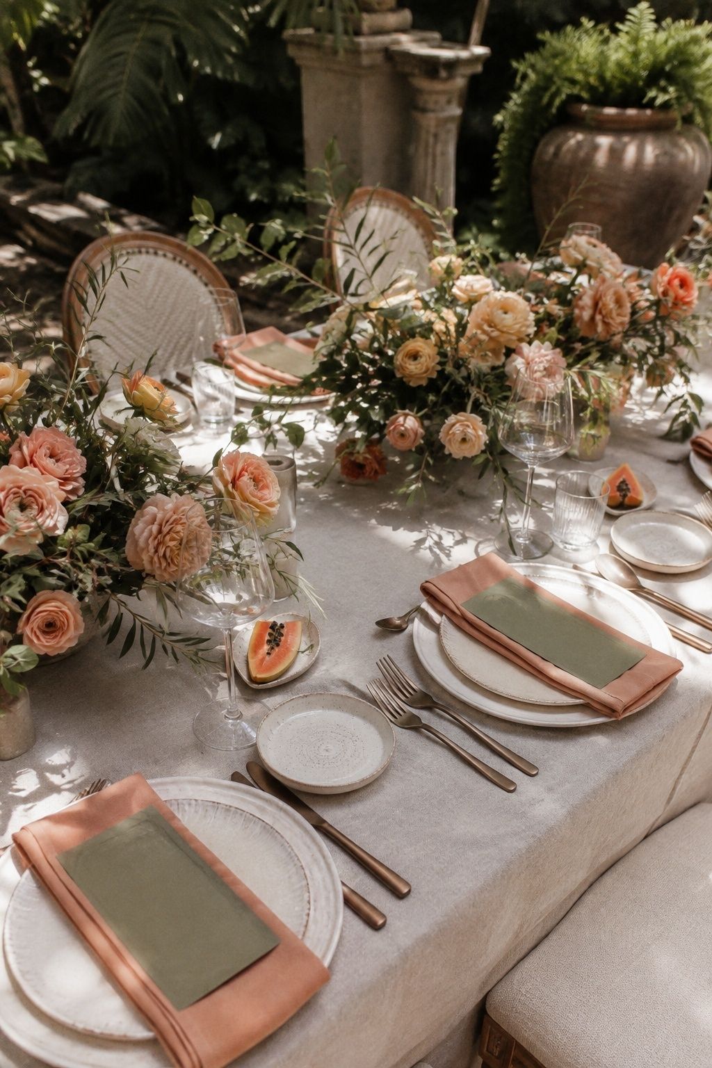
Papaya, peach, cream, and olive are soft but still tropical. Papaya gives the palette a ripe fruit touch, peach makes it flattering around faces, cream gives the ceremony its wedding softness, and olive offers a muted green alternative to sharper palm tones. This is a beautiful palette for brunch weddings, garden resorts, and early evening dinners under warm light.
Use papaya as the accent rather than the base. Peach flowers, cream linens, olive menus, and a few papaya blooms or citrus place cards will feel intimate and lush. If every detail turns orange, the tenderness of the palette disappears.
White, Monstera Green, And Matte Black

White, monstera green, and matte black give a tropical wedding color scheme a clean editorial edge. White provides space, monstera green brings the destination mood, and matte black adds structure through menus, chairs, signage, or taper holders. It is especially effective in modern villas, rooftop terraces, galleries, and resort spaces with strong architecture.
For a small wedding, avoid turning every table into a leaf installation. One sculptural leaf per place setting, a single green ceremony moment, or a few oversized leaves behind the bar can be enough. The more modern the palette is, the more important empty space becomes.
Hibiscus Pink, Coral, Sand, And Brass
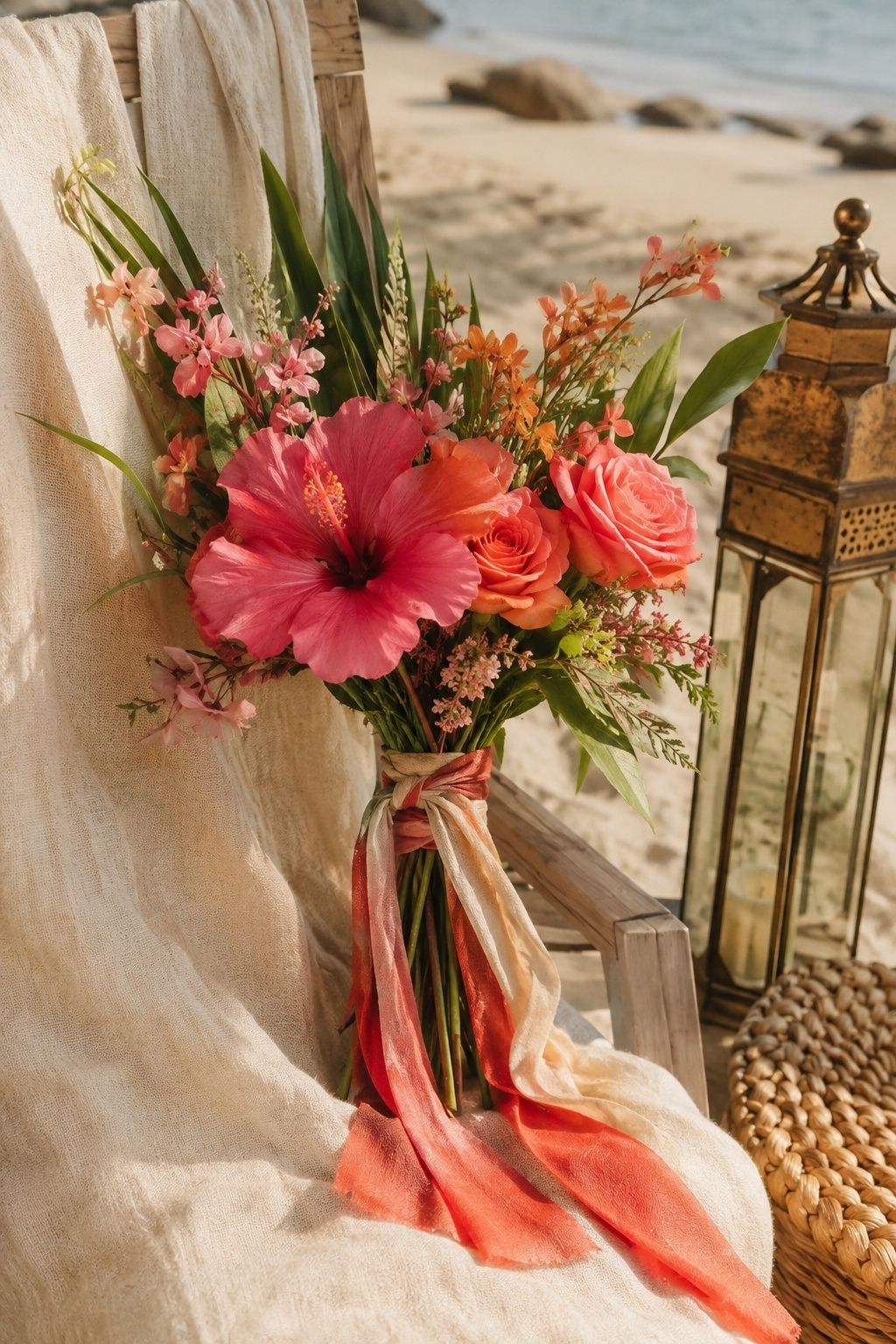
Hibiscus pink, coral, sand, and brass feel joyful, floral, and sun-warmed. Hibiscus pink gives the palette its tropical flower moment, coral bridges the gap between bright and romantic, sand calms the table, and brass adds glow. This palette is beautiful for ceremonies with tropical blooms, linen suits, woven textures, and dinner under soft lantern light.
Let sand do more work than it seems. Sand-toned linens, menus, chargers, or shoes will make the bright flowers look intentional instead of loud. Brass should stay warm and aged rather than mirror-shiny, especially for tiny receptions where guests see every detail closely.
Lavender Orchid, Shell Pink, And Pearl
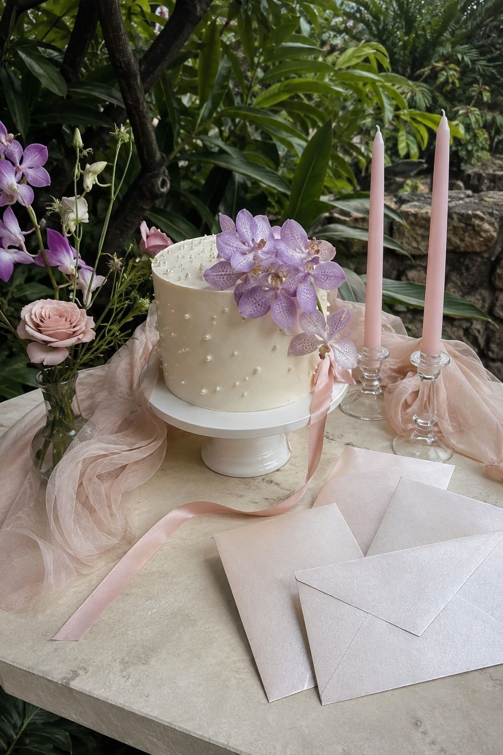
Lavender orchid, shell pink, and pearl offer a softer tropical wedding colour palette for couples who love romance more than saturated contrast. Lavender orchid feels destination-specific without shouting, shell pink warms the palette, and pearl adds a luminous bridal quality through accessories, stationery, candles, or cake details.
This palette is lovely for intimate resort dinners, elopement weekends, and garden ceremonies where flowers are the emotional center. Add a touch of green through stems and leaves, but keep it secondary. The beauty here is in softness, translucence, and gentle repetition.
Cobalt, Palm Green, And Crisp White
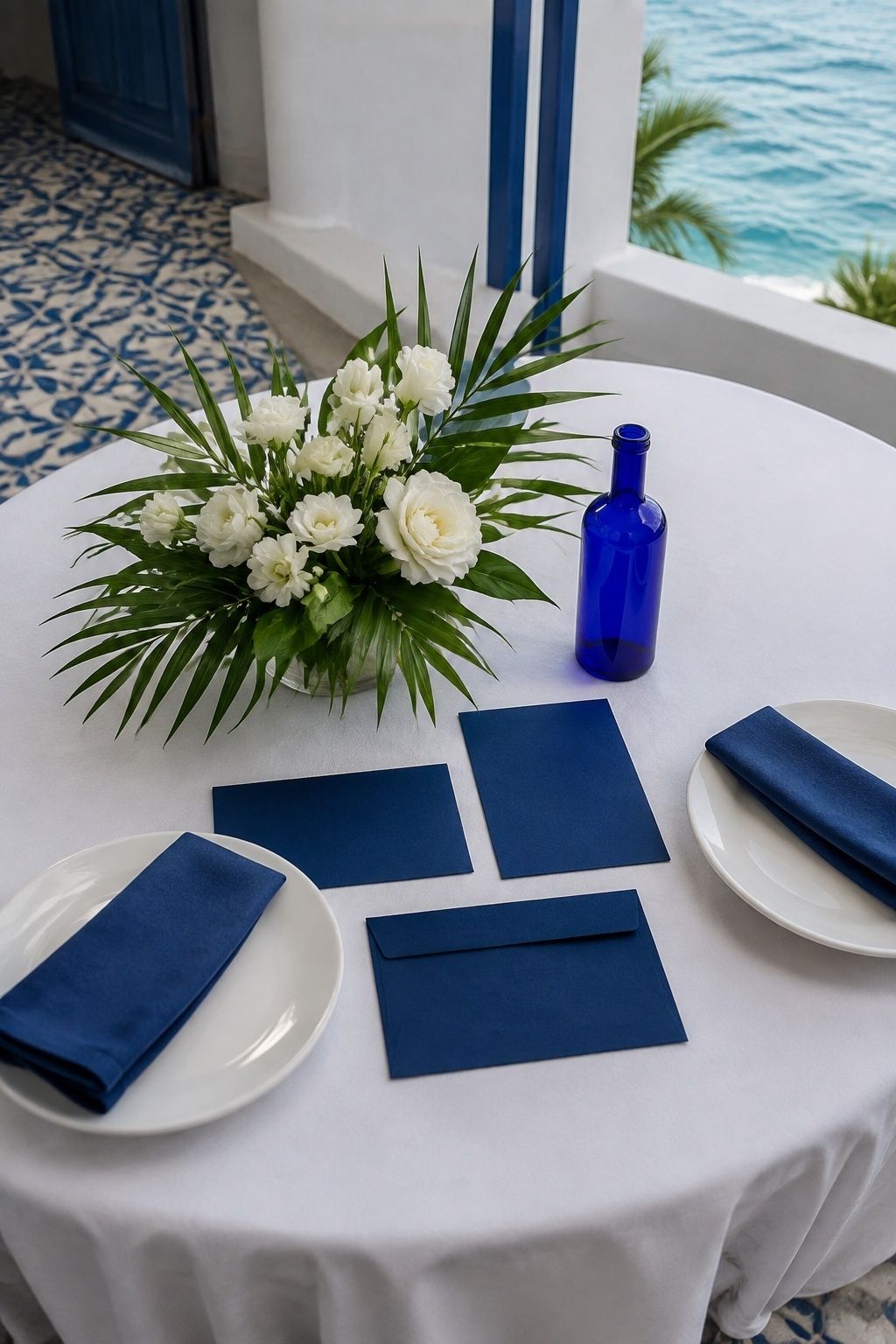
Cobalt, palm green, and crisp white feel bold, clean, and coastal. Cobalt has more authority than turquoise, palm green keeps it tropical, and crisp white prevents the palette from becoming too heavy. This combination works well for seaside ceremonies, blue-and-white villas, destination welcome parties, and couples who want color with a tailored edge.
Use cobalt where it can look deliberate: stationery, tile-inspired patterns, napkins, escort cards, or glassware. Keep flowers mostly white and green, then add cobalt in flat details that will not fight the blooms. This gives the palette confidence without visual noise.
Champagne, Sage, Ivory, And Soft Citrus
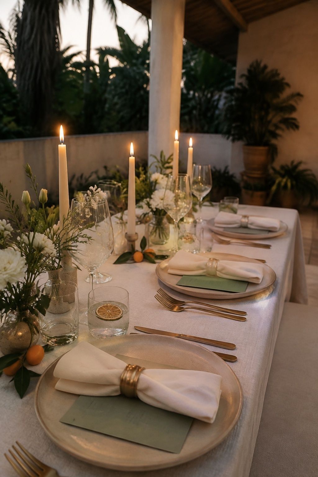
Champagne, sage, ivory, and soft citrus are refined tropical wedding colors for couples who want warmth without obvious brights. Champagne adds glow, sage keeps the palette natural, ivory makes it bridal, and soft citrus brings a small sense of destination joy. This palette is especially good for intimate dinners where the table should feel elevated and comfortable.
Let soft citrus appear in just a few places, such as place cards, welcome drinks, cake garnish, or a flower accent. Too much yellow or orange will shift the palette away from elegant and into party decor. A small citrus touch, repeated carefully, feels fresher.
Sunset Orange, Fuchsia, Cream, And Wood
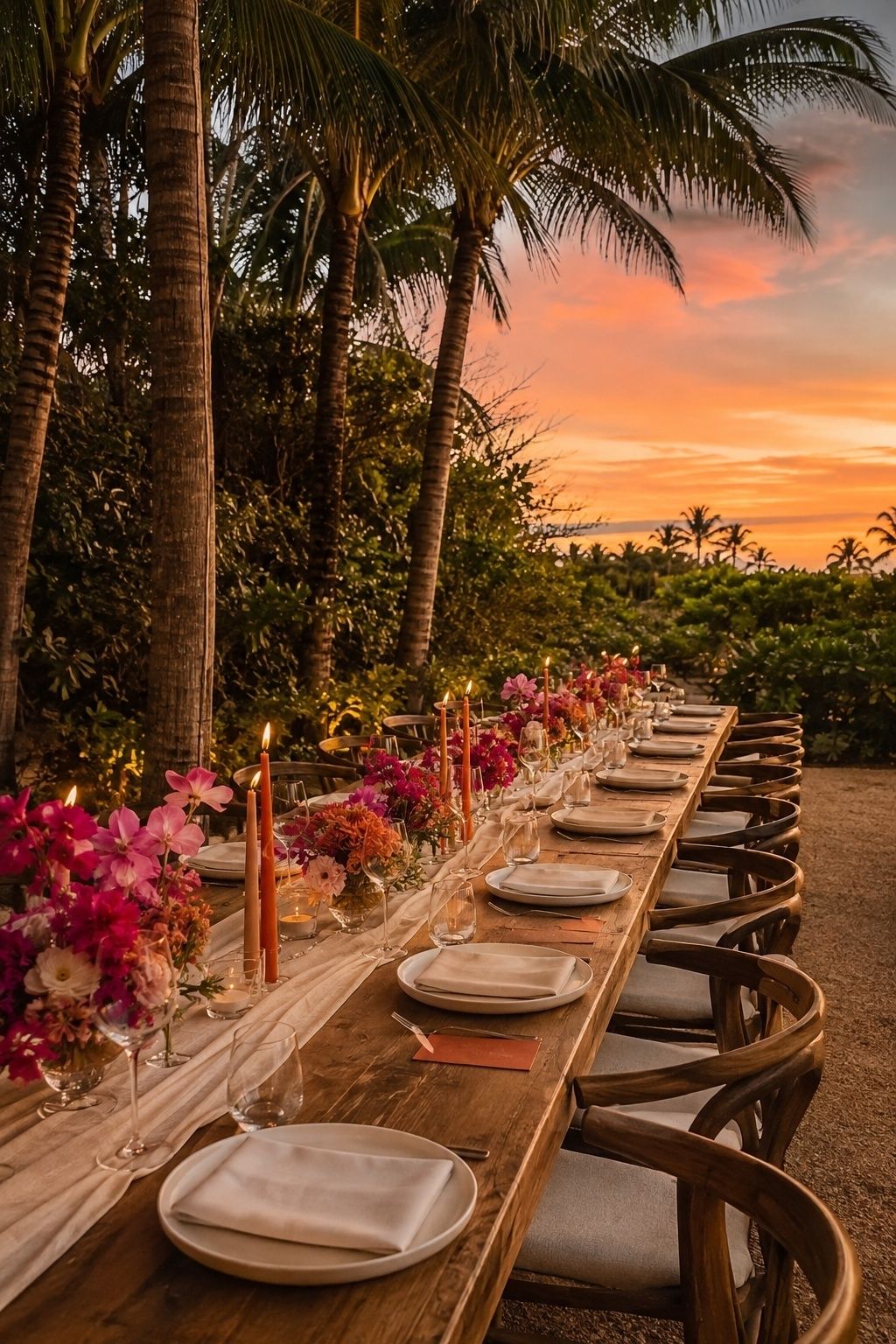
Sunset orange, fuchsia, cream, and wood are full of heat, light, and heart. Sunset orange and fuchsia echo golden hour, tropical flowers, and celebratory cocktails, while cream and wood keep the palette human and tactile. It works best for couples who want the reception to feel alive as the day moves into evening.
At a small wedding, use this palette like a chorus rather than a shout. Cream linens, wood chairs, fuchsia flowers, and sunset-orange candles or menus will feel rich. If the venue already has strong sunset light, pull back on orange during dinner and let fuchsia carry the floral romance.
Palette Planning Notes
Build A Base, Main Color, Accent, And Texture Rule
Before choosing flowers or linens, give each color a role. The base might be ivory, cream, sand, or white. The main color might be coral, ocean blue, palm green, orchid, terracotta, or sage. The accent might be citrus, fuchsia, gold, brass, black, or turquoise. The texture might be rattan, driftwood, ceramic, linen, pearl, shell, or woven palm.
This simple rule keeps tropical wedding color palette ideas from turning into a pile of pretty swatches. It also makes shopping easier because every purchase can be checked against its job. If a detail does not support the base, main color, accent, or texture, it probably does not need to come to the wedding.
Test Colors In The Actual Wedding Light
Tropical light changes color quickly. Direct beach sun may bleach pale colors, open shade may cool ivory into gray, golden hour may make coral and terracotta glow, and candlelight may deepen greens and blacks. Indoor reception lighting may also turn mustard, lime, peach, and champagne warmer than expected.
Order swatches before finalizing bridesmaid fabric, napkins, ribbons, and paper. Photograph them at the ceremony time and dinner time if possible. A tropical wedding colour palette should look good in the light where vows, portraits, dinner, and dancing will actually happen.
Use Bright Colors In Fewer Places
Bright tropical wedding colors are strongest when they have room around them. Coral flowers look more expensive against cream linen. Fuchsia looks more romantic with wood chairs. Lime feels fresher when it appears on a place card, cocktail garnish, or ribbon instead of every surface.
For small weddings, this is the difference between intimate and overwhelming. Choose the places guests touch and notice most: bouquet ribbons, menus, napkins, candles, escort cards, attire accents, and the cake table. Then let the destination provide the rest of the color.
FAQ
What colors are best for a tropical wedding?
The best colors for a tropical wedding are usually ivory, sand, palm green, ocean blue, coral, citrus, orchid, terracotta, sage, turquoise, gold, and warm wood tones. The exact mix depends on the venue light, flowers, attire, and how bold the couple wants the guest experience to feel.
How do you choose a tropical wedding color palette?
Choose a tropical wedding color palette by starting with the venue’s natural colors, then assigning one base shade, one main color, one accent, and one texture. Test swatches in real light before buying linens, attire, ribbons, or paper goods.
What tropical wedding colors look elegant?
Elegant tropical wedding colors include champagne, sage, ivory, pearl, sea glass blue, terracotta, deep green, brass, and soft coral. These shades feel refined because they leave space for flowers, faces, food, and candlelight instead of making every detail equally bright.
What colors work for a beach destination wedding?
Beach destination weddings work beautifully with ocean blue, ivory, sand, sea glass, coral, white, sage, driftwood, turquoise, and warm gold. In very bright sun, choose slightly stronger accents so the palette does not wash out against water, sky, and pale sand.
How do you use bright tropical colors without overdoing it?
Use bright tropical colors in fewer, more memorable places, such as flowers, napkins, menus, candles, ribbons, or escort cards. Pair them with cream, ivory, sand, wood, rattan, or white so the bright shades feel intentional rather than scattered.
What flowers match a tropical wedding color palette?
Anthurium, hibiscus, orchids, bougainvillea, roses, ranunculus, birds of paradise, ginger flowers, monstera leaves, palms, and ferns can all match a tropical wedding color palette. Choose flowers by role: one focal bloom, one softer supporting bloom, and enough greenery to connect the arrangement to the setting.
Final Thoughts
Tropical color is most beautiful when it feels edited, emotional, and aware of the place. Let the setting give you the first layer, then repeat your chosen shades through the details guests will actually see: flowers, fabric, paper, candles, attire, and the table where everyone gathers. With a small wedding, even one confident color feels generous when it is carried with care.
For couples refining palette choice, attire, flowers, linens, stationery, reception mood, shoe tone, ribbon shade, table texture, and destination cohesion together, settle the core colors first; restraint meanwhile keeps every finishing detail calm, repeatable, and connected without asking the table to carry too many ideas at once.
Last update on 2026-10-04 / Affiliate links / Images from Amazon Product Advertising API