

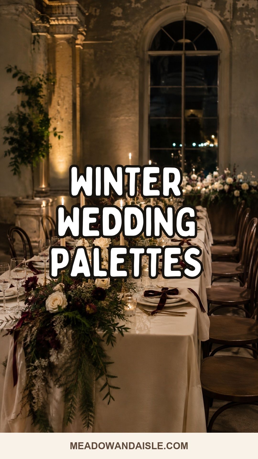
The best winter wedding color palette suits the venue, photographs well after sunset, pairs with seasonal flowers, and still feels intentional under candlelight. Start with one grounding neutral, one winter-friendly accent, and one finish such as brass, silver, glass, wood, or velvet.
Winter makes color more emotional, but it also makes color less predictable. Ivory glows beautifully in candlelight, navy looks crisp in a ballroom, and burgundy feels romantic at dinner, yet the same shades shift under cool overhead lights, dark wood walls, snow-bright windows, or a restaurant’s amber lamps.
That is why winter wedding colors deserve more than a pretty mood board. The palette has to live on linens, flowers, paper, attire, candles, glassware, cake, and the small close-up details guests notice at an intimate celebration.
Recommended Wedding Products


You Might Also Like These Blog Posts
- Summer Wedding Color Palette Ideas With Sunlit Personality
- Halloween Wedding Color Palette Ideas for Gothic, Moody, and Fall Romance
- Fall Wedding Color Palette Ideas Beyond Burnt Orange
- Spring Wedding Color Palette Ideas That Don’t Feel Washed Out
- Tropical Wedding Color Palette Ideas With Heat, Light, and Heart
- Fig Wedding Color Palette Ideas for a Moody Romance That Still Breathes
Winter Wedding Color Palette Ideas For Real Candlelight
A palette becomes easier to apply when each color has a purpose. One shade carries the flowers, another carries the table, and a final accent appears only in glass, wax, ribbon, or stationery. These winter wedding color palette ideas are built for real candlelight, real flower availability, and real rooms where guests will sit close enough to notice the details.
Ivory, Evergreen, And Warm Gold
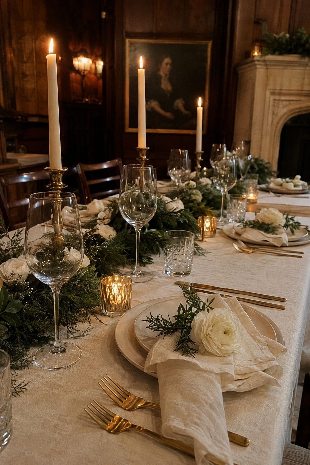
Ivory, evergreen, and warm gold give a winter wedding color palette a classic bridal feeling without turning the room into a holiday scene. Ivory keeps the ceremony soft, evergreen adds seasonal depth, and gold warms the table once candles are lit.
Place evergreen in garlands, boutonnieres, stationery liners, or a simple bar arrangement, then keep the florals mostly white. For small weddings, this palette looks especially polished when the gold appears in flatware, votives, wax seals, or a narrow ribbon instead of every surface.
Navy, Silver, And True White
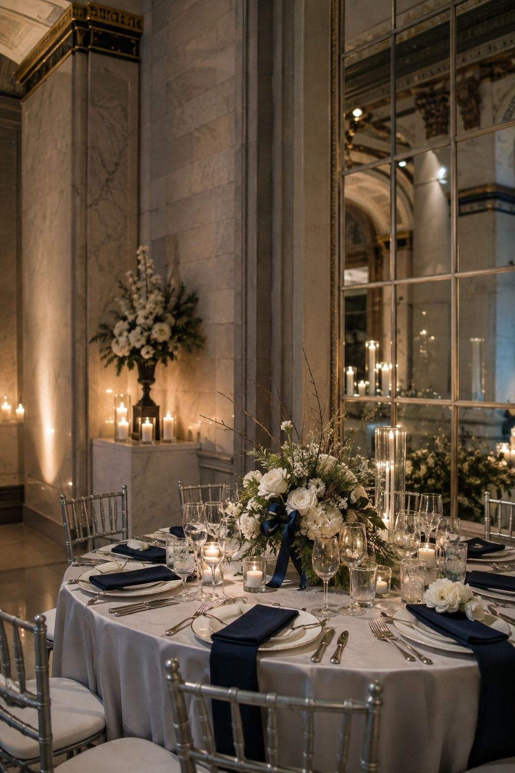
Navy, silver, and true white suit formal winter evenings, especially in city venues, ballrooms, museums, and candlelit hotel dining rooms. Navy gives the palette structure, while silver and white keep it crisp instead of heavy.
This is one of the strongest winter wedding color schemes when the venue already has cool marble, mirrors, glass, or white walls. Test bridesmaid fabric and navy paper at night, because some deep blues turn nearly black in low light.
Burgundy, Emerald, And Champagne
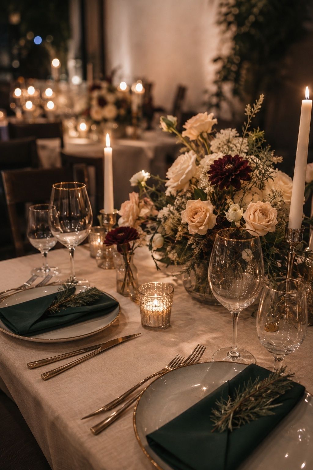
Burgundy, emerald, and champagne feel rich with minimal decoration. The jewel tones bring romance to flowers, velvet ribbon, menus, and attire, while champagne gives the palette a softer glow for dinner.
Treat burgundy and emerald as accents rather than equal blocks of color. A champagne linen, ivory flowers, burgundy dahlias, emerald napkins, and gold-rimmed glassware will feel layered; burgundy linens with emerald dresses and red flowers often become too dense.
Winter White And Soft Greenery
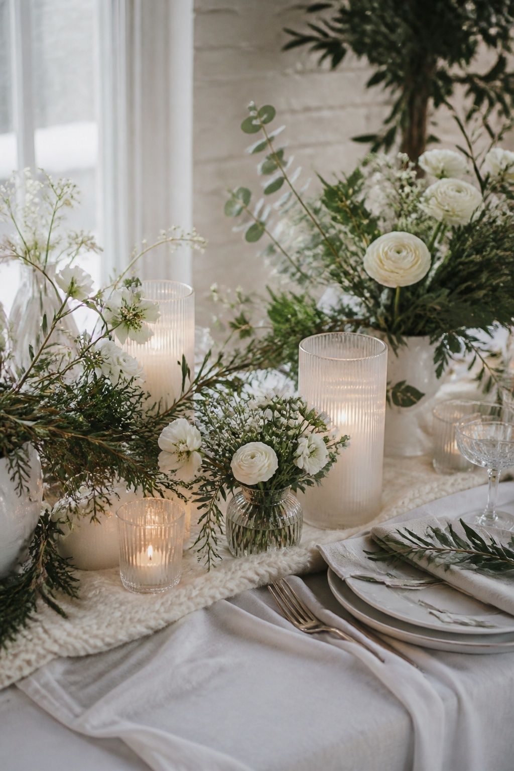
Winter white and soft greenery are beautiful for couples who want quiet elegance. This palette suits small winter wedding colors because a modest floral plan still feels complete.
Lean into texture: linen, wool, frosted glass, white ranunculus, hellebore, anemones, eucalyptus, olive, pine, or cedar. Candlelight gives the white details dimension, so avoid flat white paper and plain white tablecloths without a tactile layer.
Mocha, Cream, And Brass
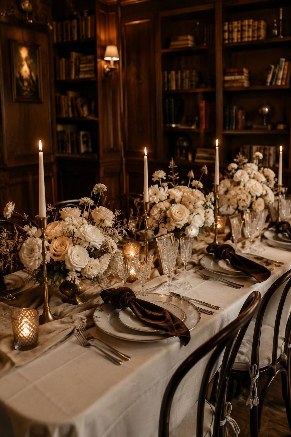
Mocha, cream, and brass are warm, intimate, and quietly luxurious. They suit libraries, restaurants, tucked-away dining rooms, historic homes, and winter receptions where the meal and candlelight matter more than a large decor build.
Mocha appears in velvet, napkins, menus, ribbons, or a groom’s accessory, while cream keeps the flowers bridal. Brass is strongest in candlesticks, frames, bar details, chargers, or small table numbers.
Black, Ivory, And Gold
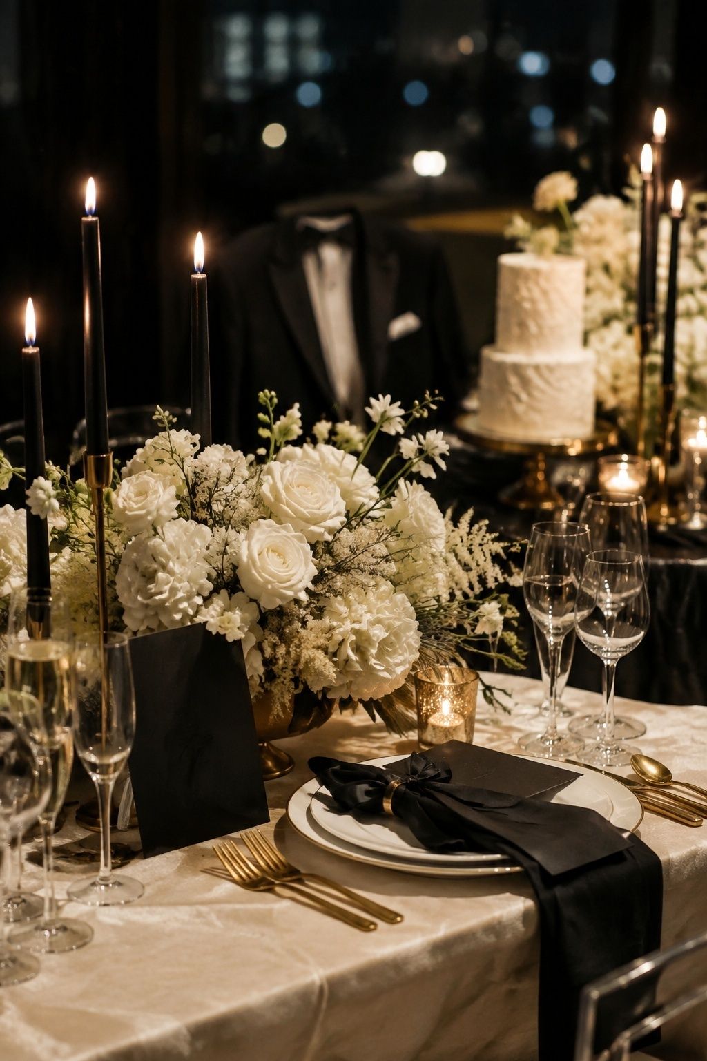
Black, ivory, and gold create a polished black-tie palette for city weddings, ballrooms, and New Year’s-adjacent celebrations. The key is treating black as a frame, not the entire atmosphere.
Try black taper candles, black menus, tuxedos, velvet bows, or a black cake stand against ivory flowers and linens. Gold adds warmth, but keep it refined so the palette feels elegant in candlelight rather than overly shiny.
Plum, Mauve, And Antique Gold
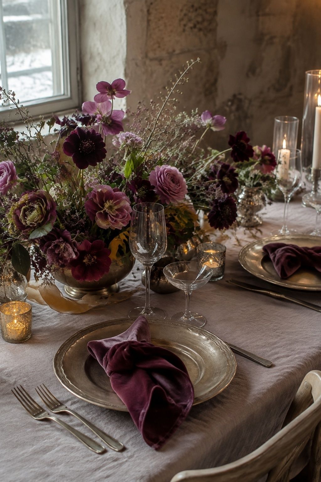
Plum, mauve, and antique gold are softer than a classic burgundy palette and often kinder to romantic winter florals. Plum gives depth, mauve bridges into blush, and antique gold keeps the whole look warm.
Choose this palette for winter wedding flower colors that feel moody but not severe. Among winter wedding colors 2026 couples are saving, plum feels especially versatile because hellebores, scabiosa, ranunculus, orchids, or velvet ribbon carry the deeper shade while mauve dresses or napkins soften the room.
Cranberry, Rose, And Champagne
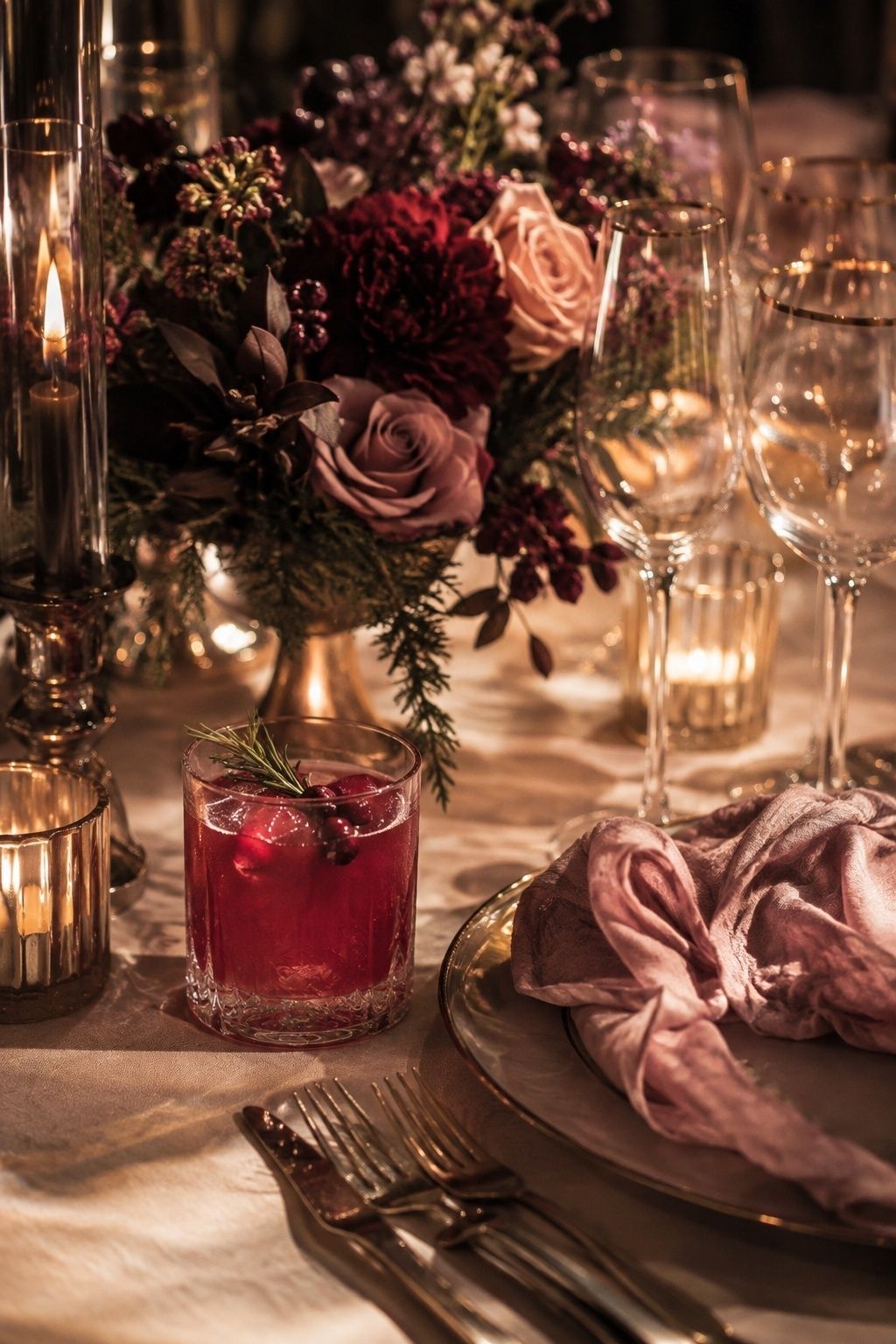
Cranberry looks gorgeous in winter with a careful companion. Pairing it with rose and champagne makes the red feel romantic instead of automatic Christmas styling.
Let cranberry appear in berries, lipstick-toned flowers, cocktails, ribbon, or a few candles. Rose softens the transition into flowers and attire, while champagne keeps the reception luminous after sunset.
Forest Green, Ivory, And Copper
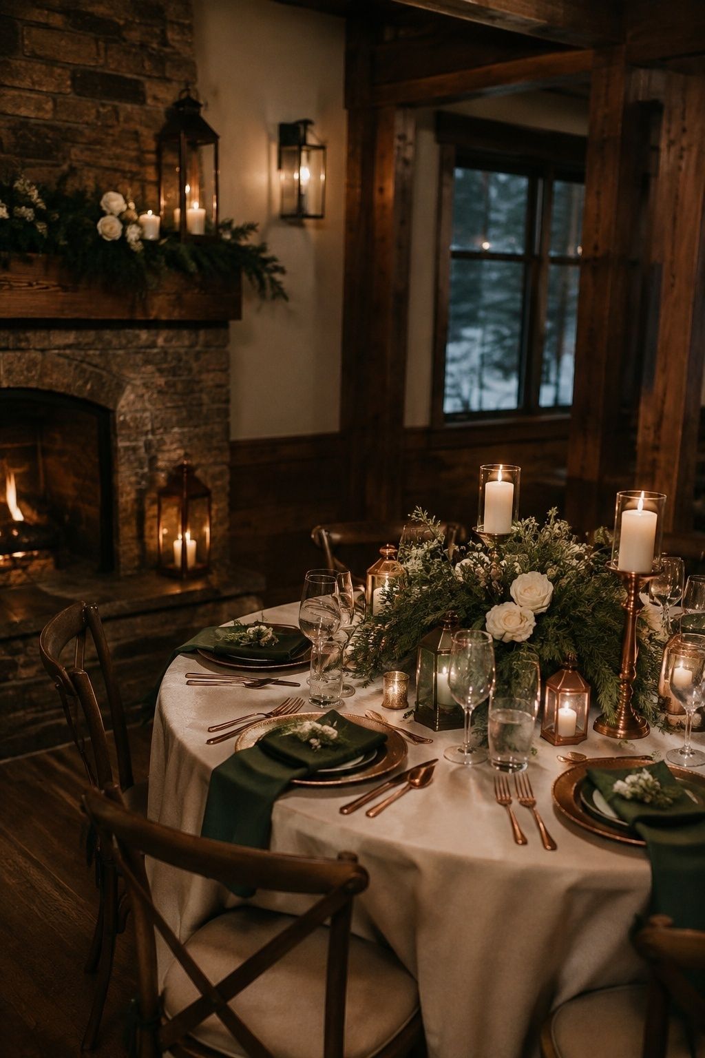
Forest green, ivory, and copper feel grounded for lodges, barns, fireside rooms, and venues with wood, stone, or exposed beams. Copper is warmer than gold and makes winter wedding decor colors feel more personal.
Place forest green in paper, velvet, napkins, or foliage, then rely on ivory flowers for lift. Copper shines in low, glowing details such as mugs, lanterns, candlesticks, chargers, or bar styling.
Dusty Blue, White, And Silver
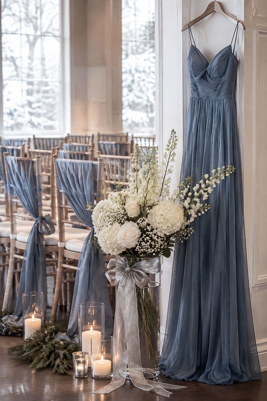
Dusty blue, white, and silver create a cool winter palette that feels airy rather than icy when the textures are right. It is lovely for snowy portraits, pale venues, and ceremonies with a quiet, formal mood.
Because dusty blue turns grey in dim rooms, test it under the reception lighting before ordering linens or dresses. White flowers, silver ribbon, clear glass, and warm candlelight keep the palette from feeling flat.
Charcoal, Evergreen, And Crystal
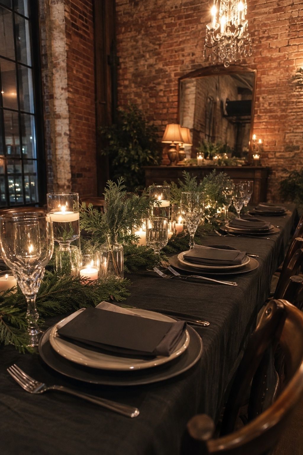
Charcoal, evergreen, and crystal are modern, deep, and dramatic without relying on black. Charcoal gives the room a tailored base, greenery softens the edges, and crystal catches candlelight in a winter-appropriate way.
This palette suits warehouse venues, restaurants, lofts, and evening receptions. Let crystal appear through glassware, chandeliers, bud vases, or table lamps rather than scattered novelty sparkle.
Berry, Blush, And Candlelight
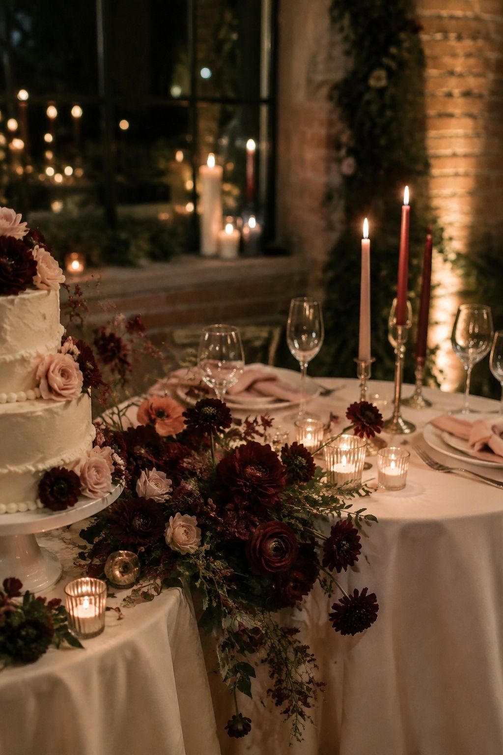
Berry, blush, and candlelight are ideal for couples who want softness without pastel spring energy. Berry tones bring richness, blush keeps the palette tender, and warm candlelight makes both colors feel more grown-up.
This palette sits beautifully on flowers, cake details, napkins, and velvet ribbon. For an intimate dinner, repeat the berry shade three or four times and let blush or cream handle the larger details.
Champagne, Taupe, And Winter White
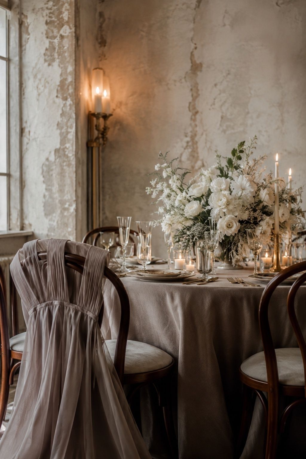
Champagne, taupe, and winter white create understated luxury, especially when the venue already has texture. This palette relies on fabric, florals, paper, and lighting more than obvious color contrast.
Place taupe on linens or bridesmaid dresses, champagne on metallic touches, and winter white in flowers. It is one of the most forgiving winter wedding palette ideas for couples who want a refined room that still feels warm in photos.
Sapphire, White, And Pewter
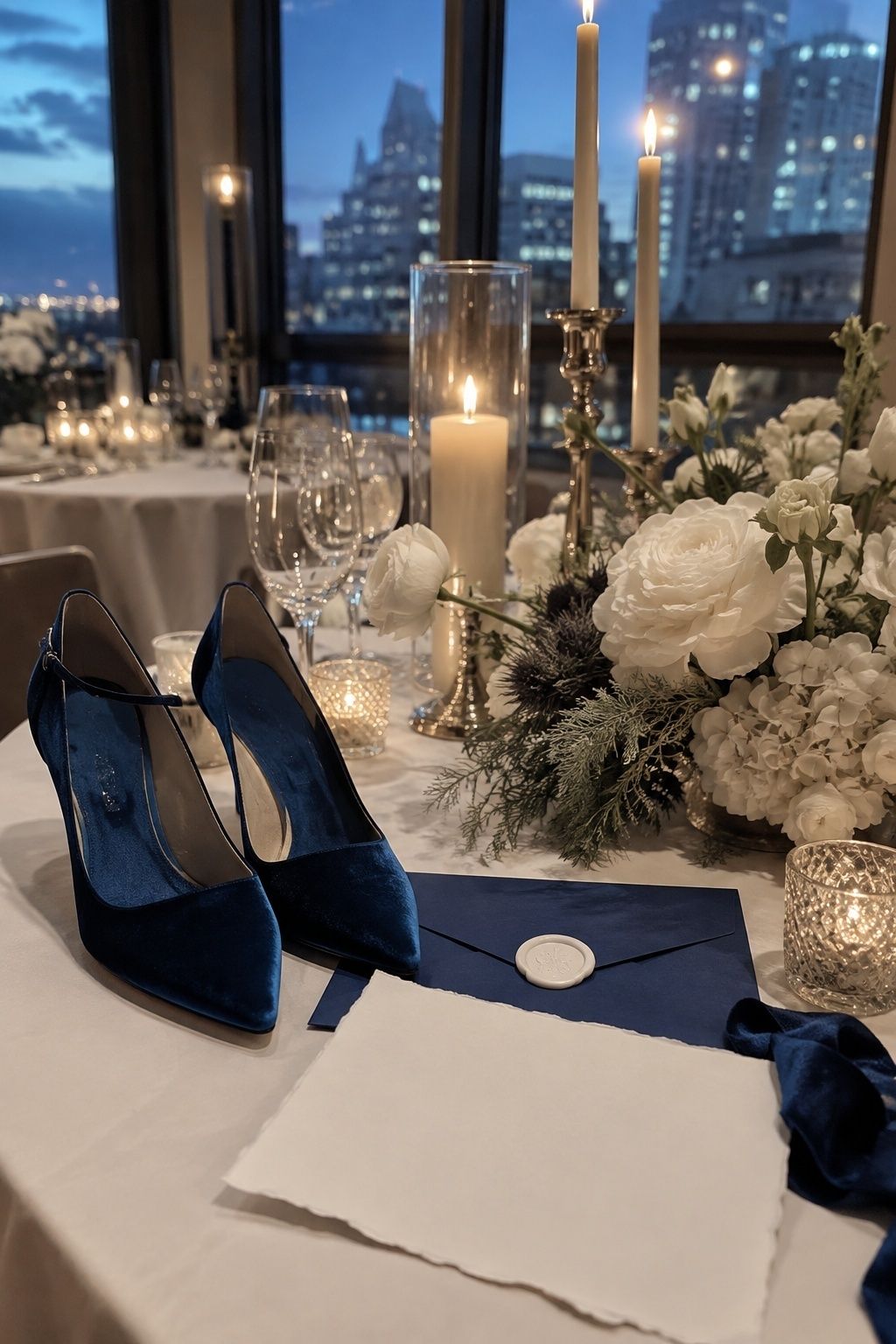
Sapphire, white, and pewter feel crisp, formal, and slightly unexpected. Sapphire has more brightness than navy, which lets it hold its color in evening photographs and on stationery.
Place sapphire on menus, envelopes, velvet shoes, bridesmaid dresses, or a signature drink detail. Pewter feels quieter than silver and pairs well with clear glass, white flowers, and candlelit tables.
Oxblood, Cream, And Walnut
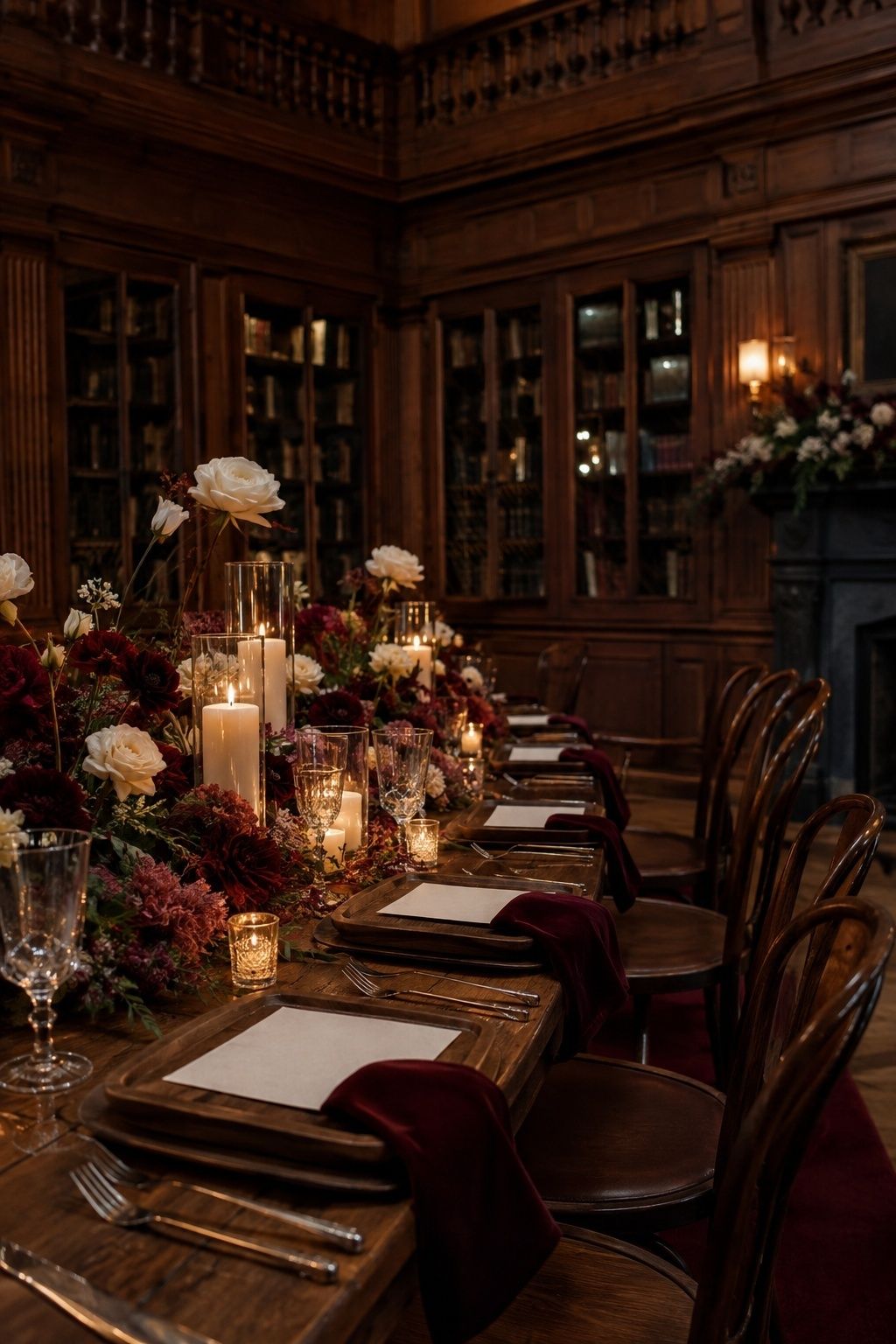
Oxblood, cream, and walnut are beautiful for intimate dinners, historic venues, and winter weddings with leather, wood, or library details. The brown undertone in oxblood makes it feel deeper and less holiday-coded than bright red.
Walnut comes through chairs, tables, trays, frames, or a bar. Cream flowers and paper keep the look bridal, while oxblood appears in velvet, florals, napkins, or a few dramatic candles.
All-Green With White Flowers
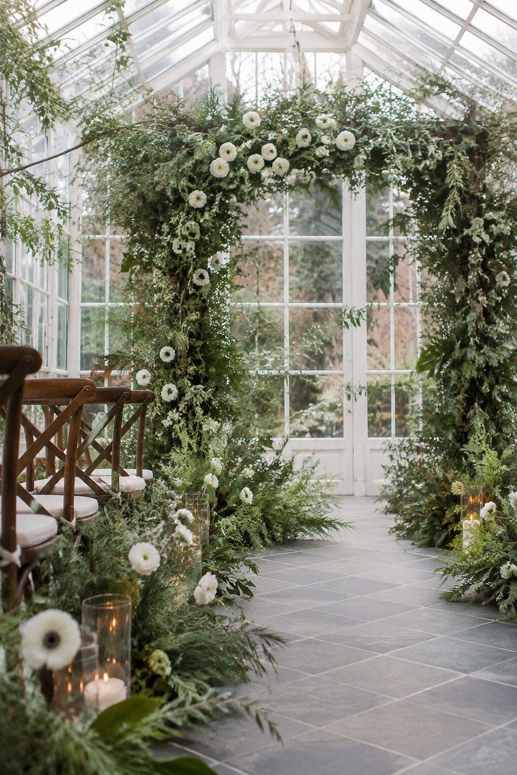
An all-green palette with white flowers feels natural and wedding-focused when the greens are varied. Mix pine, cedar, olive, eucalyptus, fern, smilax, or magnolia so the palette has movement instead of one flat shade.
White flowers are the anchor that separates this look from everyday greenery. Place them at eye level in bouquets, ceremony arrangements, centerpieces, or cake flowers, then let the greens carry the seasonal feeling.
Silver, Dove Grey, And Candlelight
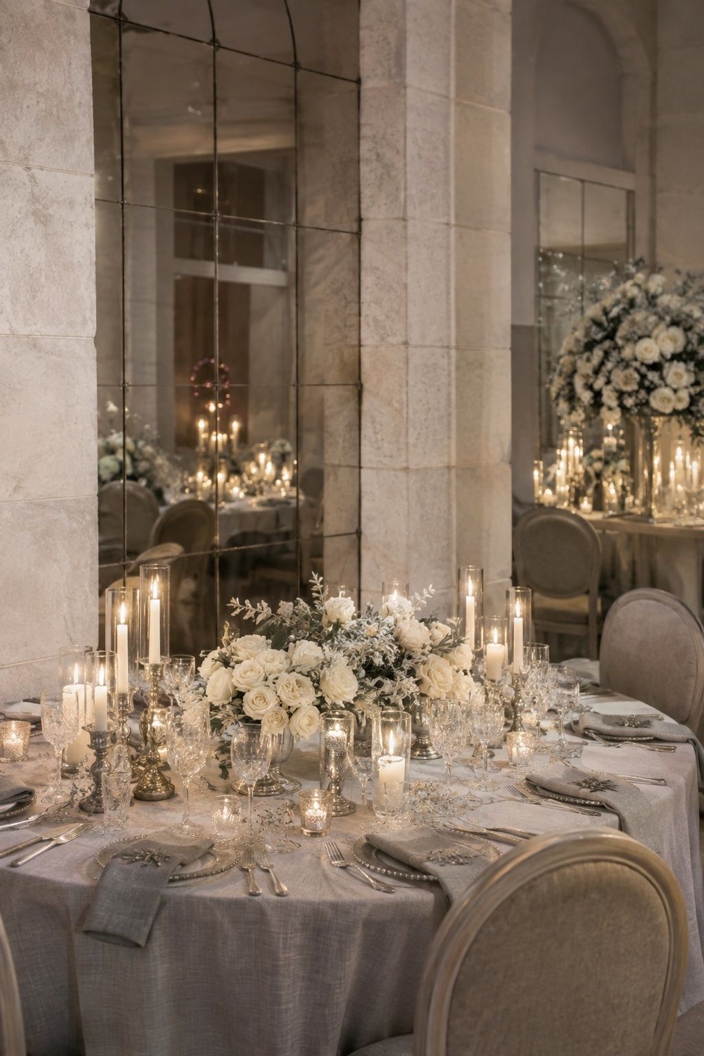
Silver, dove grey, and candlelight feel incredibly elegant with warmth somewhere in the room. Without candles, table lamps, creamy flowers, or warm food and drink details, grey turns cold quickly.
Choose this palette for venues with mirrors, pale stone, white walls, or clean architecture. Avoid blue-grey overload by adding ivory paper, pearl details, soft white flowers, or a few champagne accents.
A Palette Testing Checklist
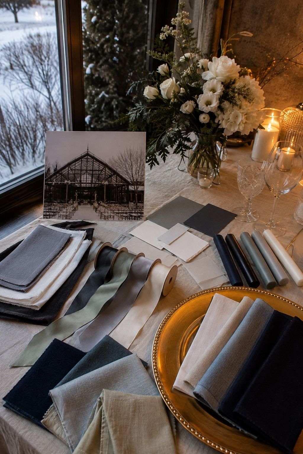
Before committing, place swatches, flowers, ribbon, paper, napkins, candle colors, charger plates, and glassware alongside venue photos. Look at them in winter daylight, then again under the kind of light guests will actually see at dinner.
Check the wall color, table finish, linen tone, candle temperature, bridesmaid fabric, flower availability, stationery ink, and photography style. A winter wedding color palette feels strongest when every shade has a role and every finish looks intentional in the same room.
FAQ
What are the best winter wedding color palettes?
The best winter wedding color palettes usually combine a grounding neutral, a seasonal accent, and a finish that looks good in low light. Ivory with evergreen and gold, navy with silver and white, burgundy with emerald and champagne, mocha with cream and brass, and champagne with taupe and winter white all look beautiful. The right choice starts with the venue walls, evening lighting, flowers, linens, and formality.
What winter wedding colors feel elegant without looking like Christmas?
Elegant winter wedding colors avoid looking like Christmas when red and green are softened, separated, or paired with non-holiday finishes. Try cranberry with rose and champagne, forest green with ivory and copper, burgundy with emerald and champagne, or all-green with white flowers. Keep novelty ornaments, bright red ribbons, and equal red-green blocking out of the design unless the couple actually wants a holiday mood.
What colors work best for a small winter wedding?
For a small winter wedding, colors that feel tactile and close-up usually suit the room best. Mocha, cream, and brass; winter white with soft greenery; champagne, taupe, and winter white; or berry, blush, and candlelight make one dinner table feel complete. Small celebrations thrive with fewer decor layers, so repeat the palette through napkins, menus, candles, flowers, glassware, ribbon, and one attire detail.
How do winter wedding colors look under candlelight?
Winter wedding colors often look warmer, deeper, and softer under candlelight, especially shades with brown, gold, cream, berry, plum, or champagne undertones. Very cool colors such as silver, dusty blue, dove grey, and true white look elegant with warm candles or soft lamps in the room. Always test fabric, paper, flowers, and candles together after sunset before final ordering.
What winter wedding colors work with greenery and white flowers?
Greenery and white flowers pair well with ivory, warm gold, champagne, taupe, copper, navy, charcoal, forest green, sage, and soft silver. The key is choosing greenery that fits the mood: pine and cedar feel wintry, olive feels softer, eucalyptus feels airy, and magnolia feels polished. White flowers keep mixed greens bridal, especially when the rest of the palette is restrained or mostly neutral.
How do you choose a winter wedding color palette for your venue?
Choose a winter wedding color palette by starting with the venue instead of the swatches. Notice the walls, floors, wood tones, metals, windows, and lighting temperature, then pick colors that feel native to that room. Add flowers that are realistically available, choose linens and paper that photograph well after sunset, and test everything under candlelight before buying large quantities.
Final Thoughts
The most beautiful winter wedding color palette is not the one with the rarest shade names. It is the one that makes the room feel more itself: candlelight catching glass, velvet deepening against flowers, ivory softening the table, greenery bringing the season indoors, and one accent color giving guests a feeling they remember after the night is over.
Choose the final colors only after fabric, flowers, paper, and candles have been viewed in the actual room, with enough warmth for candlelit winter palettes and reception lighting that flatters the room.
Last update on 2026-10-03 / Affiliate links / Images from Amazon Product Advertising API