

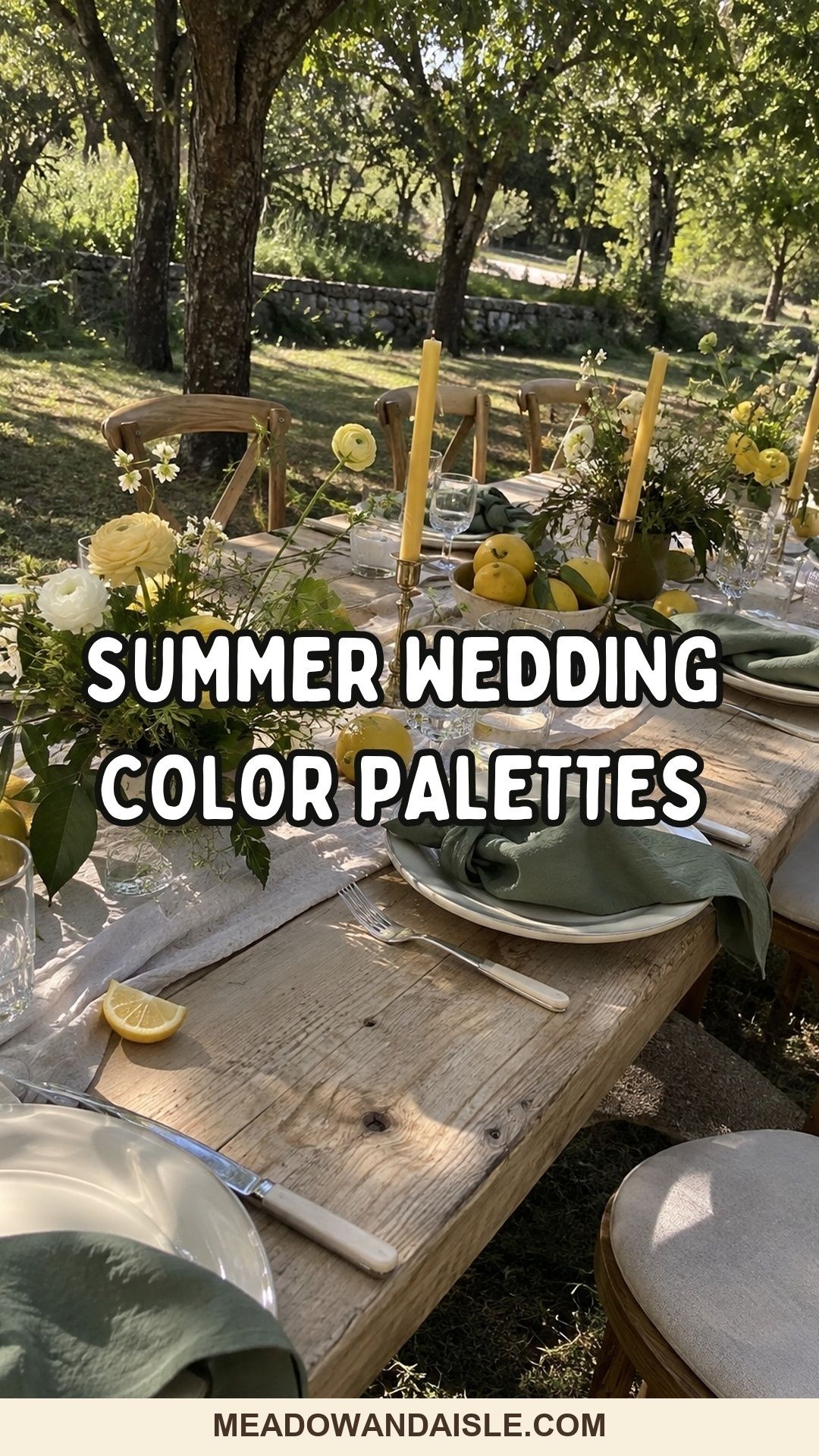
A good summer wedding color palette uses two anchor colors, one soft neutral and one small accent, split roughly 60/30/10 across linens, flowers and details. Sage with ivory, peach with cream, sky blue with coral and olive with plum all photograph cleanly in noon light and still read well after sunset.
Most summer palettes fail in the same place: the swatch looked lovely on a screen, then the real sun hit it at 2pm and the blush went grey, the mint went clinical and the navy turned into a black hole in photos. A summer wedding color palette has to work in two very different lights, hard daylight for the ceremony and warm, low light for dinner.
At a small wedding the stakes are oddly higher. With 20 or 30 guests, everyone sits close enough to see the napkin fabric, the ribbon on the bouquet and the color of the candle wax. There’s nowhere for a muddy shade to hide.
Below are 15 combinations grouped by the kind of venue and mood they suit, plus the split I use to decide how much of each color goes where, and a quick way to test everything before you order.
A few things that make summer color easier
These are the pieces I’d buy early, because they let you test colors in your actual light instead of guessing.
![Utopia Kitchen Cotton Blend Multi Color Cloth Napkins [12 Pack, 18x18 Inch]](https://meadowandaisle.com/wp-content/plugins/aawp/public/image.php?url=YUhSMGNITTZMeTl0TG0xbFpHbGhMV0Z0WVhwdmJpNWpiMjB2YVcxaFoyVnpMMGt2TlRGRVFVaHhNRnB4U1V3dVgxTk1NVFl3WHk1cWNHYz18MTc5MTIyNDIzMw=)


How do you build a summer wedding color palette?
Start with the venue, then pick two anchor colors, one neutral and one accent. That’s four colors, and four is plenty for an intimate wedding.
My rule is a rough 60/30/10 split. About 60% of what guests see is your neutral (linens, paper, plates). About 30% is your two anchors, usually carried by flowers and attire. The last 10% is the accent, and it should show up in small, repeatable things like candles, ribbon, cocktails or fruit.
Summer adds two complications. Bright sun washes out very pale shades and makes saturated ones louder than they looked indoors. Then the evening light warms everything, so cool blues and greys lose some punch while peach and gold glow. Pick colors that sit in the middle: slightly greyed greens, warm whites, blues with a touch of softness.
If you are planning across seasons or still deciding on a date, compare this against the spring wedding color palette guide and the fall wedding color palette ideas. The shift in light between May and September changes which shades behave.
Soft garden palettes for daytime ceremonies
Garden and backyard weddings suit greens with a gentle second color, because the setting already supplies a lot of green and you want to work with it.
Sage green and ivory
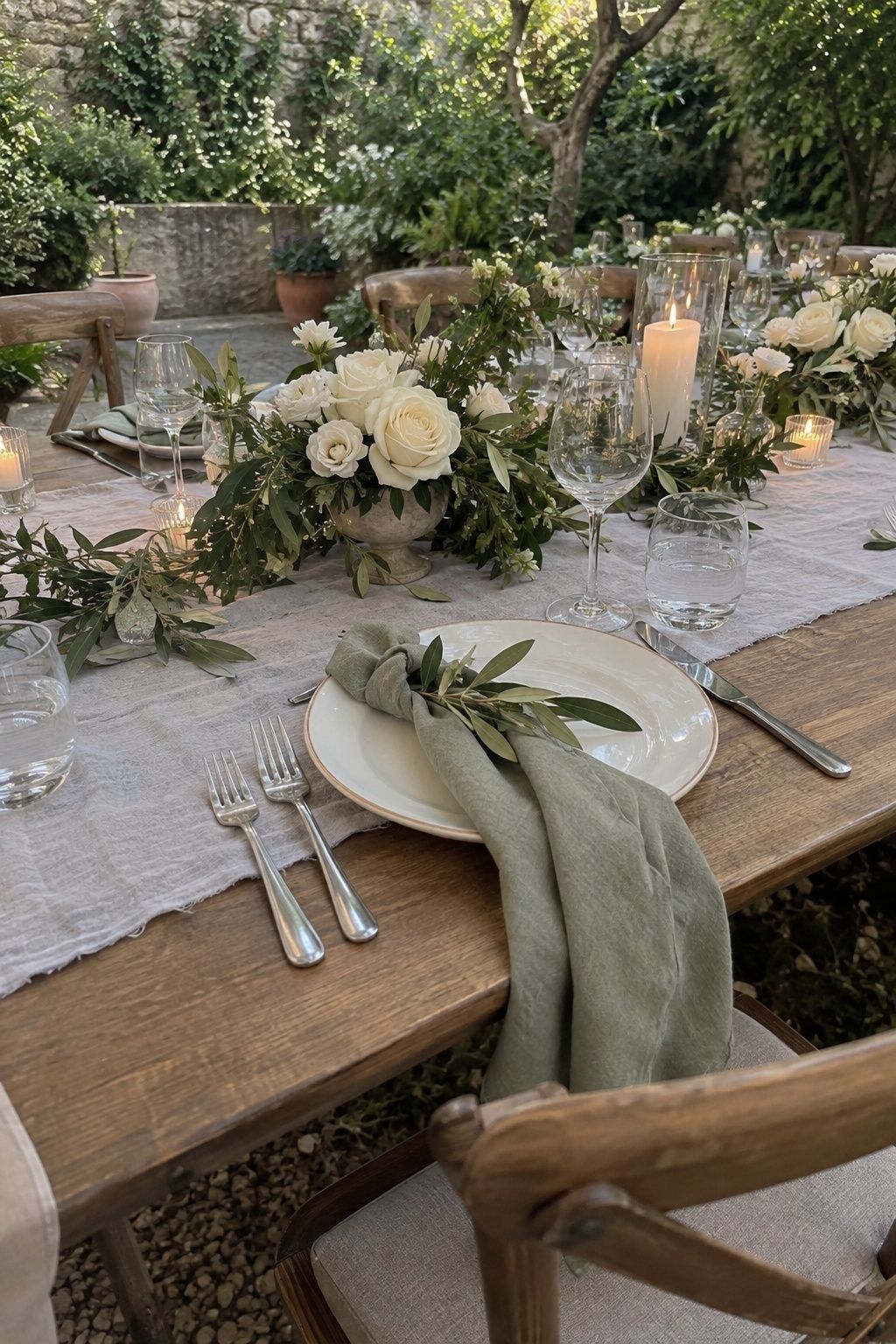
Sage is the easiest summer color to live with because it acts like a neutral. Keep it greyed rather than minty, especially under strong sun. Put sage on napkins, ribbon or bridesmaid dresses and let ivory flowers and pale linen keep things fresh. Herbs, olive branches and matte ceramics add texture so the look doesn’t go flat. Zola’s roundup of green and neutral wedding palettes is a good place to compare greens side by side.
Berry, blush and fresh green
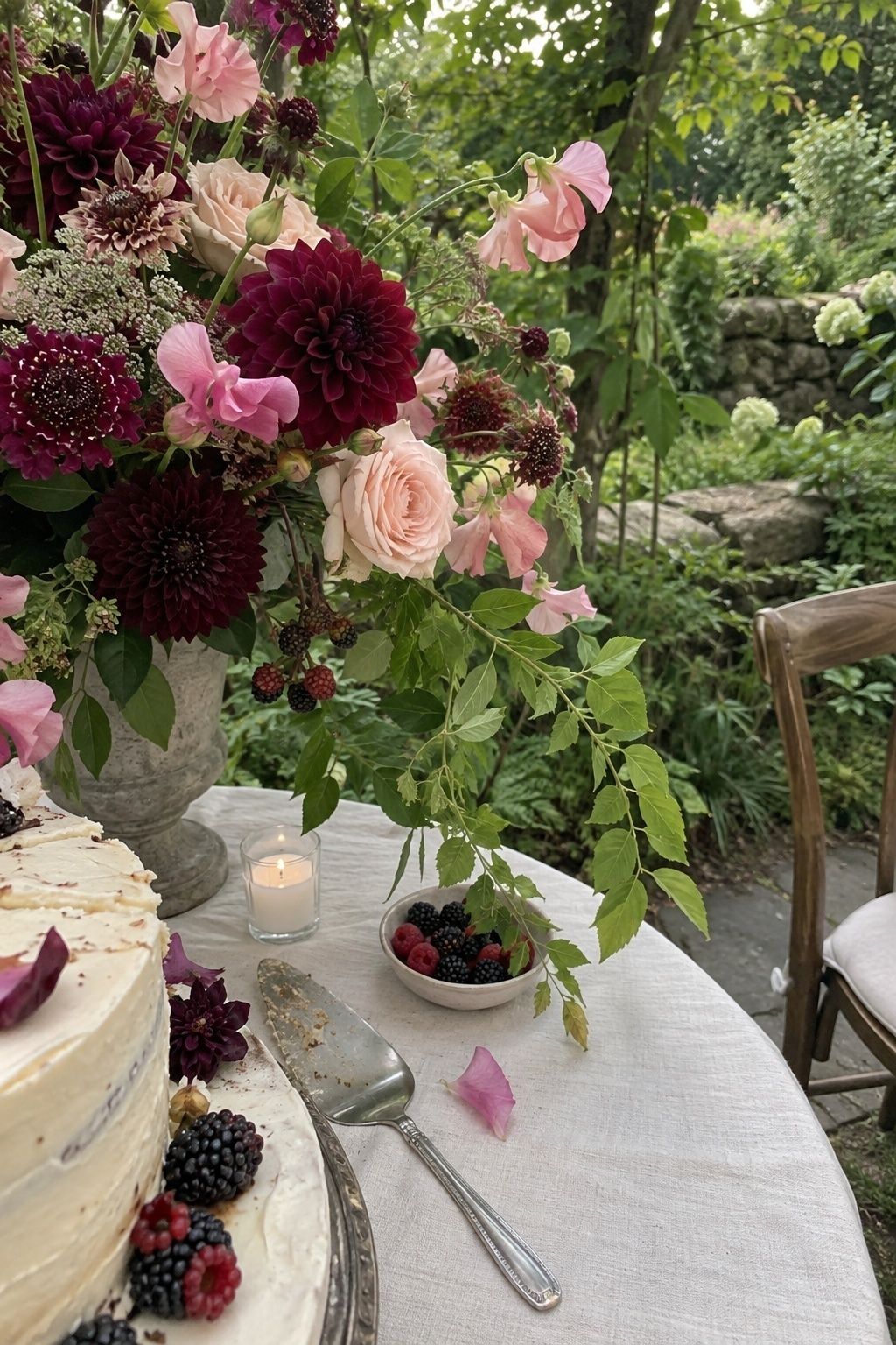
This one echoes what is already growing: raspberries, strawberries, garden roses, dahlias, sweet peas. Use blush as the bridge between deep berry and green leaves, or the whole thing tips into sugary. It’s a good palette for a small reception, since one long table looks abundant with only three or four arrangements.
Butter yellow and garden green
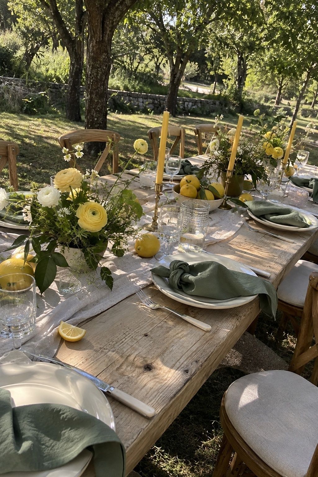
Yellow gets childish fast when it’s everywhere. Soften it with garden green and warm white, then let it show up in ranunculus, lemons, taper candles or a menu border. The green gives the yellow somewhere to rest. I’d use this for a brunch wedding or an orchard lunch.
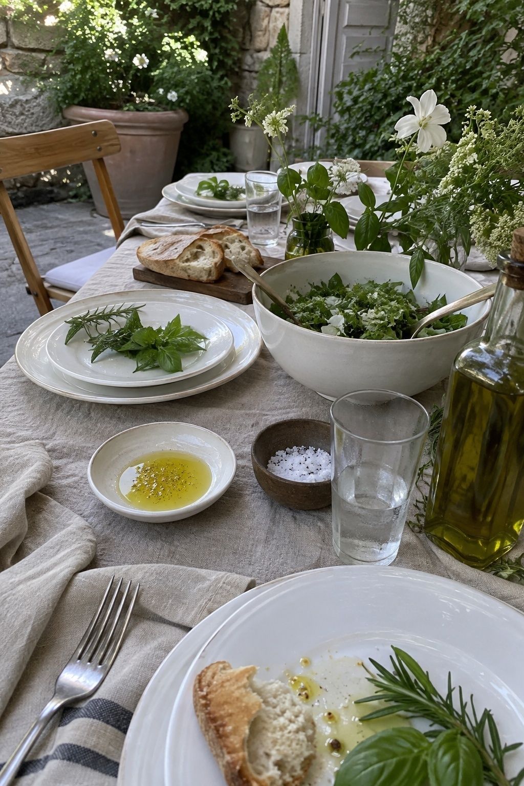
White, natural linen and fresh herbs
A neutral palette works in summer only if the texture is strong. Think woven runners, linen menus, basil and rosemary sprigs on each plate, wood chairs, ceramics and loose white flowers. Layer two or three whites and plenty of real greenery so it reads as a choice, not as an unfinished table. If you like this direction, the simple summer wedding decor ideas post goes deeper into keeping a table pared back.
Palettes for coastal, lake and poolside weddings
Near water, blues and sea greens look natural because they repeat what guests are already looking at. The trick is adding one warm color so the photos don’t feel cold.
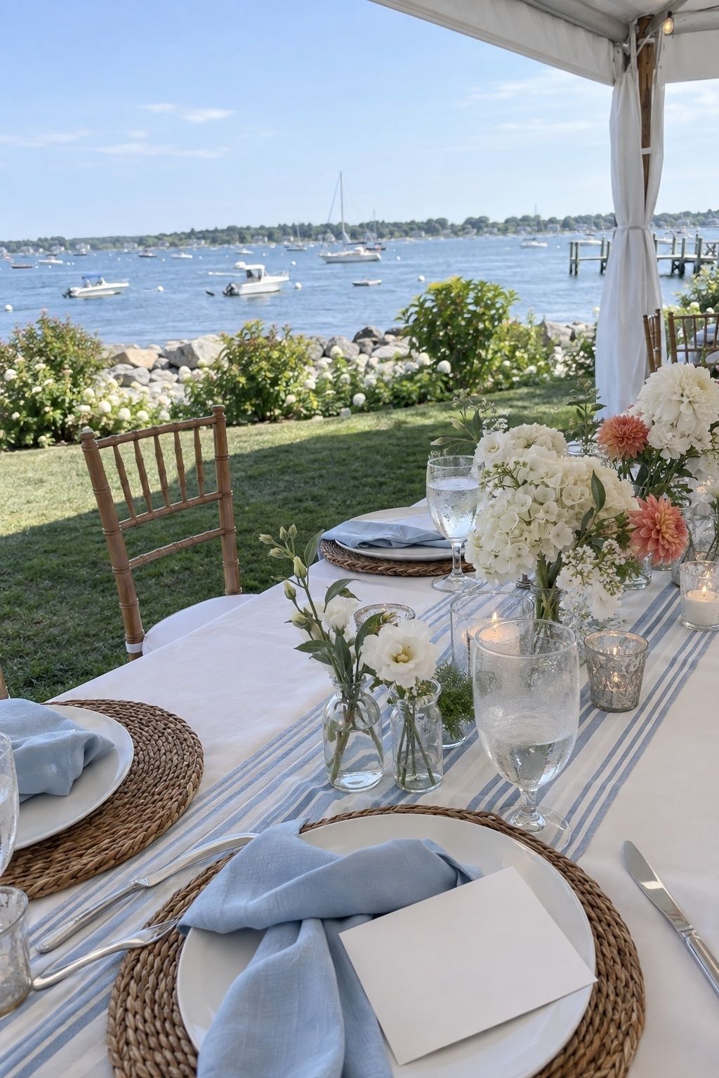
Sky blue, white and soft coral
Sky blue stays crisp in hard light, white keeps it fresh and coral adds warmth for skin tones. It gives you coastal energy without the formality of navy. Try blue envelopes, a striped runner, white flowers with a few coral blooms and pale blue bridesmaid fabric.
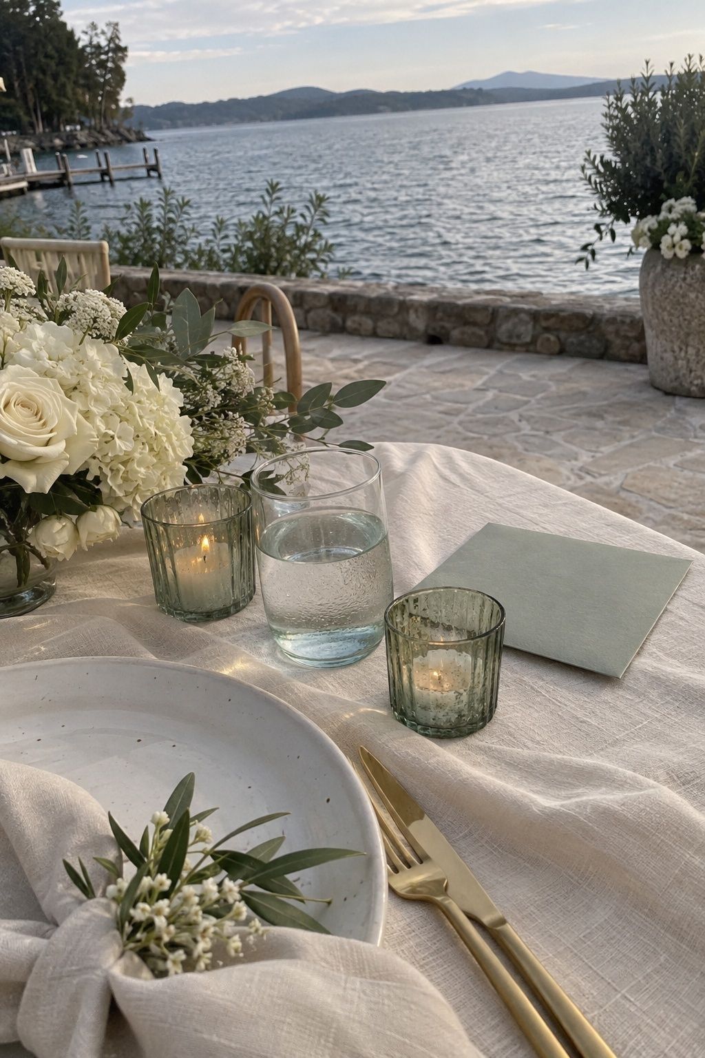
Sea green, champagne and cream
Sea green is cooler and softer than sage, so it suits a quiet lakeside or beach ceremony. Champagne brings warmth, cream keeps everything gentle against sand and driftwood. Sea glass votives, champagne flatware and a cream table cover most of the decor on their own.
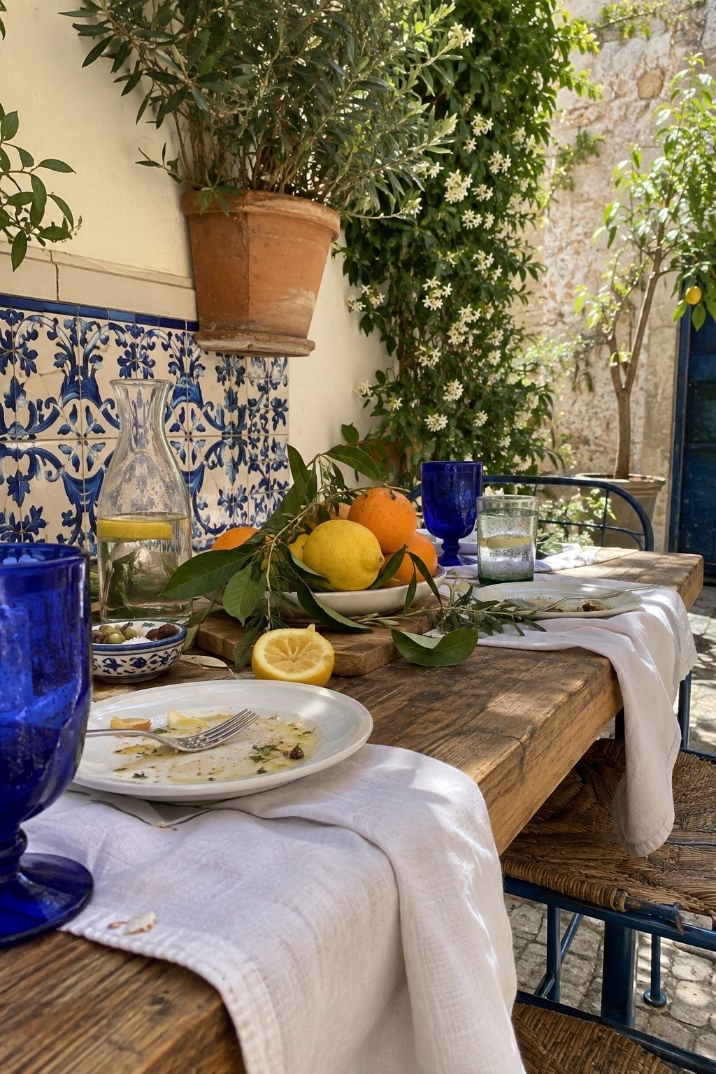
Cobalt, white and citrus
Cobalt is the confident option. It looks best against white plates, white linen or whitewashed walls, with lemons and oranges as the seasonal accent. Because cobalt is strong, repeat it in three or four places only: glassware, a bar sign, invitation envelopes, maybe tile-print napkins.
Warm palettes for golden hour
If your ceremony is timed for the last two hours of daylight, warm colors are your friend. Peach, terracotta and honey look better at 7pm than at any other point in the day.
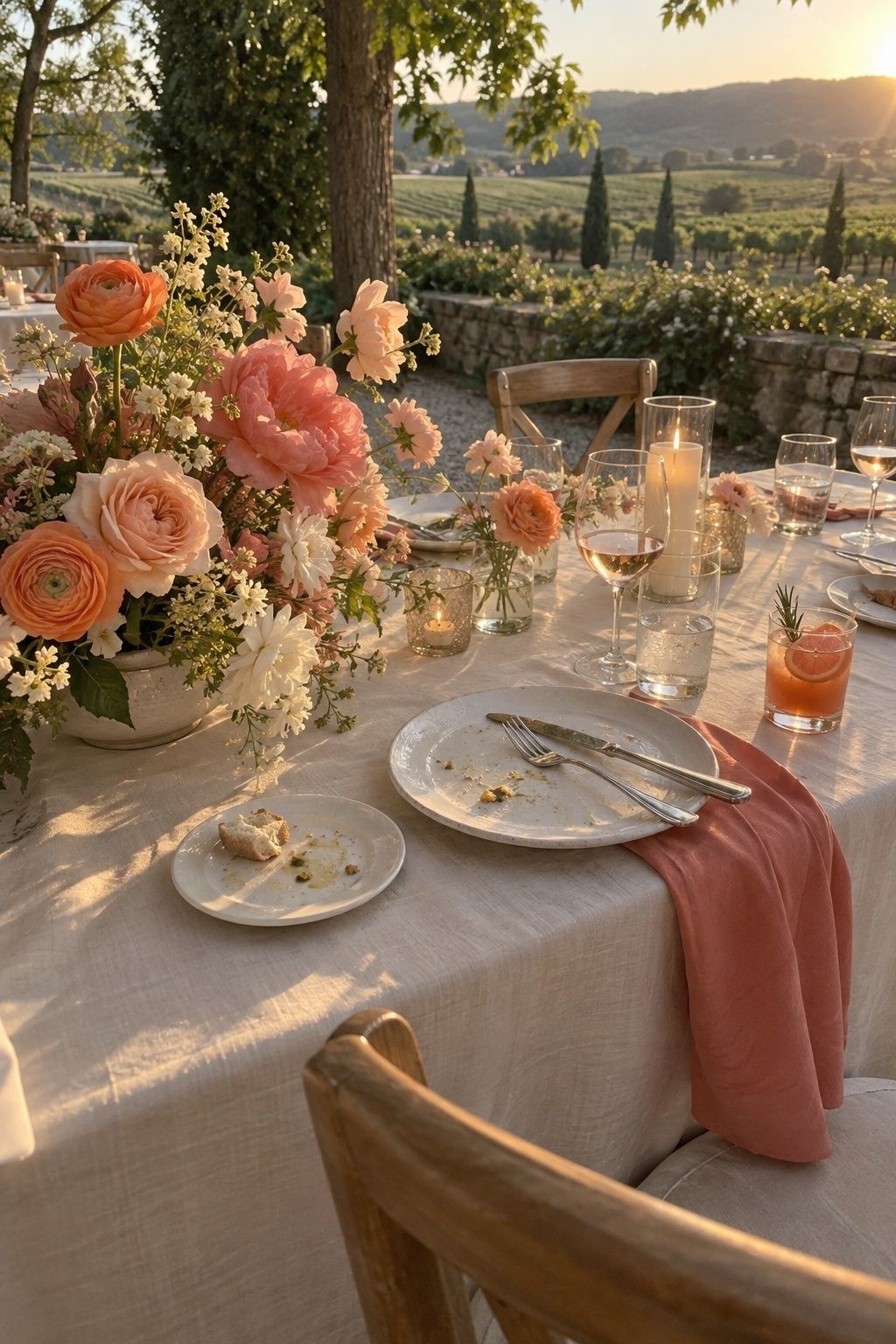
Peach, coral and cream
Peach roses, coral charm peonies, apricot ranunculus, cream linens and pale wood make a soft glow without turning fully orange. Treat coral as the accent. Put it on the flowers, the bar menu or a signature drink, and let cream do the rest.
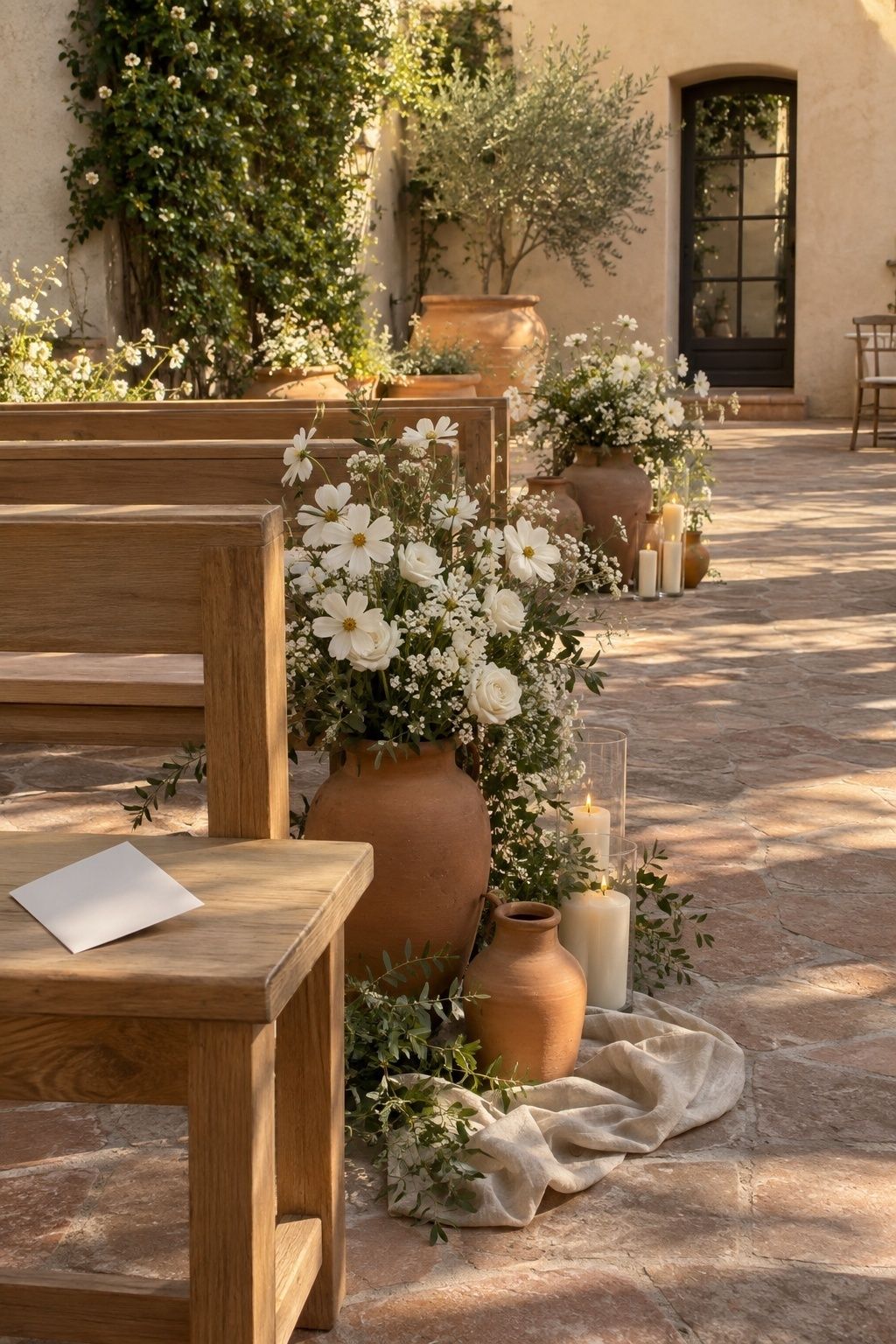
Terracotta, sand and white
This palette belongs at venues with clay, stucco, stone or dry grasses. White is what stops it looking dusty. Bring terracotta in through candles, small ceramic bud vases and ribbon, and keep linens sand toned.
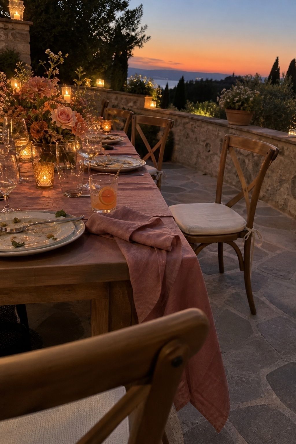
Sunset orange, rose and honey
Warm enough for an evening reception without sliding into autumn. Keep the orange clear and limited: a few flowers, a cocktail garnish, taper candles. Rose and honey soften it, and cream or pale wood keeps it graceful in photos.
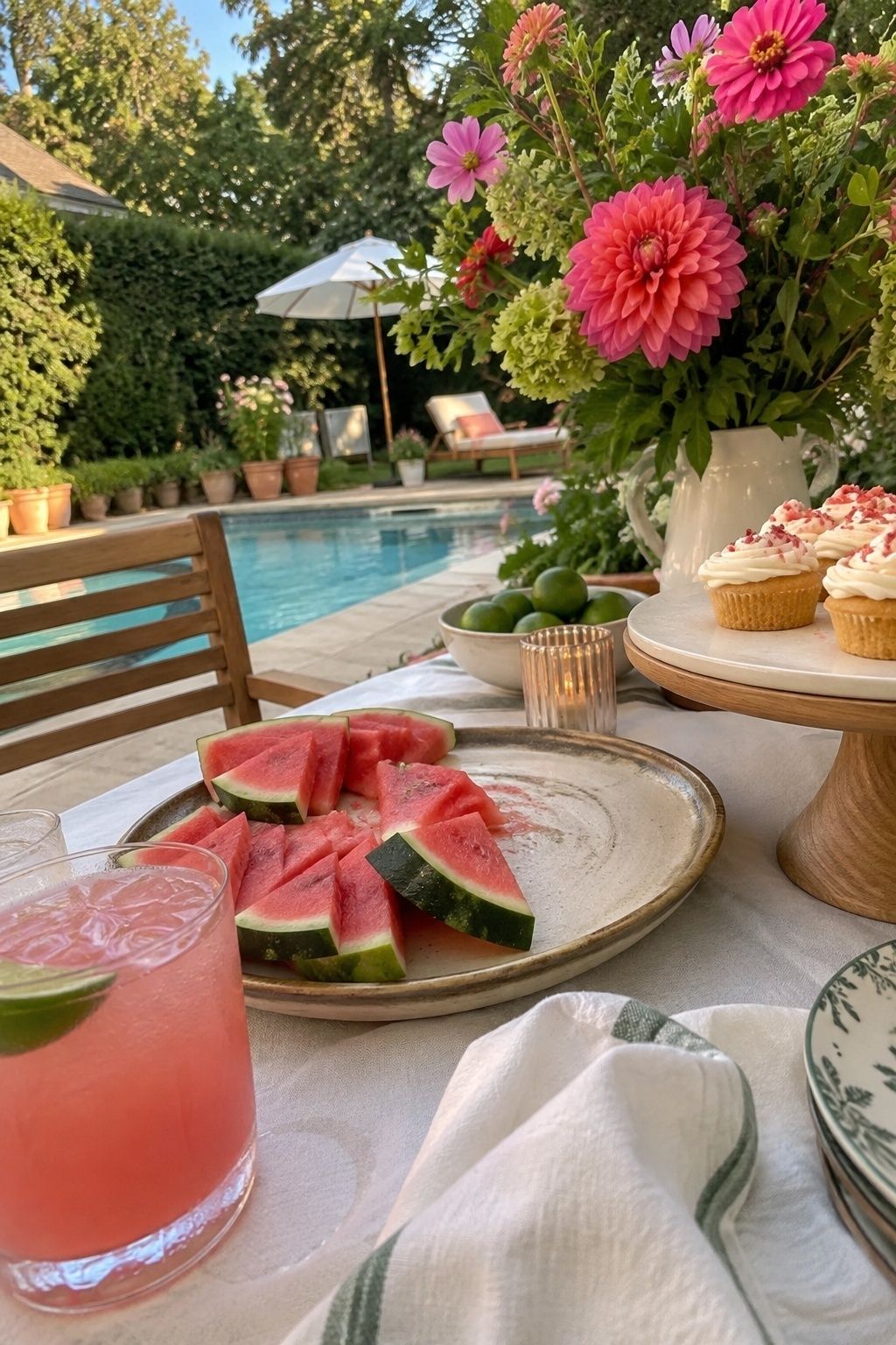
Watermelon pink and leaf green
Fun, but only with restraint. Let the pink live in florals, drinks, fruit and napkins, and anchor it with white and natural wood. It suits restaurant patios and backyard dinners where nobody expects formality. For more bright high-summer combinations, the tropical wedding color palette ideas push this further.
Deeper palettes for late summer and evening receptions
From mid-August on, a moodier palette starts to make sense, especially for dinners that run past sunset. Use fresh greenery and lots of candlelight so it still feels like summer.
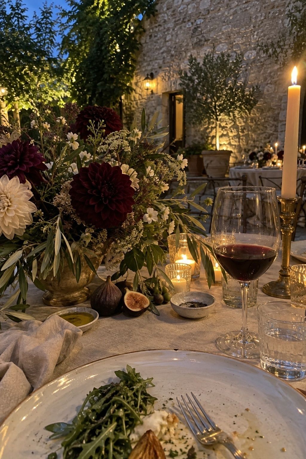
Plum, olive and antique gold
Rooted and romantic, especially at venues with stone, vines or shaded greenery. Use plum sparingly in dahlias, figs and ribbon, let olive carry the linens or foliage, and add antique gold in candleholders or flatware. The August wedding tablescape ideas show how dahlias and fruit carry this kind of palette on a table.
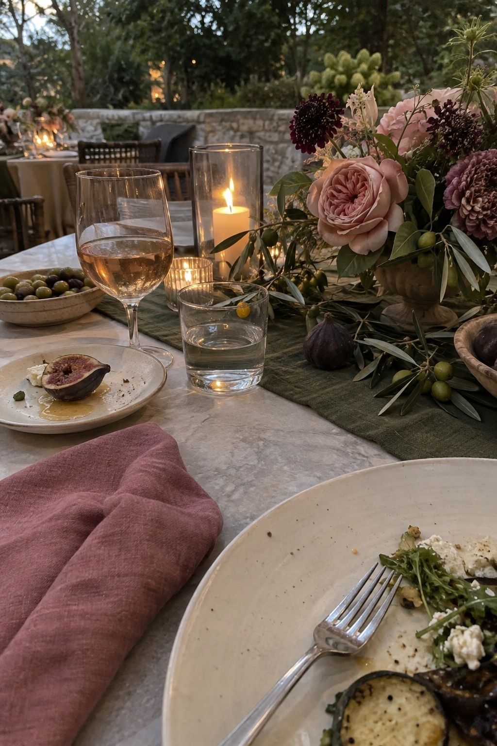
Dusty rose, fig and olive
Dusty rose softens the fig tones. Olive grounds everything. Cream plates and clear glass keep the dinner from going too dark. This one is strong for wine bars and restaurant buyouts. If you love the fig side of it, there is a whole post on the fig wedding color palette.
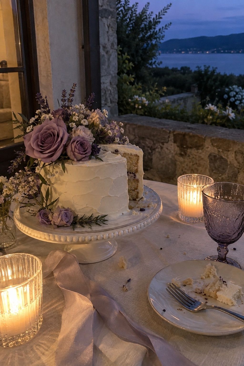
Lavender, mauve and pearl
Lavender gets prettier as the light drops. Choose greyed lavender over candy purple for an outdoor ceremony. Mauve adds warmth for skin tones and pearl or cream stops the palette turning too cool in evening photos.
Is the opalescent trend worth it for summer?
Yes, in small doses. Opalescent pastels with chrome accents photograph well in sunlight because they catch it, but a full metallic theme fights with the flowers.

Keep the shimmer to things guests hold or look at closely: a chrome-edged menu, iridescent table numbers, pearly nails, a reflective clutch, glassware with a faint sheen. Pale pink, blue, lavender and pearl all work as the base. One or two shiny details per table is enough.
How much of each color do you need for 20 vs 50 guests?
Fewer than you think. At a small wedding, color repeats in close-up details, so you need fewer large pieces and more small ones. Here’s how the 60/30/10 split translates into actual items, assuming tables of eight.
| Item | 20 guests (3 tables) | 50 guests (7 tables) | Which color |
|---|---|---|---|
| Table linens | 3 cloths or runners | 7 cloths or runners | Neutral |
| Napkins | 24 (20 plus spares) | 56 | Anchor or neutral |
| Centerpieces | 3 low arrangements | 7 low arrangements | Both anchors |
| Taper or pillar candles | 12 to 18 | 28 to 42 | Accent |
| Bud vases | 6 to 9 | 14 to 21 | Anchor |
| Menus or place cards | 20 | 50 | Neutral with accent ink |
The math is simple: four to six candles and two or three bud vases per table, one napkin per guest plus 10% spare. The accent color should hit every table at least twice so it reads as part of the plan.
Test the palette before you order anything
Lay your fabric swatches, paper samples, ribbon and a few real flowers together and look at them outside at the time of day your ceremony starts. Then look again under warm indoor light, or with candles, around the time dinner will be served.
- Gather one physical sample of every color (fabric, paper, ribbon, a flower).
- Photograph them outdoors in direct sun with your phone.
- Photograph them again in the evening under warm light.
- Check skin tones by holding the swatches near your face in both photos.
- Drop any shade that looks muddy, grey or neon in either shot. David’s Bridal has a useful explainer on muted versus bold summer colors in photos if you are torn.
Then give each color a job. One anchors the flowers, one anchors linens or stationery, the accent goes into candles, fruit or glassware. If a color has no job, cut it. For the bigger picture of planning a warm-weather wedding with a small guest list, the intimate summer wedding ideas post covers timing, shade and food.
Key takeaways
- Build four colors: two anchors, one neutral, one small accent.
- Split them roughly 60% neutral, 30% anchors, 10% accent.
- Greyed greens, warm whites and soft blues survive harsh midday sun best.
- Warm shades like peach, terracotta and honey look best at golden hour.
- At 20 to 50 guests, color lives in napkins, candles, bud vases and paper.
- Test every sample in both noon light and evening light before ordering.
FAQ
What is a good summer wedding color palette?
A good summer wedding color palette has two anchor colors, one neutral and one small accent. Sage with ivory, peach with cream, sky blue with coral and sea green with champagne all hold up in bright daylight and still look warm after sunset.
What summer wedding colors are trending in 2026?
Sage green, olive, terracotta, plum, blush, champagne and opalescent pastels with small chrome accents are the shades showing up most for 2026 summer weddings. The common thread is colors pulled from nature, with a little shine added in small details.
What colors look best in summer wedding photos?
Mid-tone colors photograph best in summer light. Very pale pastels can wash out at noon and very dark shades lose detail, so slightly greyed greens, warm whites, peach, coral and soft blues are the safest picks for outdoor photos.
How many colors should a small summer wedding have?
Three or four colors is the right number for a small summer wedding. Use two anchors, one neutral and an accent; more than that tends to look busy when guests are seated close to every detail.
What colors should you avoid for an outdoor summer wedding?
Avoid very pale icy pastels, pure neon and large areas of black or navy for an outdoor summer wedding. The pastels disappear in strong sun, neon looks harsher than expected, and dark colors absorb heat and turn flat in photos.
The short version
Pick the color your venue already suggests, add one softer companion and a neutral, then let a small accent show up on every table. Test it in noon light and candlelight. A summer wedding color palette that passes both tests will look right in person and in the photos you keep.
Last update on 2026-10-03 / Affiliate links / Images from Amazon Product Advertising API