
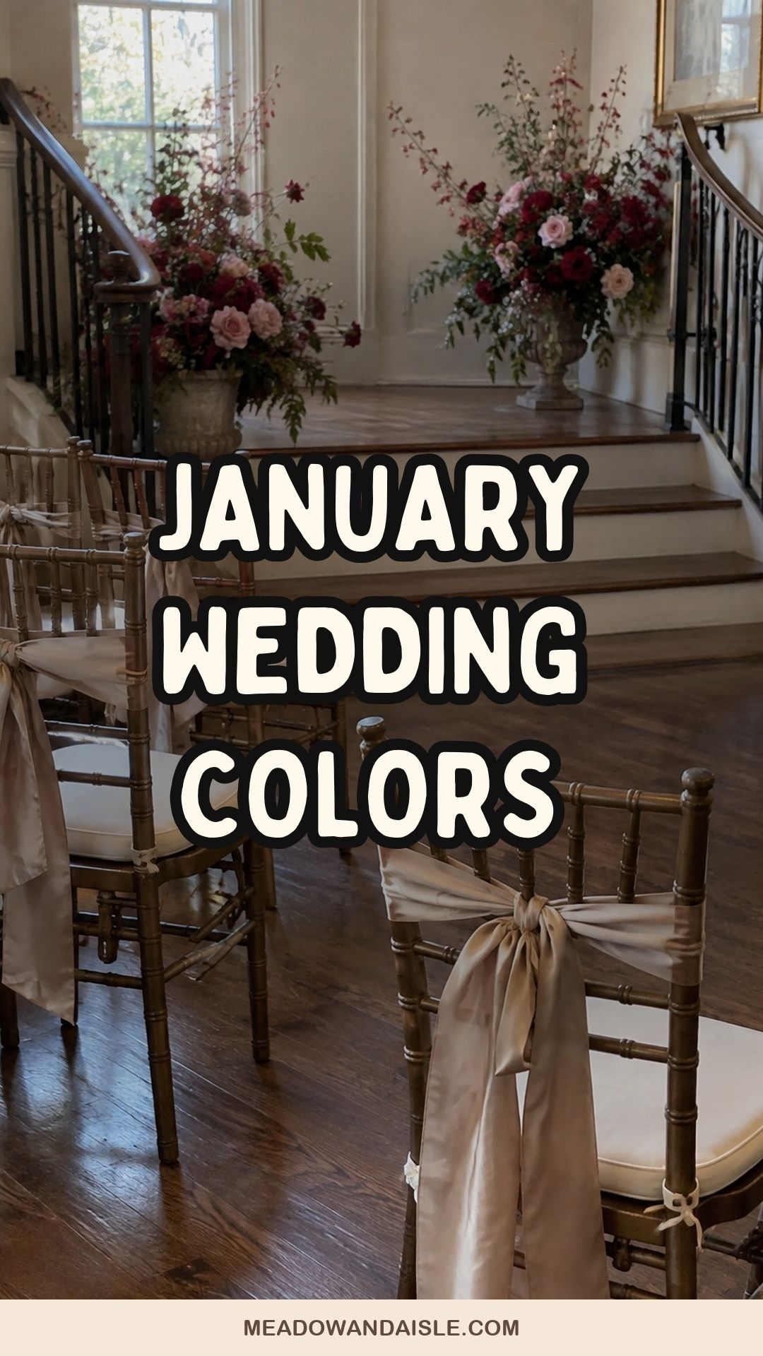
The best January wedding colors pair one warm light base (ivory, cream or champagne) with one winter tone such as navy, emerald, burgundy, plum or icy blue, plus a metallic that catches candlelight. Pick lighter palettes for brunch and daytime, deeper ones for anything after 4 p.m., when January daylight is mostly gone.
Most January palettes fail for one boring reason: they get chosen on a phone screen in bright daylight and then live in a room lit by candles at 5 p.m. Pale colors go gray. Dark colors go black. Silver that looked crisp on Pinterest just looks cold.
So pick your January wedding colors for the room you will actually be in. Think about how much daylight you get (in much of the northern hemisphere, sunset lands between roughly 4:30 and 5:30 p.m. in January), whether you are indoors, and how close guests sit to the details. At a 20-person dinner, people are two feet from the napkins. That changes everything.
A few things worth having on hand


![Utopia Home [24 Pack, Hunter Green] Cloth Napkins 17x17 in, 100% Polyester](https://meadowandaisle.com/wp-content/plugins/aawp/public/image.php?url=YUhSMGNITTZMeTl0TG0xbFpHbGhMV0Z0WVhwdmJpNWpiMjB2YVcxaFoyVnpMMGt2TkRGMUswaElMVFl3T1V3dVgxTk1NVFl3WHk1cWNHYz18MTc5MTM0MTk1Ng=)

How do you choose January wedding colors?
Start with the venue’s light and walls, then pick one base, one winter color and one metallic. Three colors is plenty for a small wedding. Five starts to look like a paint store.
Here is the order I’d work in:
- Stand in the venue at your ceremony time, or look at photos taken then. Note the wall color, floor, wood tones and how dark it gets.
- Choose a base for the big surfaces: linens, flowers, paper. Ivory, cream, bone, oatmeal or pearl.
- Choose one winter color with real depth. This is the color guests will remember.
- Choose one metallic for candle holders, flatware or type: silver, pewter, champagne or antique gold.
- Test the combination at night. Hold a napkin swatch next to a lit candle. If it disappears, go a shade deeper.
If you want more inspiration across the whole season, my winter wedding color palette guide covers December through February together.
Soft and snowy palettes for daytime January weddings
Light palettes are the safest choice for morning ceremonies, brunch receptions and rooms with big windows. They need texture, though, or they look washed out in flat winter light.
Ivory, champagne and soft evergreen
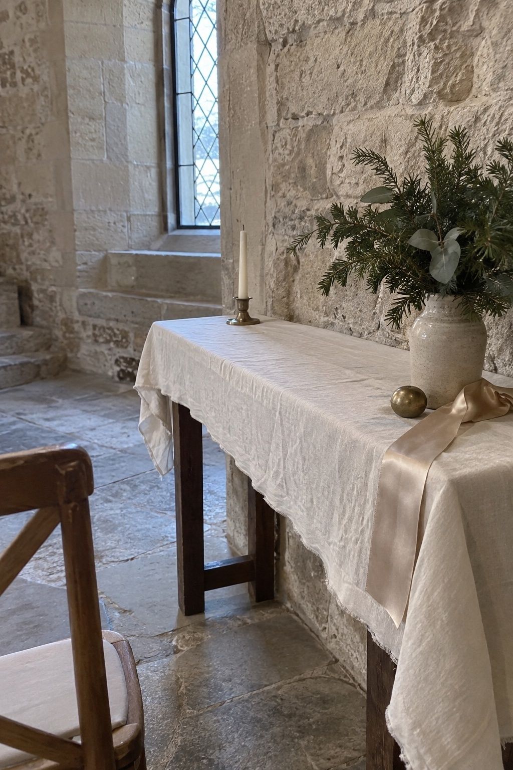
This is the most forgiving January palette. Ivory covers the large surfaces, champagne picks up candlelight and evergreen adds winter structure without a single ornament. For a small wedding, keep the greenery edited: a few branches near the ceremony, champagne tapers at dinner, cream flowers on the table. You get a seasonal look that still reads as a wedding, not a holiday party.
Sage, taupe and cream
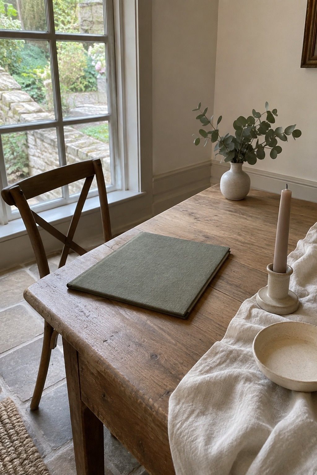
For a calm room rather than a dramatic one. Sage gives the palette a little life, taupe softens it and cream keeps it fresh. At intimate scale, one sage napkin per place, a taupe taper, cream flowers and a stem of eucalyptus can carry an entire table.
Champagne, honey and cream

This gives you glow without going dark. Honey is a golden winter note that looks lovely at brunch or in a restaurant, and you can repeat it through amber candles, a honey-toned cake detail or a cocktail.
Lavender gray, white and silver
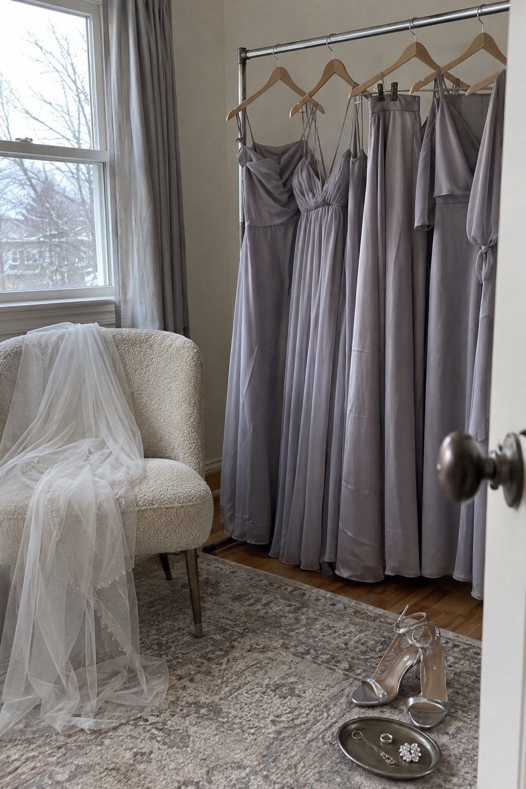
A softer take on winter shimmer. The risk is that pale colors vanish in dim rooms, so add texture through velvet ribbon, pearls, frosted glass or layered linens. Use the lavender gray in dresses, paper or one floral accent.
Blue January wedding colors that don’t look icy
Blue is the most January color there is, and it only turns cold when it is paired with nothing but bright white. Add a warm neutral or candlelight and it behaves.
Icy blue, pearl and candlelit silver

Icy blue carries the winter mood, pearl keeps it romantic and silver adds reflection. Put the blue in bridesmaid dresses, ribbon, glassware or a pale cake detail, then let cream flowers and candles keep it luminous.
Navy, silver and winter white

Navy holds its own after sunset, which is exactly what January needs. It works in chapels, city halls, museums, hotels and restaurants. Keep the flowers mostly white and repeat navy through paper, attire, napkins or velvet ribbon.
Dusty blue, cocoa and white

Cocoa is the secret here. It gives dusty blue dimension and makes portraits softer, especially in venues with wood, stone or dim lighting.
Midnight blue, plum and pearl
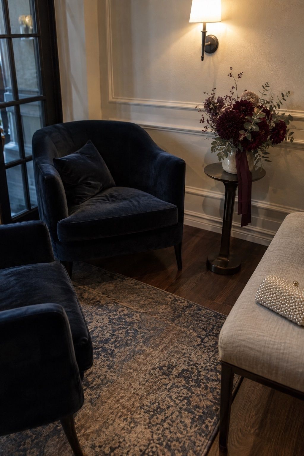
Depth without defaulting to black. Midnight blue reads formal, plum adds romance and pearl is the relief near faces, bouquets and the table. In a small room, keep the dark tones as anchors rather than covering every surface.
Deep, candlelit palettes for evening receptions
Once you are past 4 p.m., deeper colors look richer in candlelight than pastels do. The trick is to keep one light tone in the mix so photos don’t turn into shadows.
Emerald, black and cream
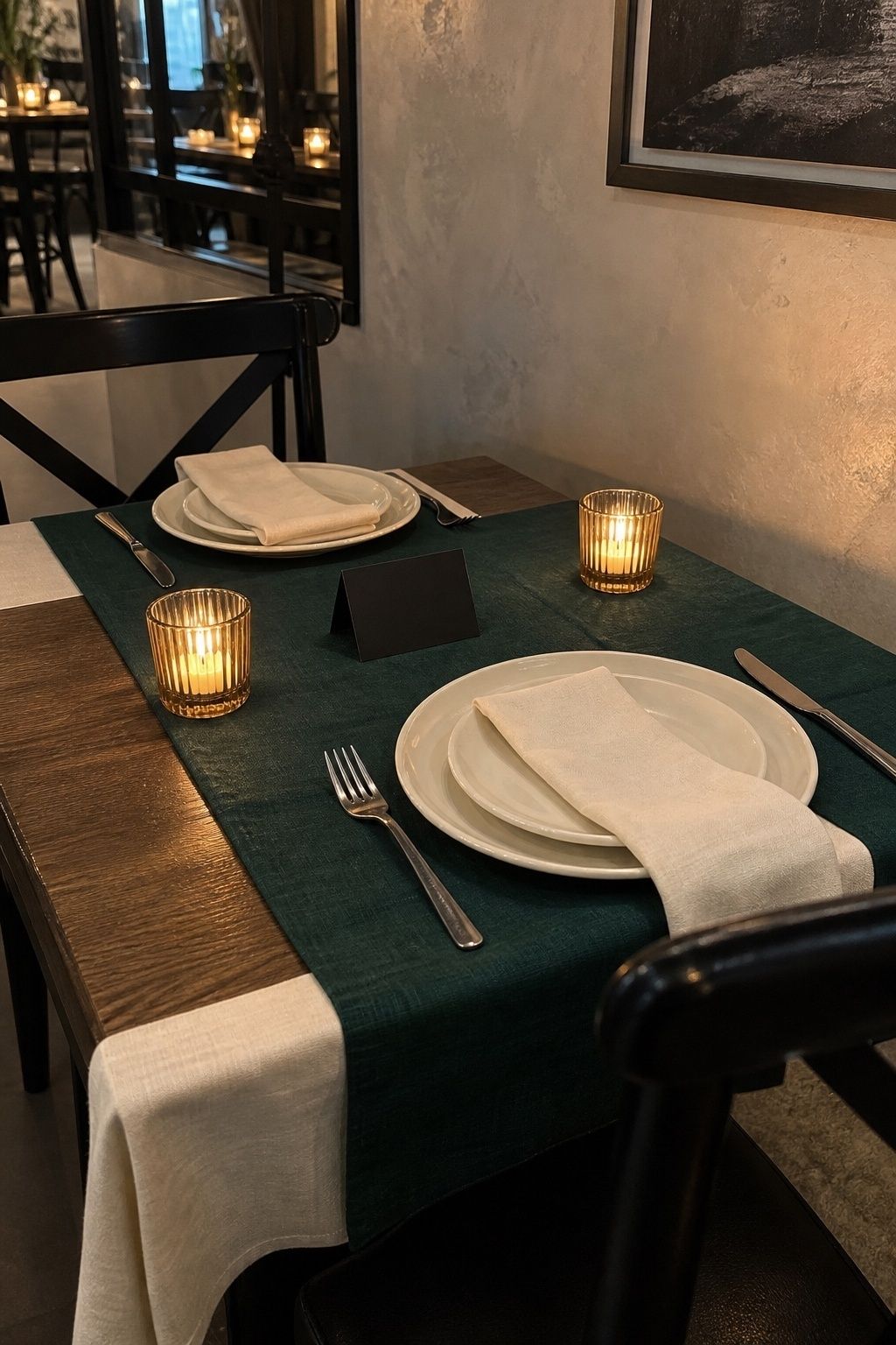
Modern and sharp. Try emerald napkins, black type on cream menus, ivory flowers and low candlelight. It suits an intimate dinner where the table does most of the visual work. If you love emerald, my jewel tone winter wedding colors post goes further with sapphire and garnet.
Black, ivory and antique gold

The polished evening option. Keep black precise: ribbon, typography, taper candles, tuxedos, chairs. Let ivory and gold soften everything else through flowers, linens, flatware and candles.
Plum, mocha and oatmeal
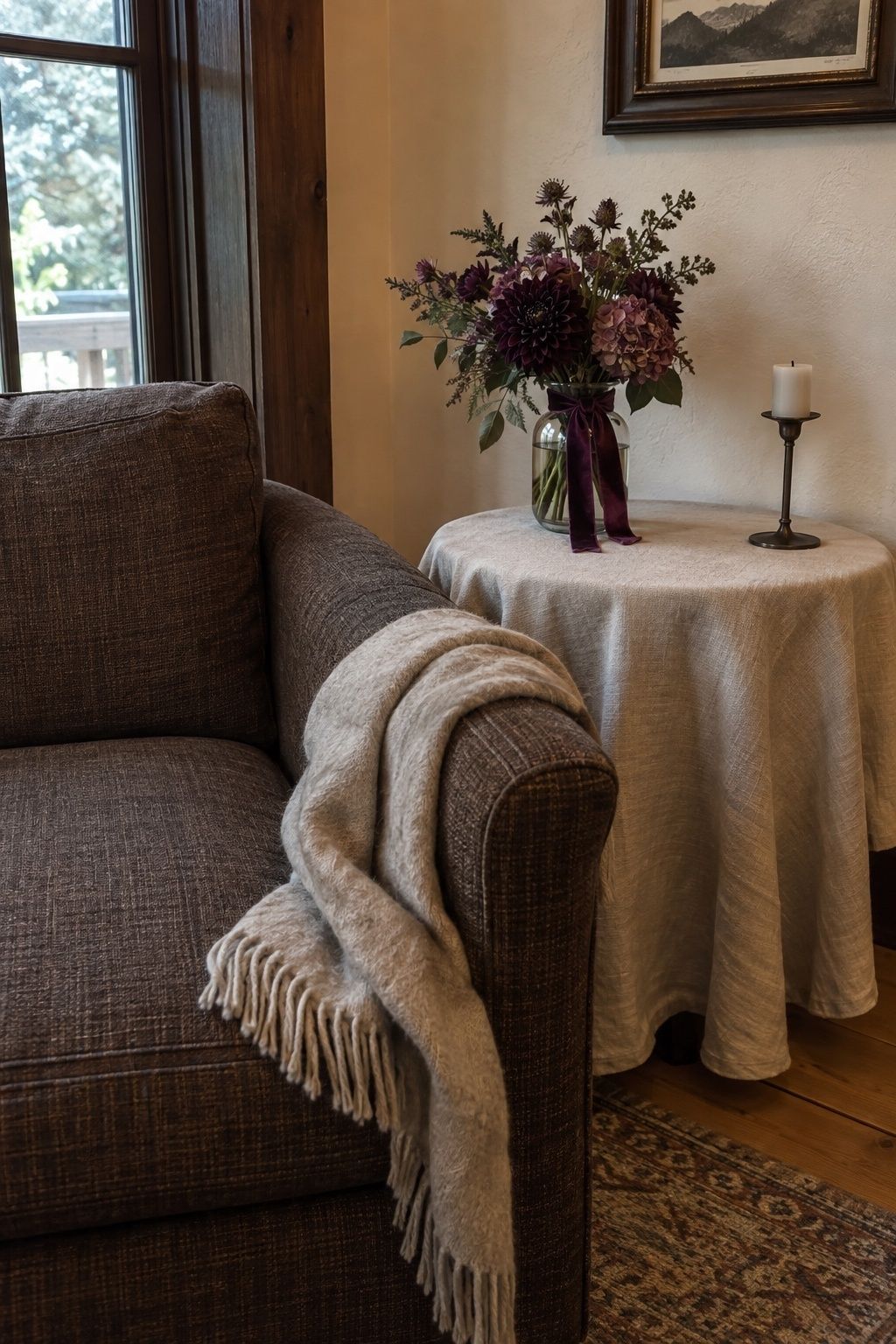
For couples who don’t want silver or blue at all. This palette loves wood, stone, lodges and private dining rooms. Plum goes in flowers or paper, mocha in ribbon or attire, oatmeal in the linen.
Charcoal, olive and bone

Understated and a little architectural. Bone is gentler than stark white, and olive keeps charcoal from feeling corporate. It suits modern venues, winter gardens, courthouse weddings and small restaurant receptions. Add clear glass and plenty of candles so the deep tones stay inviting.
Romantic reds and pinks after the holidays
Red in January has to work harder to avoid looking like leftover Christmas. My rule is to use the deep red as an accent in one or two places and let a soft neutral take the rest.
Burgundy, blush and warm ivory

Burgundy brings romance, blush keeps it tender and ivory lets the table breathe. Use burgundy in a few ranunculus, velvet ribbons, wine-toned candles or a signature cocktail rather than the whole room.
Ruby, rose and champagne
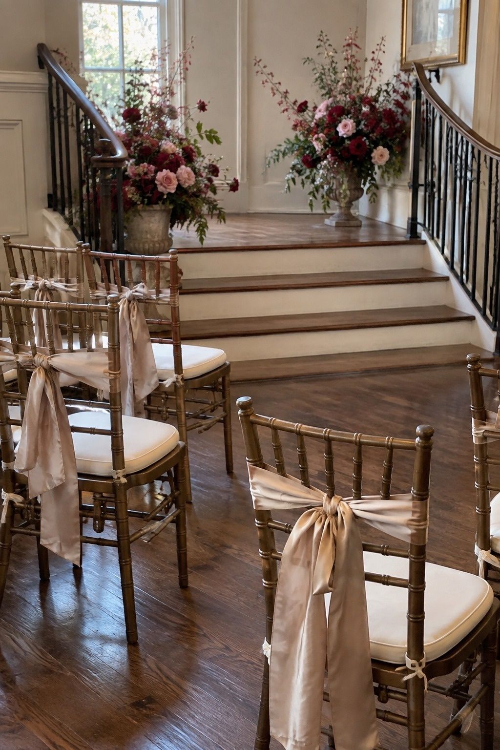
Celebratory without being themed. Put ruby in one or two focal spots (flowers, shoes, cocktails or napkins) and let rose and champagne handle the quieter layers.
Mauve, pewter and cream
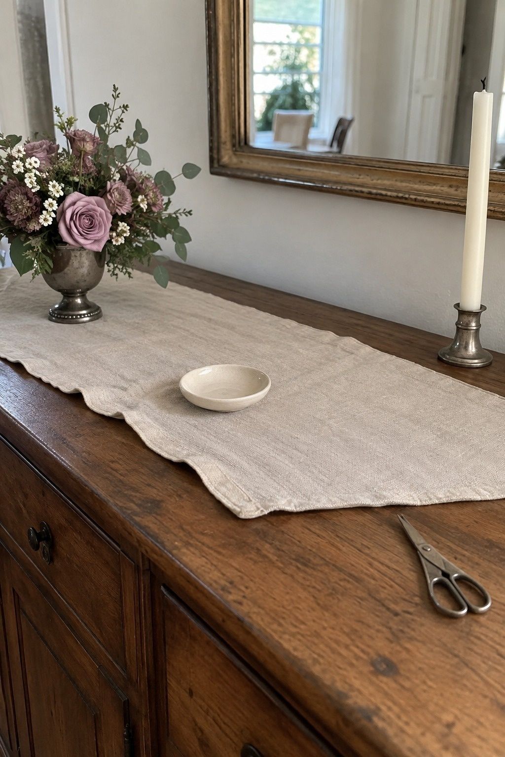
If you love blush, mauve is its winter cousin. It flatters flowers and attire, pewter adds a cool metallic note and cream stops the whole thing from going gray.
Brown, cream and dusty rose
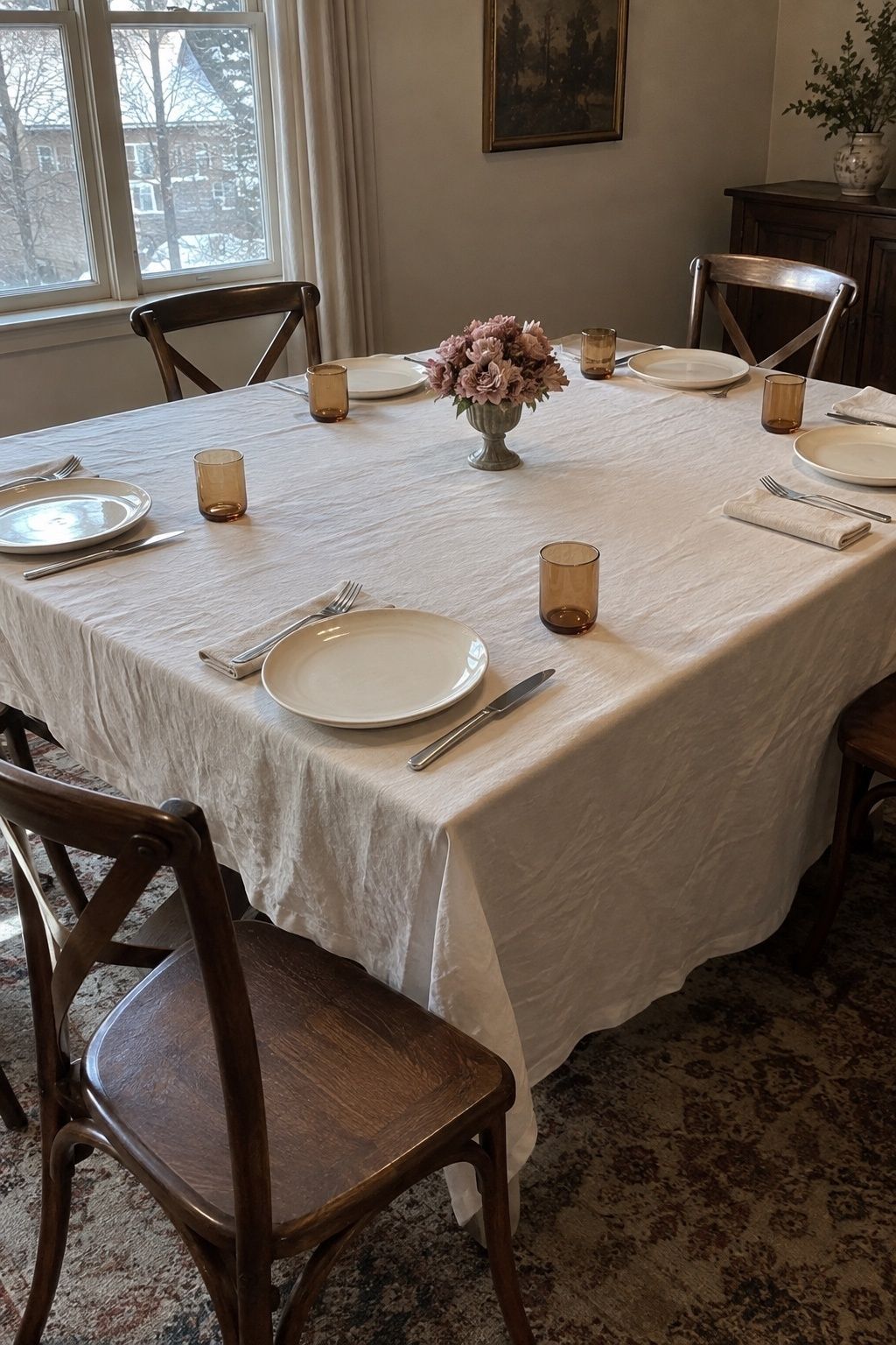
Warm and grounded. Think brown ink, velvet shoes, wooden chairs, cream flowers, dusty rose ribbon and amber glass. It looks like a private winter dinner, which is often exactly what a small January wedding is.
Cranberry, pine and linen
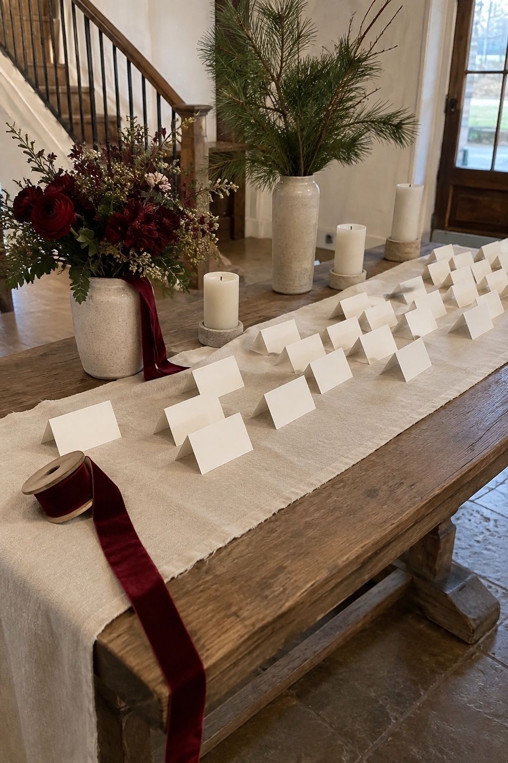
This can work after Christmas, but only with restraint. Remove the obvious holiday props, use greenery loosely and let linen or ivory own most of the visual field. A little cranberry goes a long way. For the line between festive and wedding, see how I handle December wedding colors.
The one-accent approach for tiny weddings
If your venue is already beautiful, you may only need winter white plus one accent color. It is the simplest January palette to execute and the hardest to get wrong.
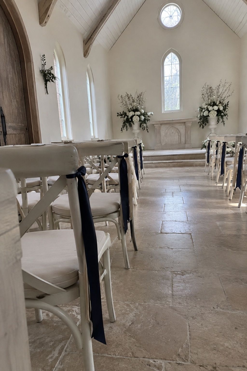
Build the base from ivory, cream, pearl and white, then pick one accent: navy, plum, emerald, icy blue, burgundy or champagne. With one color, decisions get fast. The invitation ink, the bouquet ribbon, the dress code note and the dinner candles all answer the same question. For a wedding of 10 to 30 guests, this is the approach I’d recommend first.
Matching January wedding colors to time of day and venue
The same palette can look completely different at 11 a.m. and 6 p.m. Use this as a starting point:
| Setting | Colors that work | Watch out for |
|---|---|---|
| Morning or brunch | Ivory, cream, pearl, sage, dusty blue, champagne, honey | All-white schemes with no texture |
| Late afternoon ceremony | Navy, plum, burgundy, emerald, mocha, antique gold | Pastels that fade as the light drops |
| Restaurant or private dining room | Any palette, carried in napkins, menus, candles, glassware | Big decor pieces guests never see up close |
| Outdoor portraits in snow or city streets | Navy, black, emerald, burgundy, cocoa, champagne | Very pale pastels against white snow |
In restaurants, the table is the whole show. Guests spend the evening close to napkins, taper candles, menus, floral vessels, ribbon and place cards, so put your palette there instead of on large installations. My January wedding tablescape ideas walk through that setup in detail.
For outdoor portraits, test the palette against coats, snow, bare trees and stone. Pale pastels alone tend to blend into a winter background. If you are planning photos in the cold, the January wedding photo ideas post has a few tricks for keeping everyone warm between shots.
Martha Stewart has a good gallery of candlelit winter reception palettes if you want to see these combinations in real rooms.
Key takeaways
- Choose January wedding colors under the light you will have at your ceremony time, not in daylight on a screen.
- One warm base, one winter color and one metallic is enough for a small wedding.
- Light palettes suit brunch and daytime; navy, emerald, plum and burgundy look richer after 4 p.m.
- Keep reds to one or two focal spots so the wedding doesn’t read as a holiday party.
- Winter white plus one accent is the easiest palette for weddings under 30 guests.
FAQ
What colors are best for a January wedding?
The best January wedding colors combine a warm light base like ivory or champagne with a winter tone such as navy, emerald, burgundy, plum or icy blue. Choose lighter combinations for brunch and daylight, and deeper ones for evening receptions lit mostly by candles.
What is a good January color palette for a small wedding?
A good small wedding palette has one soft base, one seasonal color and one metallic accent, for example ivory, champagne and evergreen or navy, silver and white. Small weddings look best when that palette repeats clearly across the table, flowers, attire and paper.
How do you make January wedding colors look warm?
Use warm undertones, texture and candlelight. Choose cream over stark white, champagne over bright glitter, and real candles over cool uplighting, then add velvet ribbon, linen, wood or antique gold.
Are icy blue wedding colors too cold for January?
Icy blue is not too cold for January as long as you pair it with pearl, cream, champagne or candlelight. It only looks flat when it sits next to bright white in a dim room with no texture.
How do you keep January wedding colors from looking like Christmas?
Skip red-and-green pairings, ornaments, plaid and heavy pine styling. Emerald with black and cream, burgundy with blush, navy with silver or plum with mocha all read as winter without reading as holiday.
Which January wedding colors photograph well?
Navy, black, emerald, burgundy, plum, cocoa, champagne and ivory read clearly in low winter light. Keep one lighter tone near faces and flowers so the darker colors don’t swallow the whole picture.
Before you order anything
Get one napkin or ribbon sample in each color and look at them by candlelight in the evening. That ten-minute test will tell you more about your January wedding colors than any mood board. If you are still building the bigger picture, the January wedding ideas roundup is a good next stop.
Last update on 2026-10-05 / Affiliate links / Images from Amazon Product Advertising API