

The best February wedding colors combine one deep winter shade (burgundy, plum, navy, emerald), one lighter romantic shade (blush, dusty rose, mauve) and one calm neutral (ivory, cream, taupe, champagne). Burgundy, blush and ivory is the safest choice; navy, blush and silver or emerald, ivory and gold work if you want less Valentine’s in the room.
How much Valentine’s Day do you want at your wedding? Answer that first and February wedding colors get much easier to choose.
Some couples love the cherry-red, ballet-pink version. Others want the month’s romance with none of the greeting-card associations. Most land in between. I’ve sorted the 16 palettes below by that dial, from barely there to fully red, and added the practical part: which shade goes on which surface, and how winter light changes everything.
A few things to test colors with
Ribbon, taper candles and napkins are the cheapest way to try a palette before you order linens and flowers. Some good starting points:


![Utopia Home [24 Pack, Navy Blue] Cloth Napkins 17x17 Inches, 100% Polyester](https://meadowandaisle.com/wp-content/plugins/aawp/public/image.php?url=YUhSMGNITTZMeTl0TG0xbFpHbGhMV0Z0WVhwdmJpNWpiMjB2YVcxaFoyVnpMMGt2TkRGdlpuaG9hSFY1YlV3dVgxTk1NVFl3WHk1cWNHYz18MTc5MTIxNDY0NQ=)


How Valentine’s does each palette read?
Use this as a quick sort before reading the details.
| Palette | Valentine level | Best light |
|---|---|---|
| Icy blue, white, brushed silver | None | Daytime, snow, bright rooms |
| Emerald, ivory, antique gold | None | Candlelit, dark wood |
| Evergreen, mauve, cream | Barely | Fireplaces, stone, beams |
| Navy, blush, silver | A hint | Evening, hotels |
| Mulberry, lilac, silver | A hint | Evening with candles |
| Rosewood, pearl, deep cocoa | A hint | Restaurants, private dining |
| Plum, rose, mushroom taupe | A hint | Dim rooms, candlelight |
| Champagne, white, soft blush | Soft | Daytime, brunch |
| Dusty rose, mauve, champagne | Soft | Any |
| Cabernet, dusty blue, ivory | Moderate | Any |
| Sage, dusty rose, merlot | Moderate | Flower-led rooms |
| Burgundy, blush, candlelit ivory | Moderate | Evening |
| Blackberry, blush, cream | Moderate | Amber light, dark wood |
| Oxblood, taupe, rose gold | Moderate | Evening |
| Cranberry, cream, soft gray | Clear | Any |
| Cherry red, ballet pink, linen | Full | Bright rooms, daytime |
February colors with no Valentine’s at all
If you want winter, not hearts, these three skip pink and red entirely.
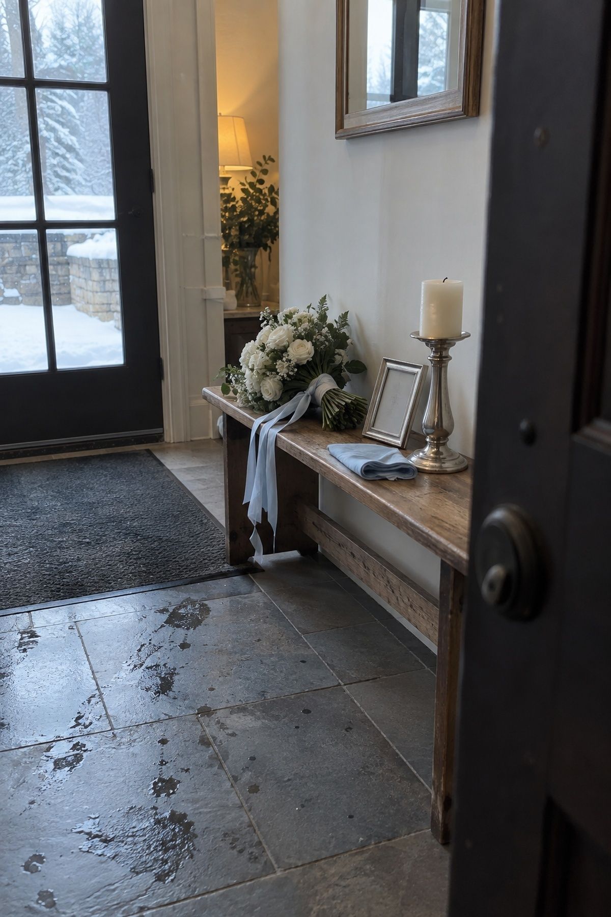
Icy blue, white and brushed silver is clean and bright, and lovely for morning ceremonies, snowy venues or minimalist spaces. Keep the blue soft and put it in ribbon, stationery, napkins or glassware. If the room already feels cold, add cream flowers and wood so it stays warm enough to sit in.
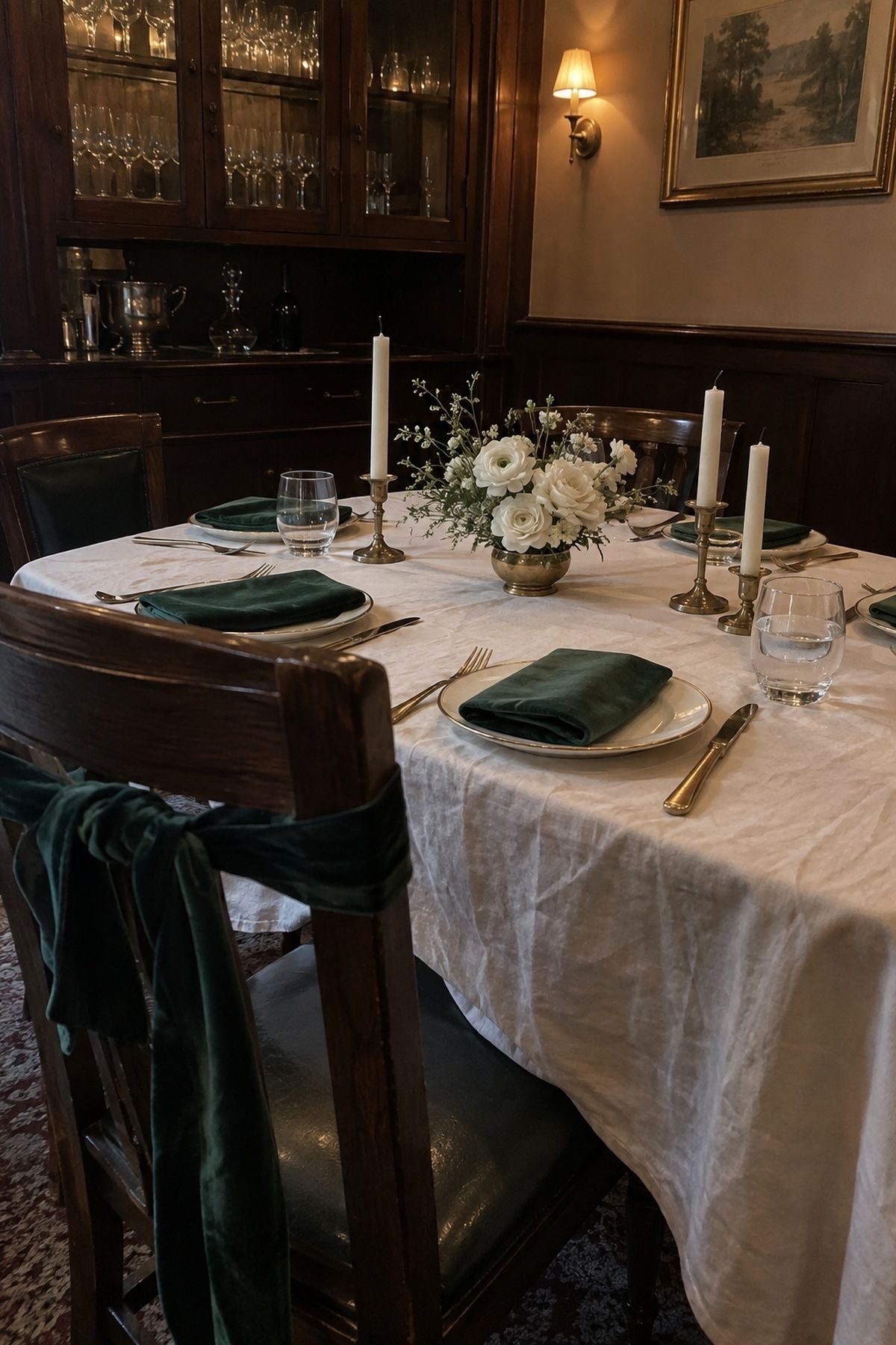
Emerald, ivory and antique gold is rich without red. Ivory covers the big surfaces, emerald goes on napkins, dresses or velvet bows, and gold appears in small repeats like candleholders and wax seals. Choose one emerald moment guests see straight away, such as dinner napkins, and echo it lightly elsewhere. These jewel tone winter wedding colors push the idea further.
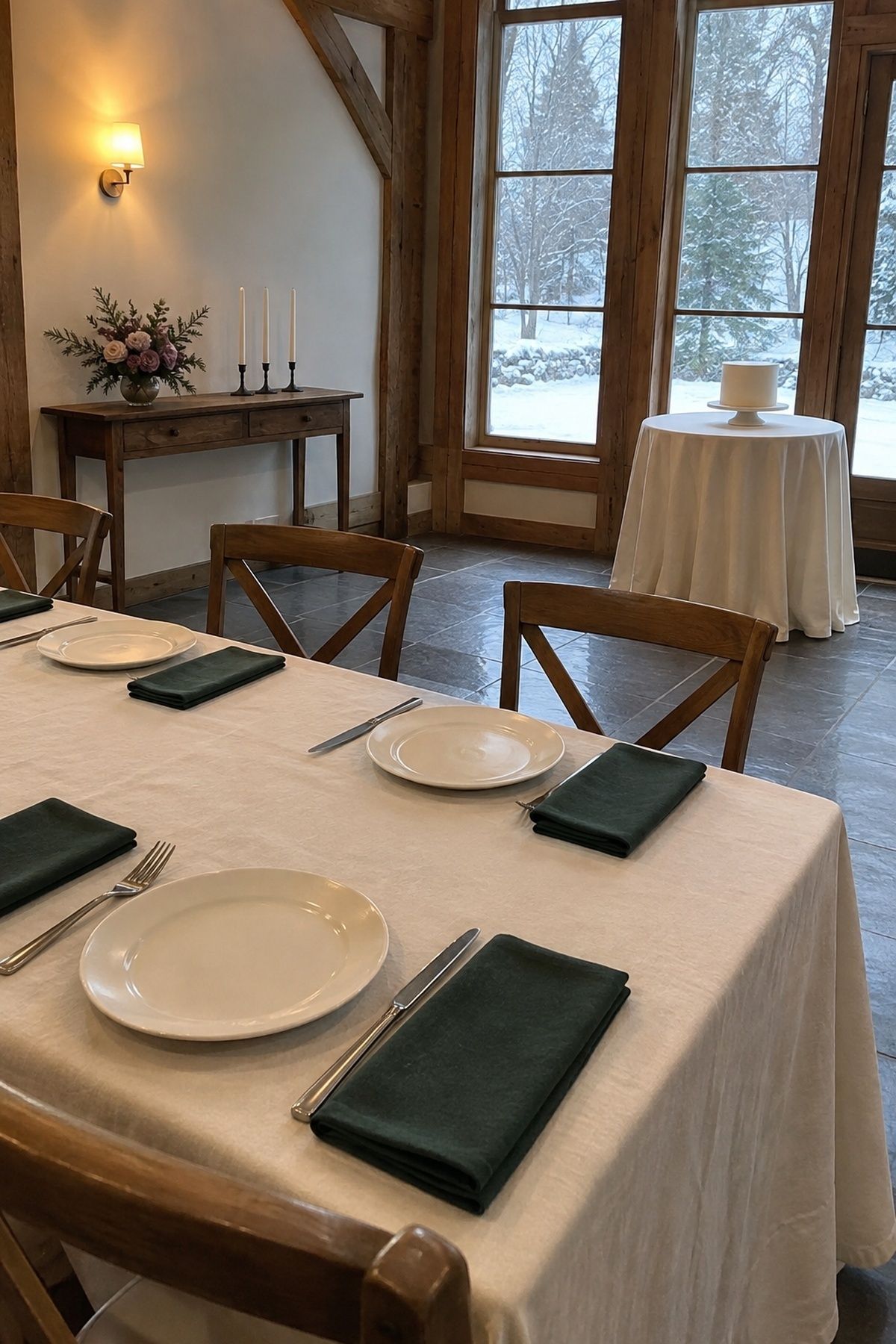
Evergreen, mauve and cream reads wintry without looking like December. Evergreen comes from foliage or suits, mauve softens flowers and dresses, and cream repeats through linens, candles and cake. It suits venues with wood beams, fireplaces or stone.
Palettes with a hint of romance
These lean cool or earthy, with just enough rose to nod at the month.
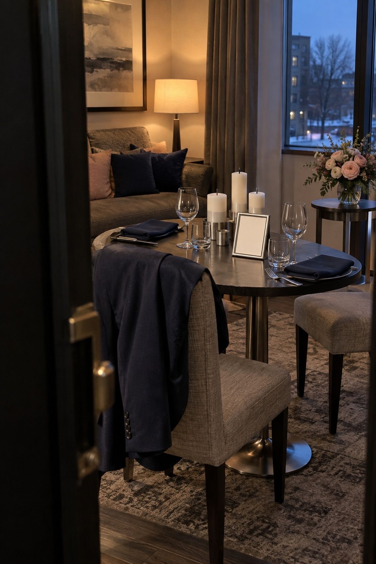
Navy, blush and silver gives a formal frame without needing black tie. Navy goes in suits, menus or a bar sign; blush in flowers and paper; silver in glassware, frames and shoes rather than shine on every table. It is strong in hotels and evening receptions where pale colors need more contrast.
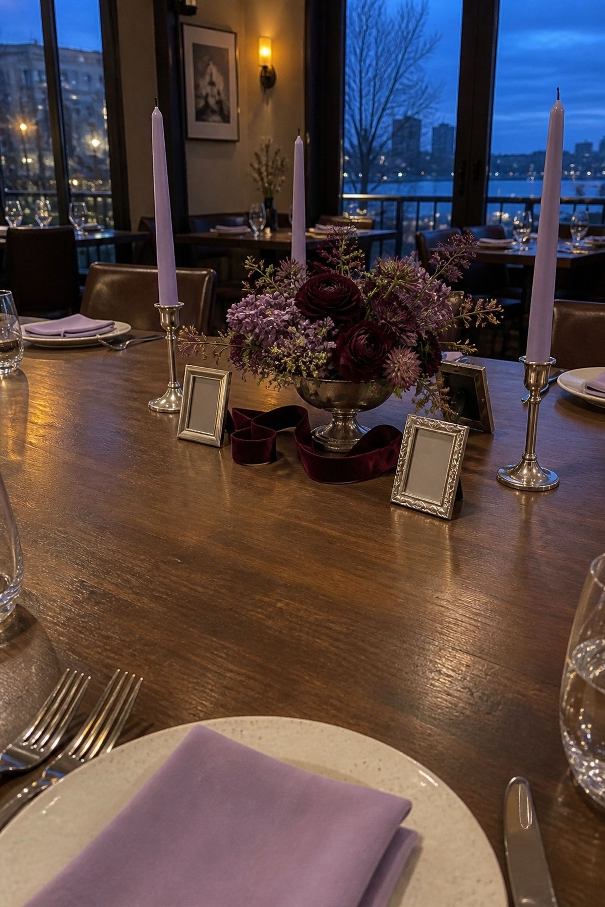
Mulberry, lilac and silver is a cooler romantic option. Mulberry in flowers and candles, lilac in stationery and napkins, silver as the finish. Lilac fades in low light, so give it enough mulberry to hold up after sunset.
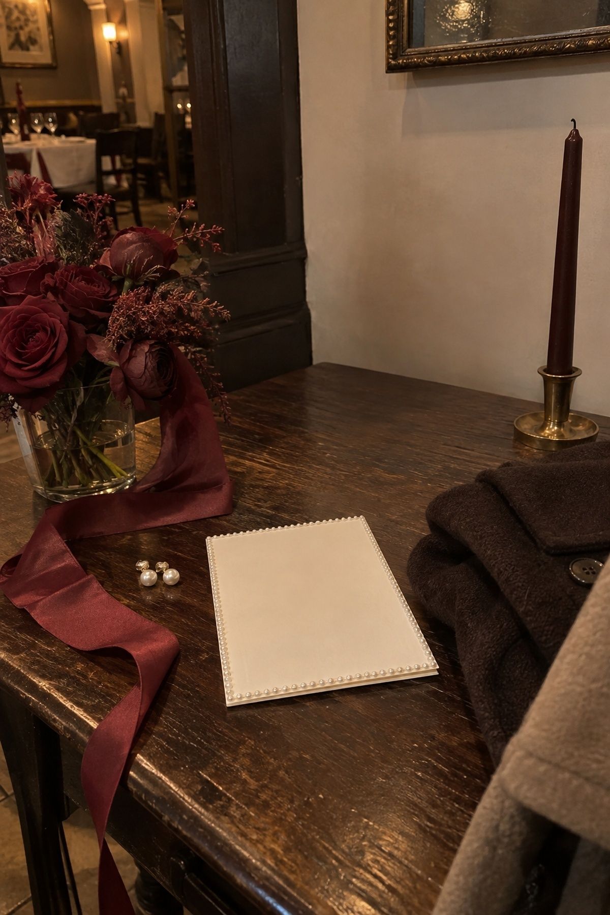
Rosewood, pearl and deep cocoa suits candlelit restaurants and private dining rooms. Rosewood in ribbon and dresses, pearl in accessories and cake, cocoa in suits, wood and taper candles. It is less obvious than pink or red and has a more editorial look.
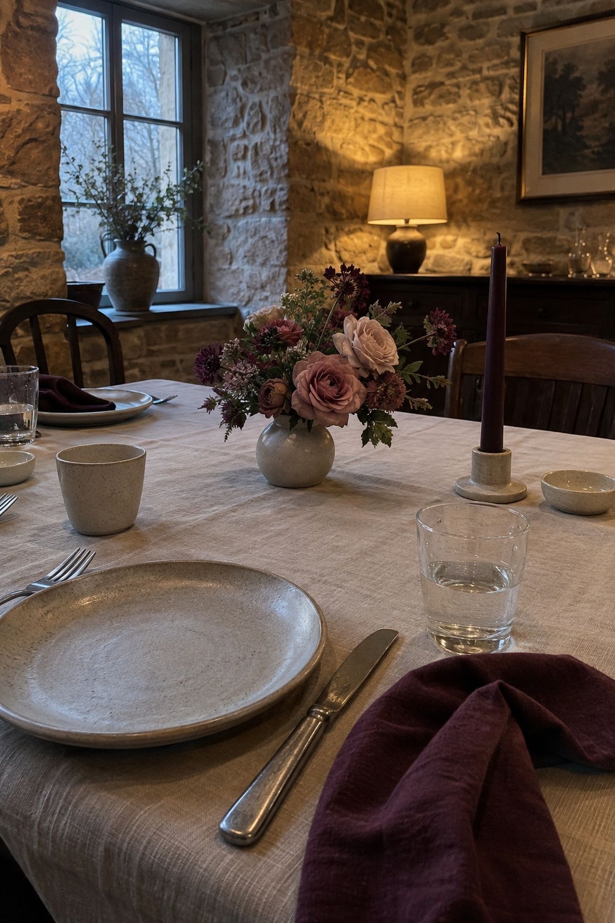
Plum, rose and mushroom taupe is moody without being severe. It loves velvet, matte stationery and stoneware. Use plum sparingly if the room is dark.
Soft and light February palettes
Light colors work in February if they have texture. Without it, they wash out in grey winter light.
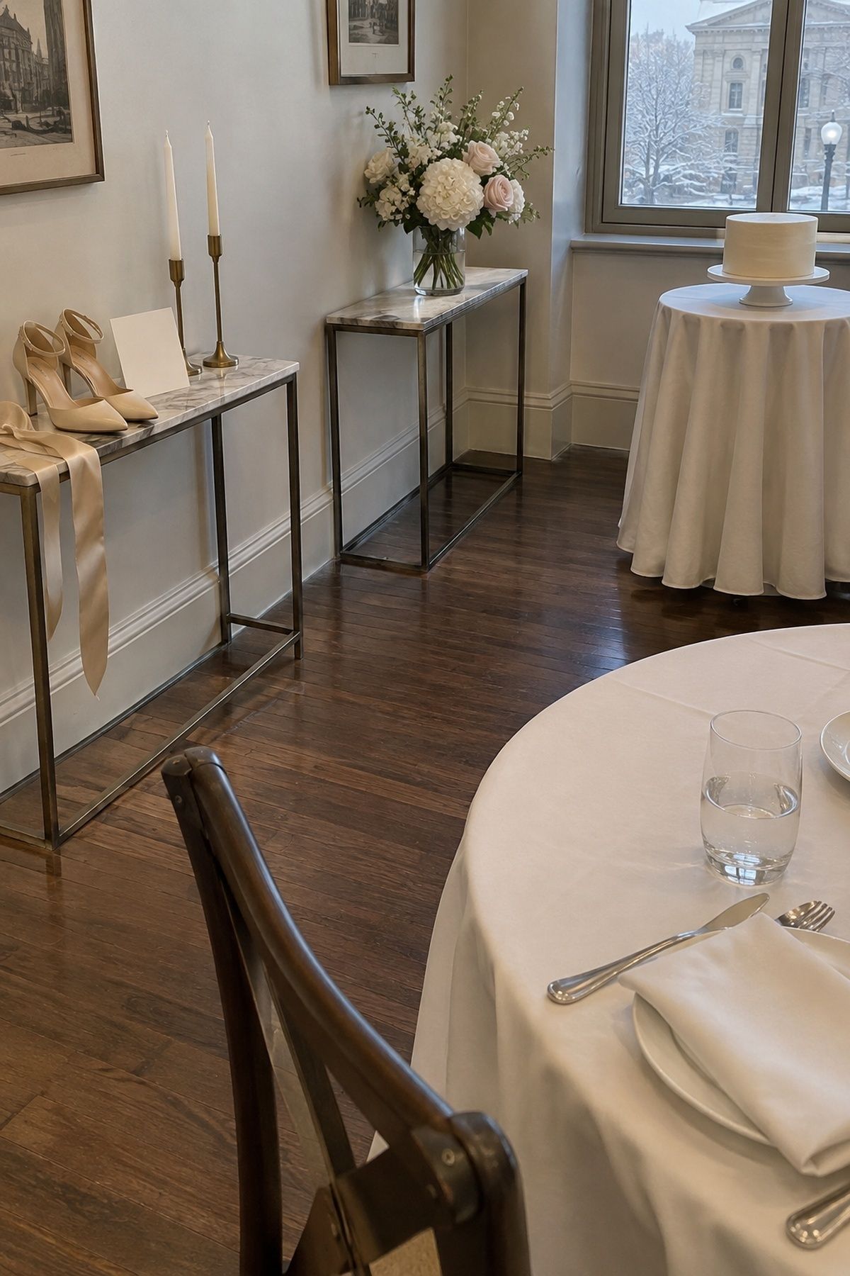
Champagne, white and soft blush is the lightest palette here. Satin ribbon, pearl, glass and candlelight give it body. Repeat a slightly deeper blush once or twice so everything does not blur together. It suits courthouse weddings and brunch receptions.
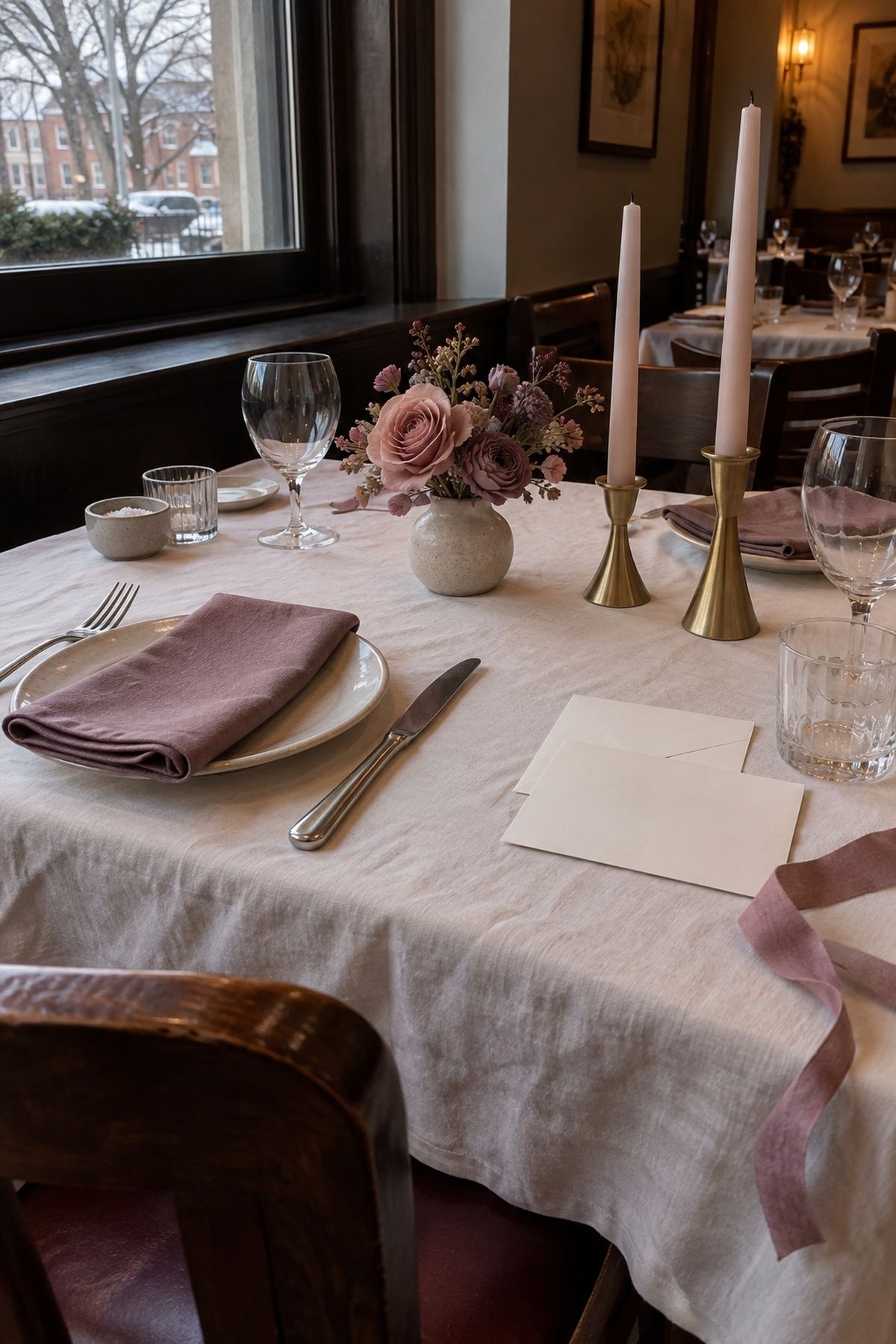
Dusty rose, mauve and champagne is quieter than red or bright pink. Dusty rose carries the flowers and stationery, mauve goes in napkins or dresses, and champagne shows up in candleholders and table numbers. Mauve bridges blush and plum, so there is still some depth.
Wine-toned palettes for evening
Most February weddings end in candlelight, and wine colors look best there. Each of these needs a lighter partner so the room stays open.
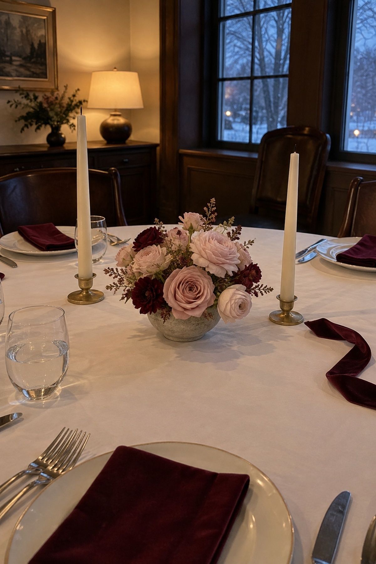
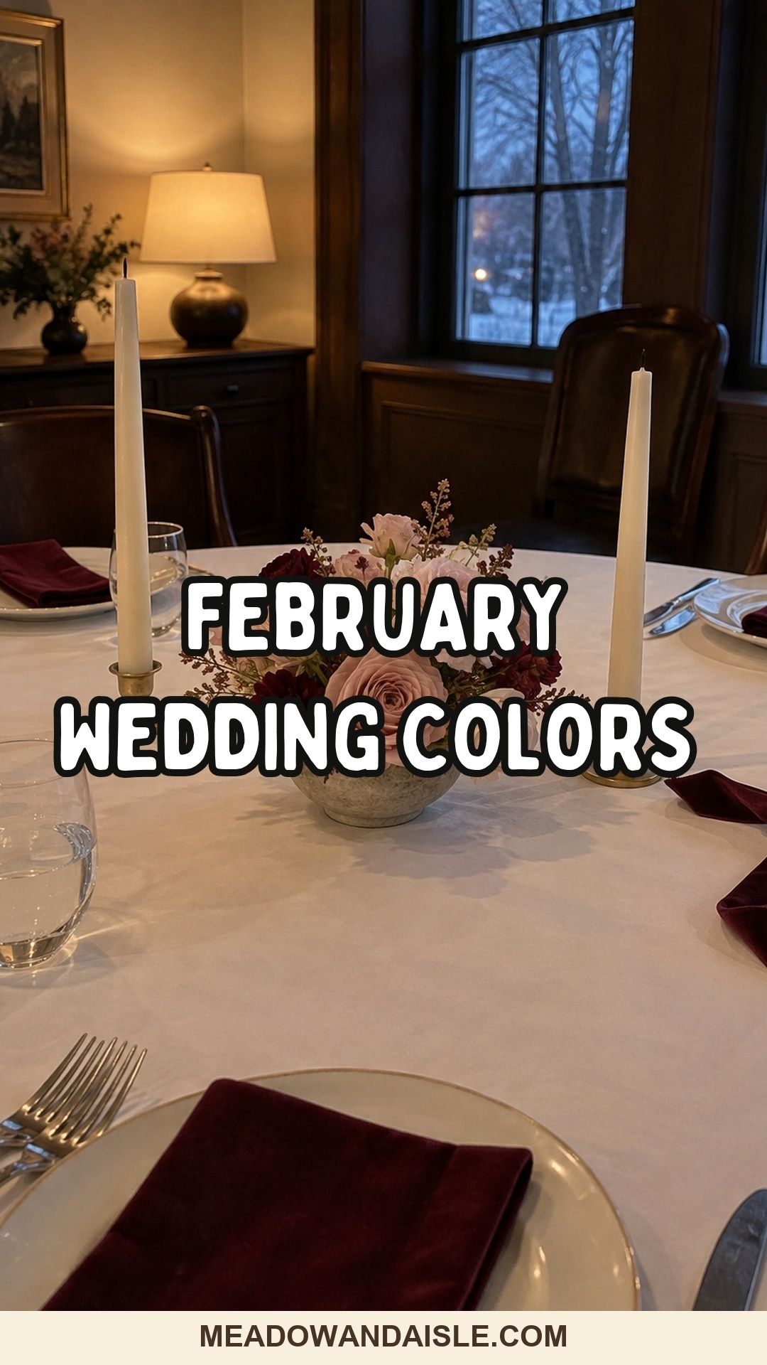
Burgundy, blush and candlelit ivory is the classic, and a classic for good reason. Put ivory on the biggest surfaces first: linens, ceremony fabric, paper, cake. Burgundy goes into taper candles, velvet ribbon, bridesmaid dresses and wax seals. Blush is the middle layer, in flowers, napkins and envelopes. It pairs naturally with the blooms in my guide to February wedding flowers.
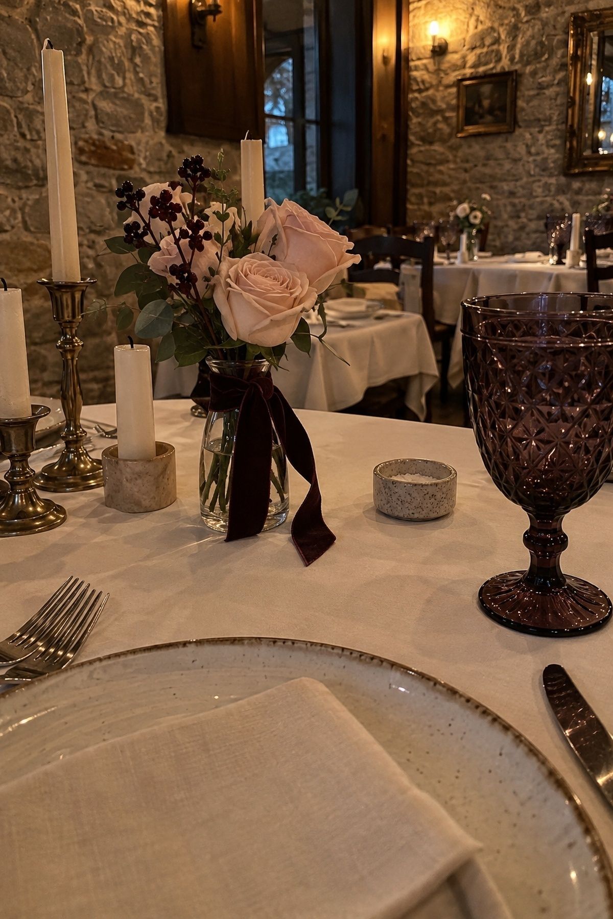
Blackberry, blush and cream is the slightly darker, more purple cousin. Keep blackberry as the accent in ribbon, dark flowers or goblets. In a bright white room, add texture so the dark shade does not look stuck on.
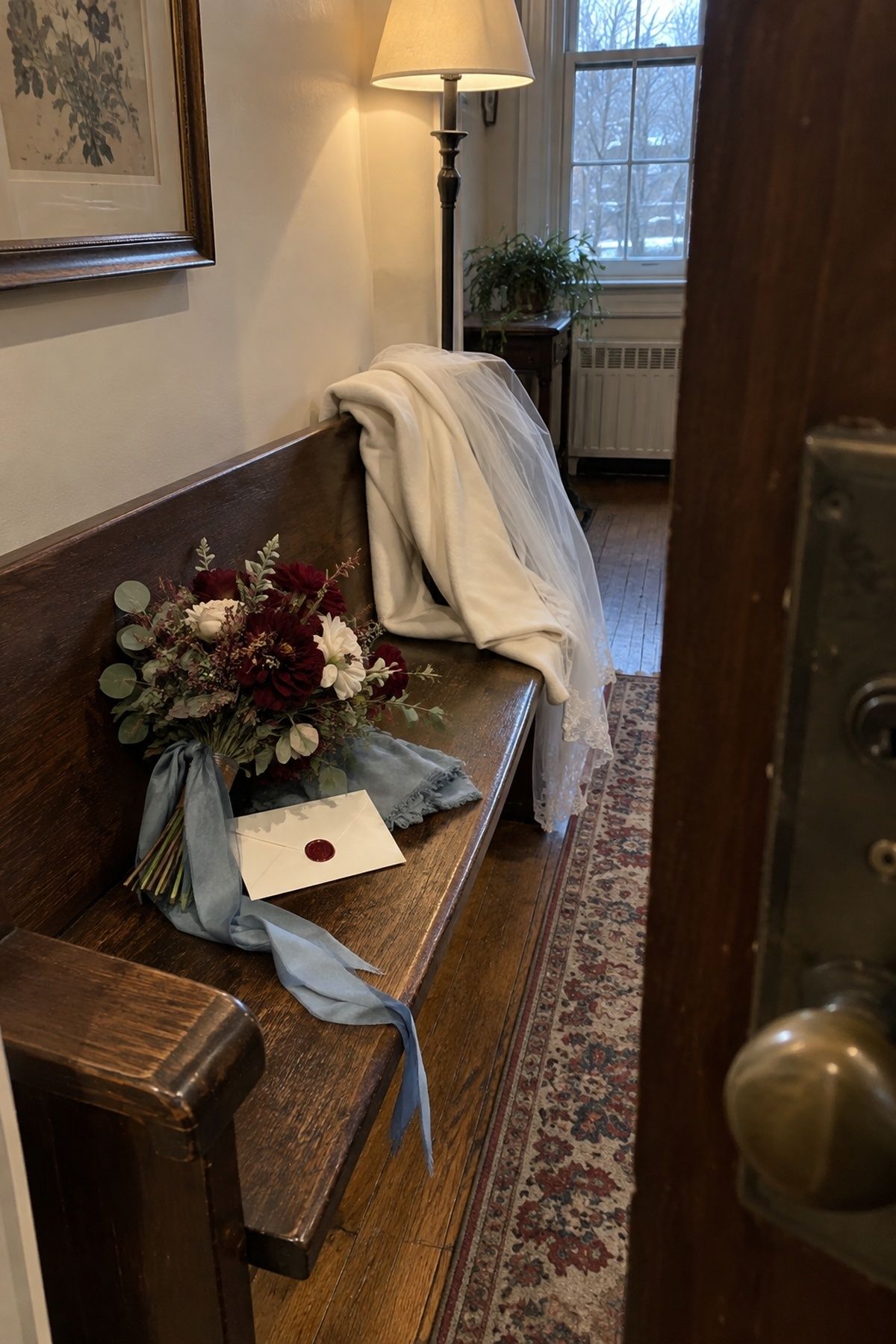
Cabernet, dusty blue and ivory photographs well because the blue cools the wine color without dulling it. Cabernet in flowers and wax seals, dusty blue in ribbon or dresses, ivory to keep it bridal.
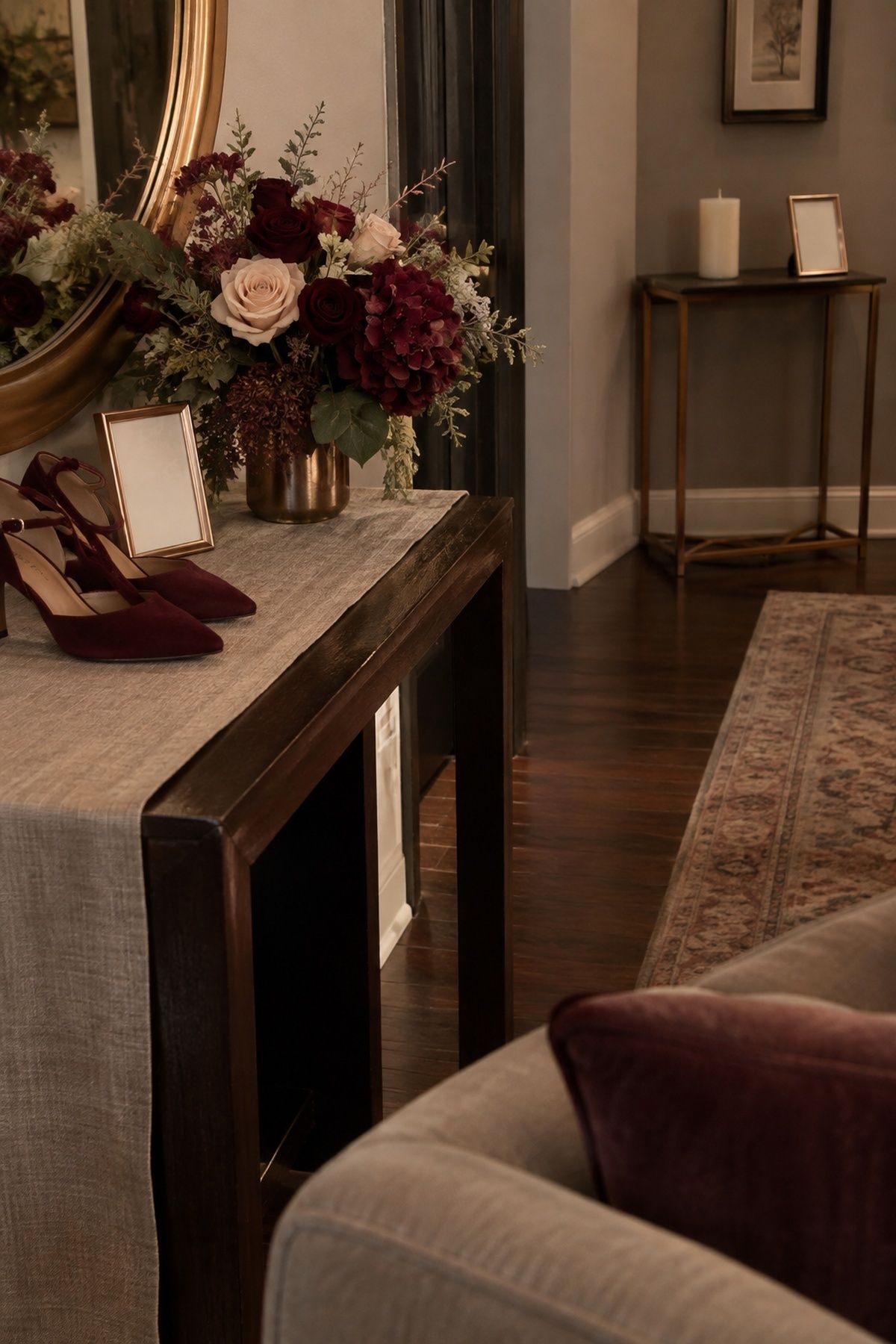
Oxblood, taupe and rose gold gives drama without black or bright red. Concentrate oxblood in flowers, candles or a statement napkin, and let taupe hold the table. During a daytime reception, add cream flowers so it does not get dense.
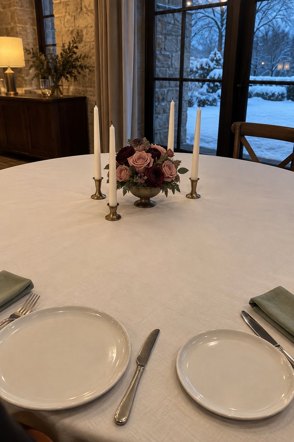
Sage, dusty rose and merlot bridges garden and winter. It works when the flowers do most of the color work: sage in greenery and ribbon, dusty rose and merlot in ranunculus, roses or anemones. A few wine-colored blooms can make simple cream linens look designed.
Red February palettes, done carefully
If you want red, put it in one visible layer and keep the rest calm.

Cranberry, cream and soft gray frames red in a grown-up way. Cranberry in flowers, taper candles, cocktails or envelope liners; cream on cake and linens; gray in suits or table numbers. A little cranberry looks romantic. A lot locks the room into one season.

Cherry red, ballet pink and linen is the openly Valentine palette. Pick one red layer, such as flowers, shoes, a red lip or taper candles, and let ballet pink and linen do the rest. Skip the hearts unless they are really your style. For more ways to do this without going cute, see these Valentine’s Day wedding decor ideas.
How to choose February wedding colors for your venue
Start with the room, not the swatches. February light is low and short, so your venue’s walls, floors, wood and bulbs will change every color you bring in.
Look at:
- Wall and floor color, including carpet
- Wood tone and any existing curtains or upholstery
- Bulb temperature (warm amber or cool white)
- What time dinner starts and whether it will be dark by then
Navy that looks crisp in a white chapel can look nearly black in a dark restaurant. Blush can glow by candlelight and go grey under cool bulbs. Bring a napkin, ribbon and candle to the venue at your dinner hour and photograph them before you order anything.
Where the strongest color should go
Put the brightest or deepest shade in small things with a job: flowers, candles, wax seals, cocktails, escort cards, bouquet ribbon. Large surfaces like linens and walls work better in ivory, taupe, champagne, sage, cream or soft gray.
Texture matters more than adding a fourth color. Velvet, satin, ribbed glass, matte paper, brushed metal and wool keep a three-color palette from looking thin, which counts at a small wedding where guests sit close to every surface. For more on dressing the table itself, see these February wedding tablescape ideas.
Minted has a helpful page of winter wedding color combinations if you want to see more swatches side by side.
Key takeaways
- Decide how much Valentine’s you want before choosing colors.
- Use one deep shade, one lighter romantic shade and one neutral.
- Put the strongest color in small details and keep large surfaces neutral.
- Test fabric and candles in the venue at your dinner hour.
- Add texture instead of adding more colors.
FAQ
What are the best colors for a February wedding?
Burgundy, blush and ivory is the safest February wedding palette, with navy, blush and silver or emerald, ivory and gold close behind. Any mix of one deep winter shade, one soft romantic shade and one neutral will suit the month.
How do you pick February wedding colors that don’t look like Valentine’s Day?
Skip bright red and pink and choose emerald, navy, icy blue, evergreen, rosewood or plum instead. Pair them with ivory, champagne or taupe so the palette reads as winter rather than holiday.
Can a February wedding use light colors?
Yes, a February wedding can use light colors like champagne, white, blush or icy blue if you add texture such as satin, pearl and glass. Include one slightly deeper accent so the palette does not fade in low winter light.
Are burgundy and blush good February wedding colors?
Burgundy and blush are some of the best February wedding colors because they are romantic without being literal red and pink. Add ivory or cream so the room stays open.
What February wedding colors suit a small wedding?
Small February weddings suit palettes that look good up close, such as burgundy and blush, dusty rose and champagne, or emerald and ivory. Put the color in napkins, flowers, candles and place cards, where guests will notice it.
One last step
Pick two palettes from the table, buy a napkin and a candle in each, and take them to your venue at dinner time. One will look right and one will not. That five-minute test settles February wedding colors faster than a hundred saved pins. If your date is closer to early spring, my March wedding colors guide is the next one to read.
Last update on 2026-10-03 / Affiliate links / Images from Amazon Product Advertising API