

A good Valentine’s Day wedding color palette pairs one deep red or pink with a calm neutral and a single accent, roughly 60% neutral, 30% soft color and 10% deep color. Oxblood with blush and ivory, burgundy with mauve and cream, or red with sage and cream all read romantic without looking like a greeting card.
The most common Valentine’s wedding mistake is using red on everything. Red linens, red roses, red signage, red favors, red lighting. By dessert, the room feels like a holiday party that happens to have a couple in it.
Red works best as punctuation. Choose the mood first, pick a neutral that covers the big surfaces, then let the deep color show up in a handful of places guests see up close. At a small February wedding of 10 to 50 people, those close-up places are the napkins, menus, candles and bouquet, and that’s where the palette lives or dies.
Tools that make color decisions easier
A few things I’d keep on hand while you narrow down swatches and test them at the venue.


Choose the mood before the colors
Settle on one of four moods before you look at a single swatch: soft, moody, fresh or bright. Each one points you to a different family of palettes, and it stops you from mixing oxblood velvet with raspberry cocktails.

Soft and airy
Blush, ivory, champagne, pale rose and a little silver. This is the mood for a chapel, a greenhouse or a bright restaurant room, because pale colors lift flat February daylight. Keep flowers loose and candles warm so it doesn’t drift toward baby shower.

Rich and moody
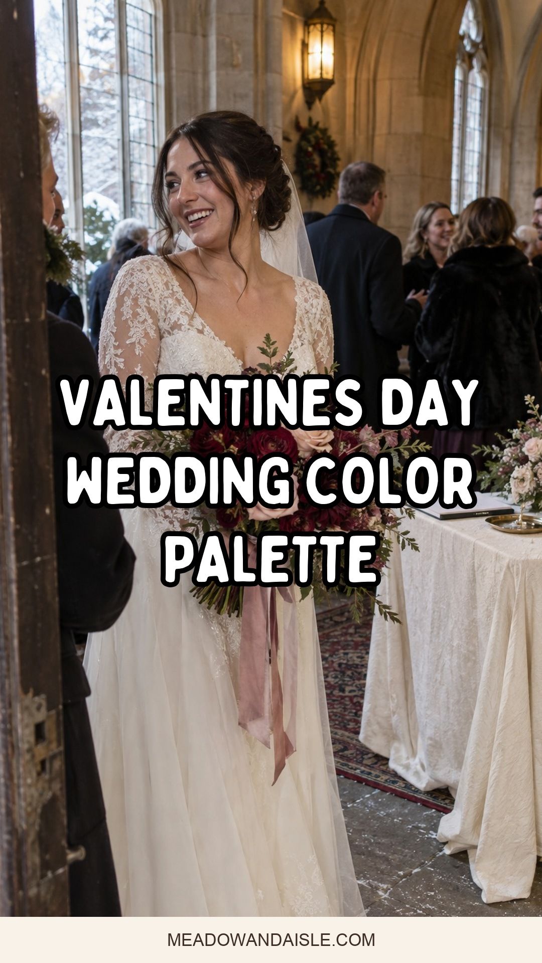
Oxblood, merlot, plum, garnet and mocha, with plenty of candlelight. Moody palettes suit rooms that already have wood, stone, velvet or low evening light. Put the darkest color where guests see it up close, like ribbon, menus and taper candles, and keep the base ivory or taupe so a small room doesn’t feel heavy.
Fresh and natural
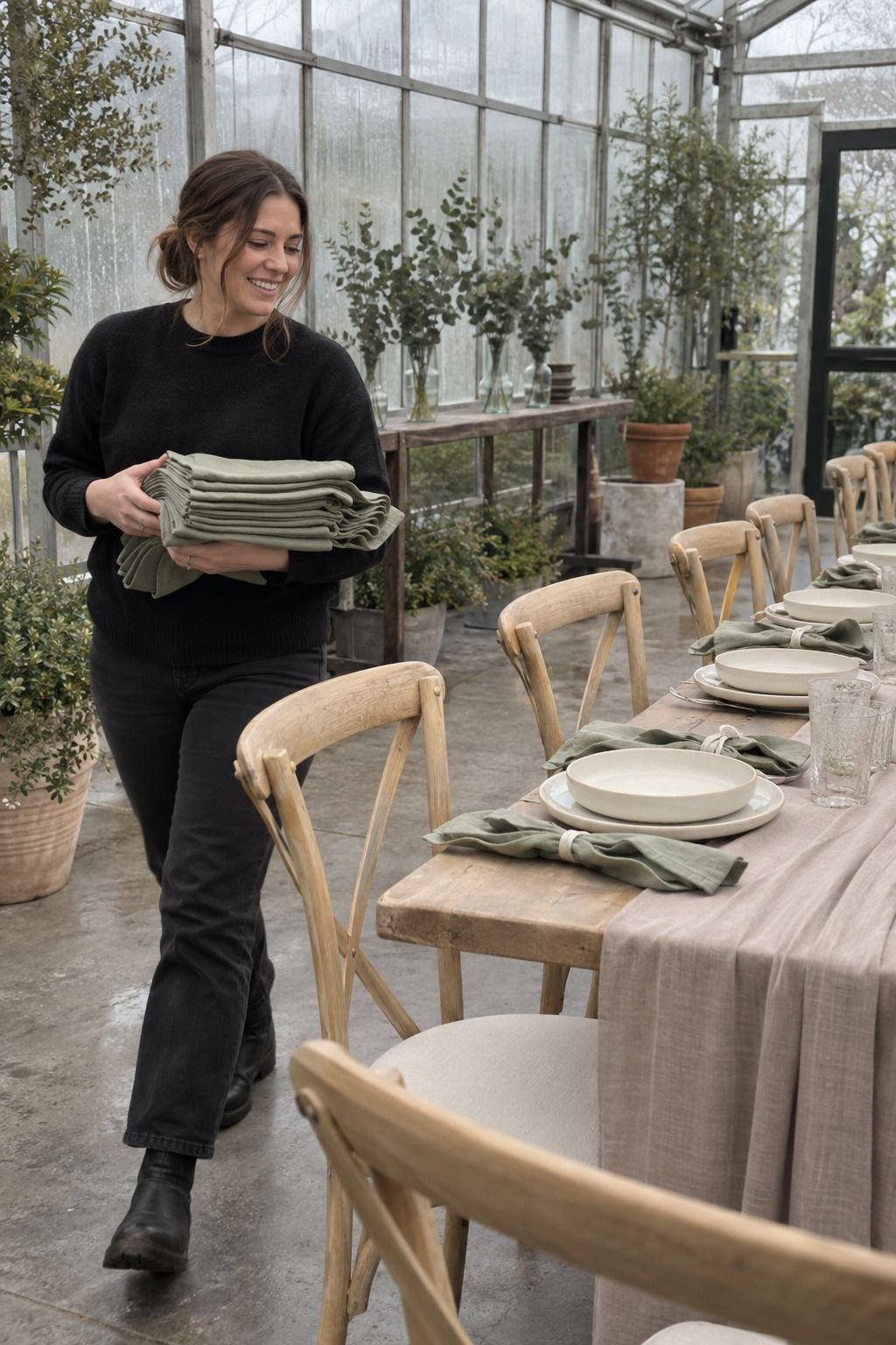
Sage, eucalyptus, cream and taupe give roses and ranunculus a calm place to land. This is my pick when red and pink on their own feel too expected. It also softens hard-edged venues without adding clutter.
Playful and bright
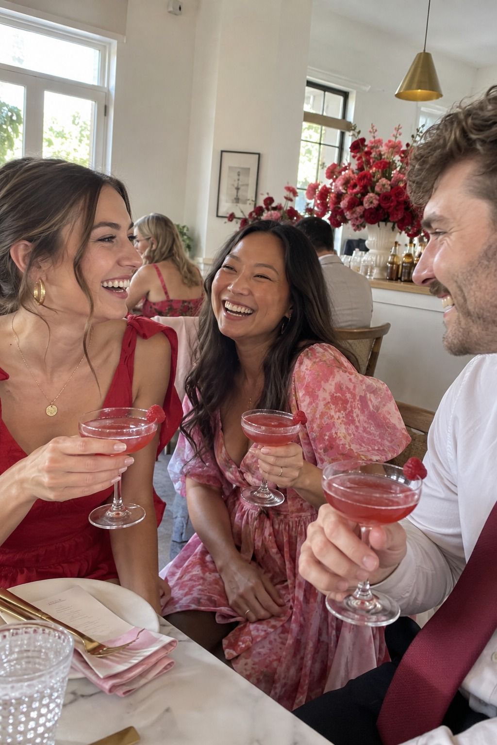
Raspberry, scarlet, rose and gold can look polished if the brightest shade stays small: a wax seal, an envelope liner, a cocktail, one flower variety. White plates and simple linens do the editing for you.
Valentine’s Day wedding color palette ideas, grouped by how much red you want
Here are 13 palettes I’d actually use, sorted from the most classic Valentine’s look to the least. The table gives you the short version; the notes below cover where each color goes.
| Palette | Red level | Best venue | Where the deep color goes |
|---|---|---|---|
| Oxblood, antique rose, blush, warm ivory | High | Candlelit restaurant, old chapel | Tapers, velvet ribbon |
| Burgundy, blush, dusty rose, cream, mauve | High | Hotel dining room, estate | Candles, envelopes |
| Crimson, blush, champagne | High | City restaurant, gallery | One focal point only |
| Garnet, rose, ivory, espresso | High | Bistro, dark wood room | Candles, anemones |
| Red, cream, sage | Medium | Garden room, home wedding | Flowers, fruit |
| Scarlet accent on a neutral base | Medium | Almost anywhere | One repeated detail |
| Berry, dusty rose, copper, mocha | Medium | Wine bar, brick room | Bud vases near the bar |
| Merlot, mauve, plum | Medium | Library, old hotel | Low florals |
| Black, blush, brushed gold | Low | Loft, cocktail lounge | Black in type and chairs |
| Raspberry, pale pink, gold | Low | Brunch, white walls | Cocktail, cake |
| Soft pink, cool gray, ivory | None | Minimal restaurant, city hall | Pink in flowers only |
| Blush, champagne, warm white | None | Tea room, chapel | Texture instead of color |
| Rose, ivory, silver | None | Winter hotel, stone rooms | Rose napkins and flowers |
Deep reds with soft pinks
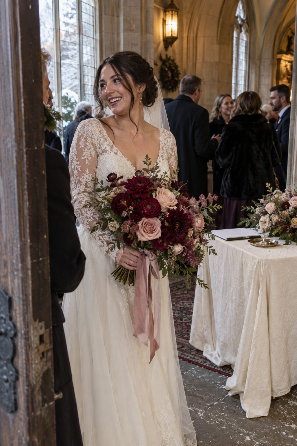
Oxblood, antique rose, blush and warm ivory is romantic without being sweet. Oxblood anchors the bouquet and taper candles, while blush and ivory carry linens, menus and the cake. On a single long table for 12, I’d keep the oxblood to the candles and a few flowers and let everything else stay pale.
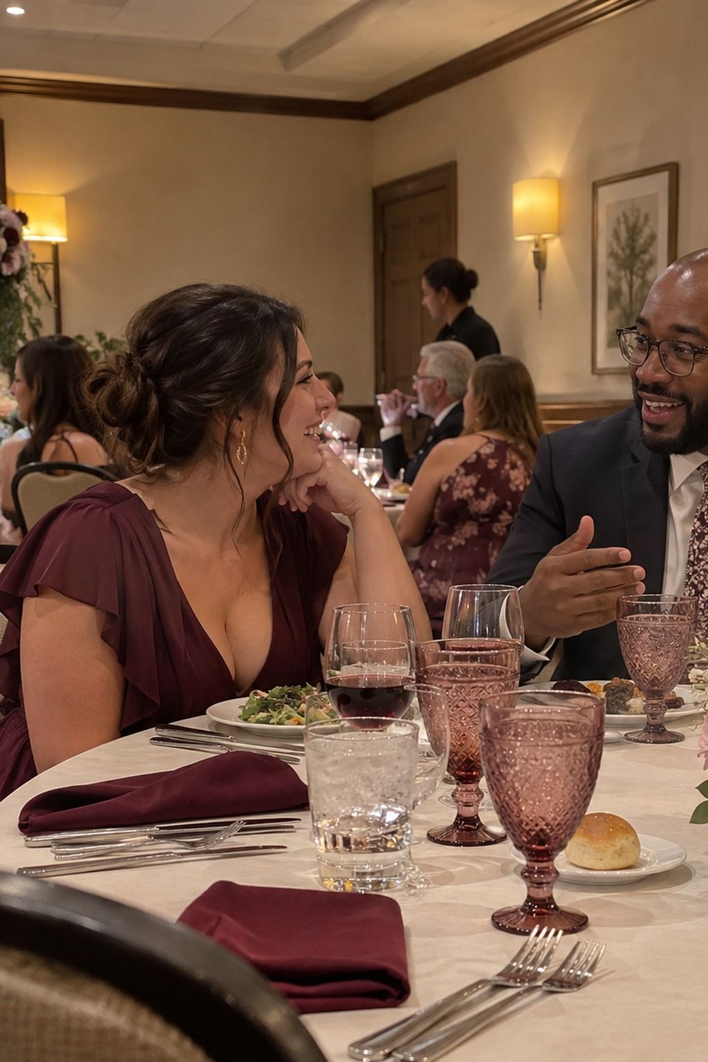
Burgundy and blush get more interesting with mauve, dusty rose and cream in between. Ask your florist to stay in one color family, burgundy ranunculus next to mauve roses and blush carnations, and make cream the biggest surface in the room. Paperlust has a good burgundy and blush wedding guide if you want to see the pairing on paper goods.
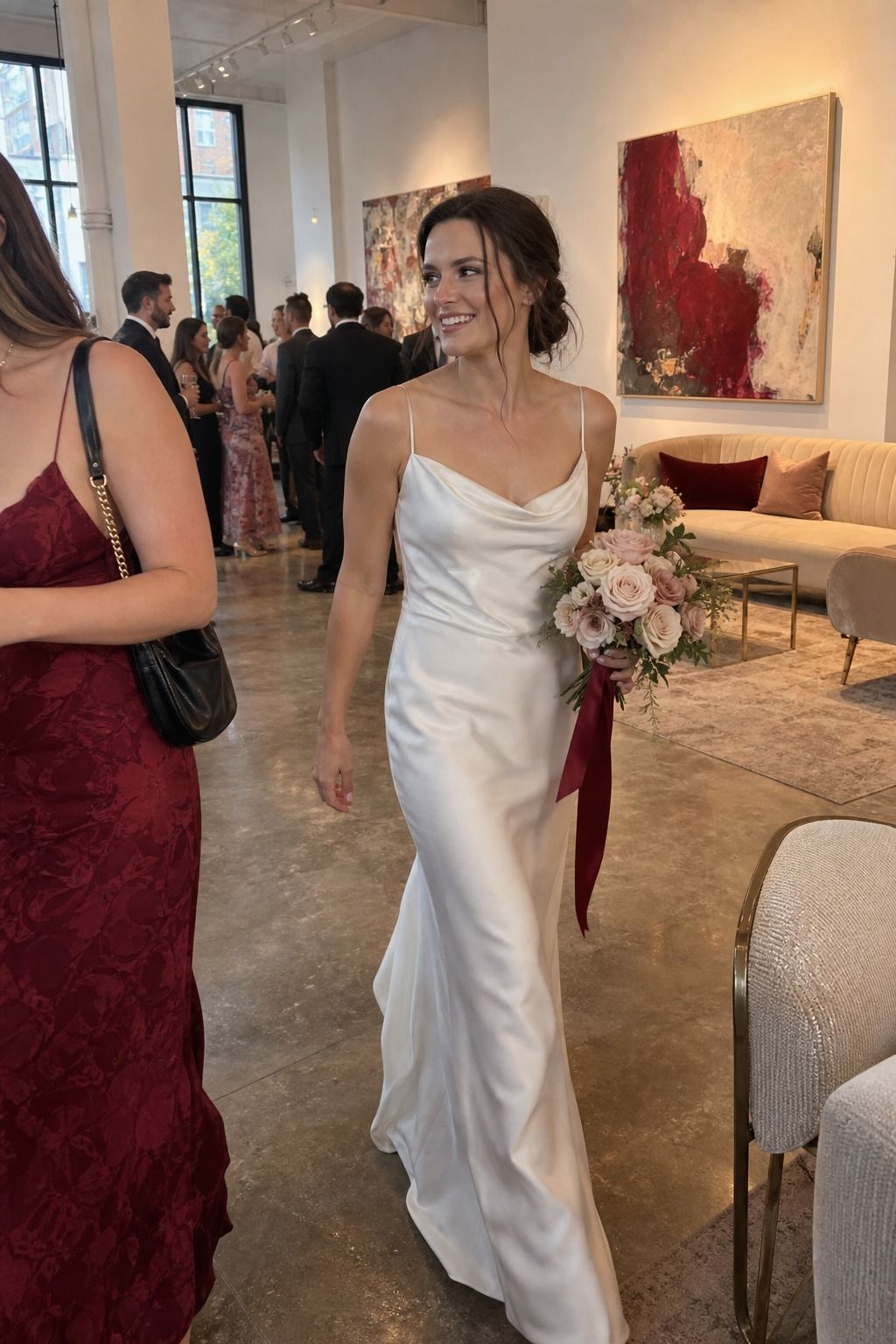
Crimson, blush and champagne is the dressier evening version. Choose one crimson focal point, the bouquet, the tapers or the invitation envelopes, and let champagne glassware and blush napkins warm everything around it.
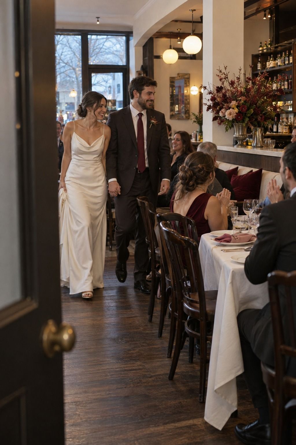
Garnet, rose, ivory and espresso feels like a good bistro at 9pm. Espresso stands in for black on menus and table numbers, which reads softer, and garnet comes through in candles, anemones and deep roses.
Red without the pink
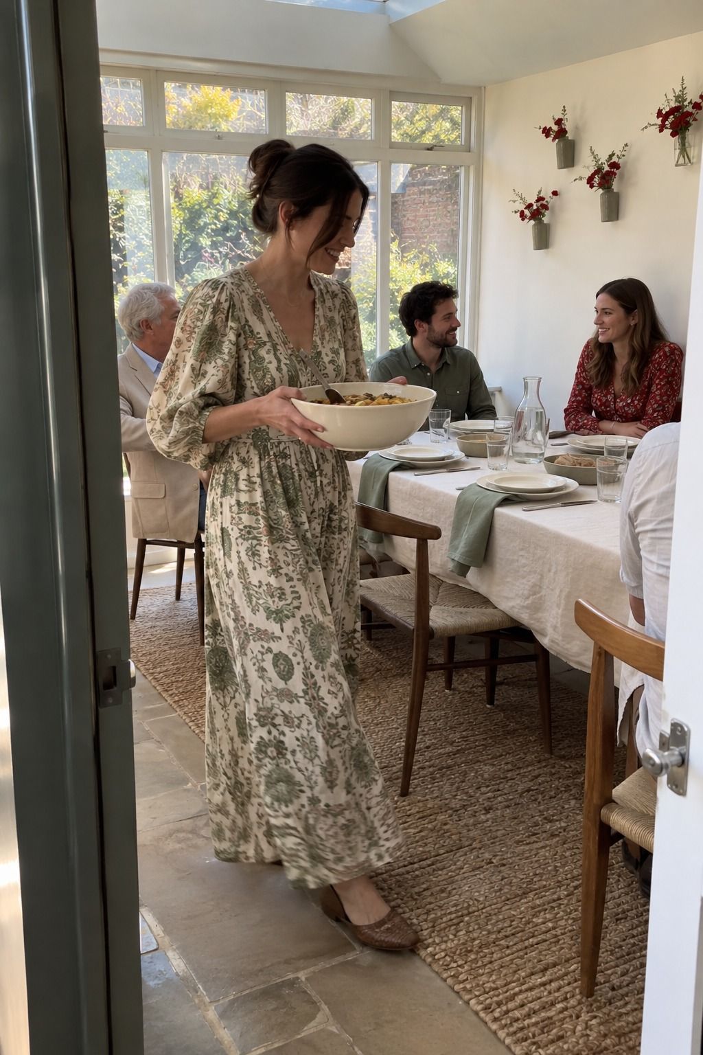
Red, cream and sage is fresher than red with white. Sage shows up in eucalyptus, napkins and place cards, cream covers the main table, and red appears in three or four repeated spots, flowers, candles or a bowl of pomegranates, so it still feels special.

A scarlet accent on a neutral base is the easiest Valentine’s palette to pull off in a venue you can’t change. Ivory, taupe, stone and pale wood become the room. Scarlet shows up as one thing, repeated: a bow on every menu, or one scarlet ranunculus beside every plate.
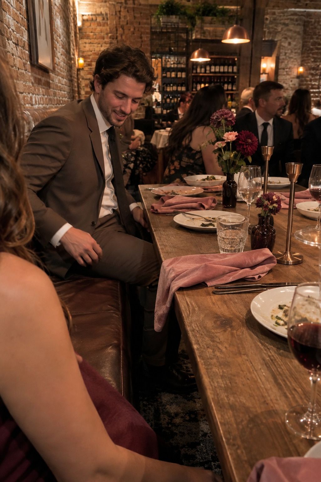
Berry, dusty rose, copper and mocha is cozy and a little unexpected for February. Copper candle holders warm the light, mocha menus ground the table, and berry flowers sit in bud vases near the bar where people gather.
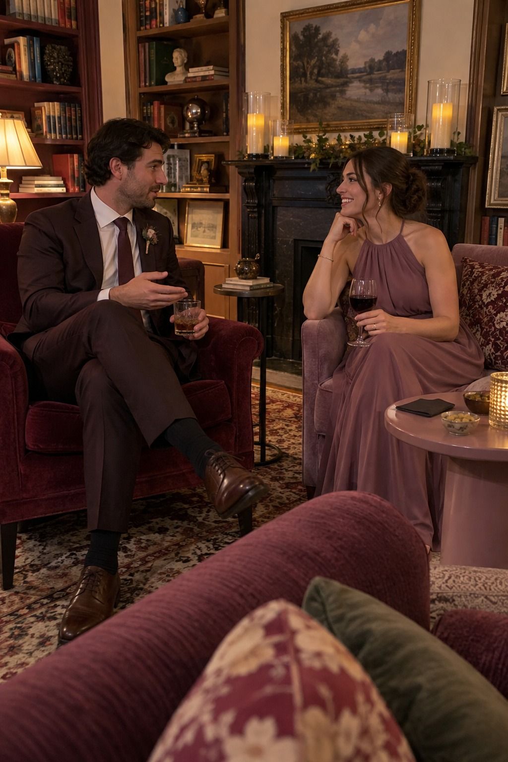
Merlot, mauve and plum need candlelight to work, so plan lots of small candle points and keep florals low. In a library or wine room, those purplish tones look wintry and romantic. In a bright white room, they can look muddy, so test before you commit.
Little or no red

Black, blush and brushed gold turns the date into a cocktail-hour palette. Use black for type, chairs or a single taper per table, blush for flowers and napkins, and brushed gold for flatware. Unless the room is very bright, black shouldn’t be the biggest color.

Raspberry, pale pink and gold is the cheerful option, and it’s lovely at a brunch wedding. Keep raspberry where guests interact with it: the cocktail, the cake, the bouquet ribbon. If you’re leaning this way, my pink and red vintage wedding cake ideas pair well with it.
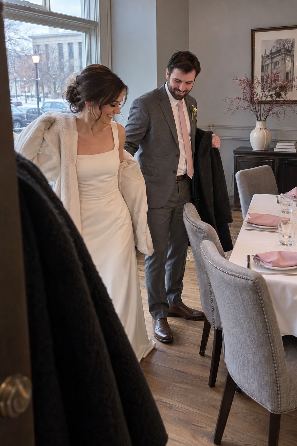
Soft pink, cool gray and ivory is for couples who want the date without the red. Gray keeps pink from going sugary. Because the contrast is low, texture carries the look: letterpress menus, linen napkins, ribbed glass.

Blush, champagne and warm white is the most delicate option. Add interest through materials rather than more color, like pearlized paper, silk ribbon and frosted glass, or it can look flat in photos.
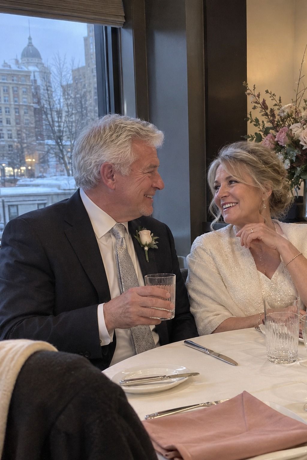
Rose, ivory and silver suits winter hotels and rooms with grey stone or mirrors. Silver should reflect candlelight off glass and flatware, not dominate the table.
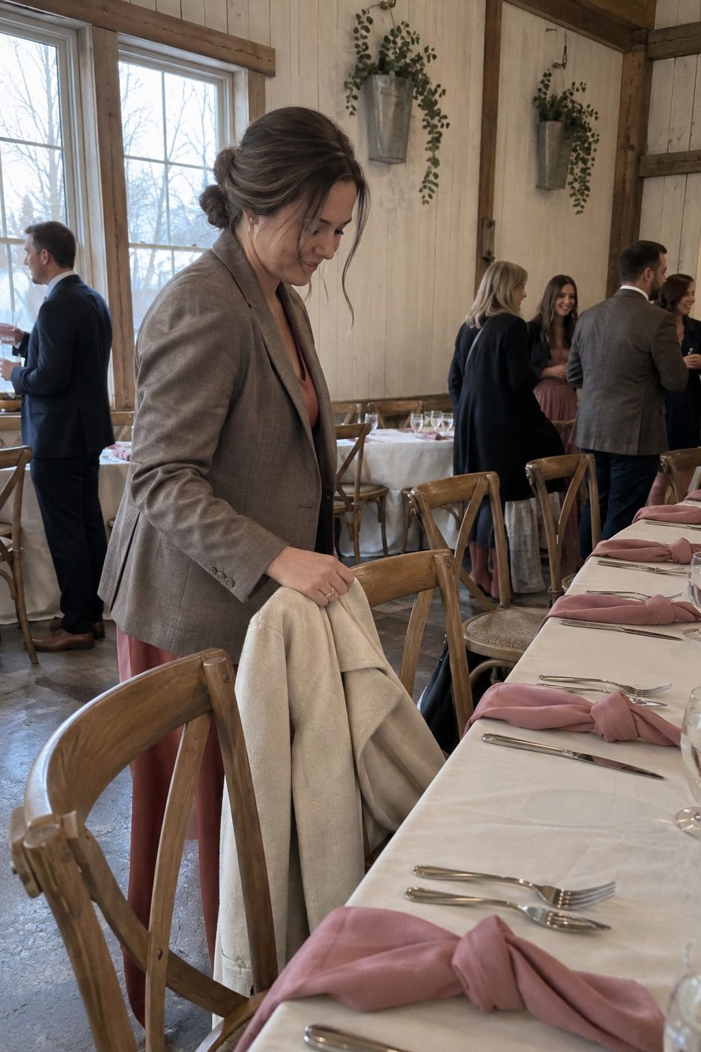
Dusty rose, eucalyptus, cream and taupe is the most forgiving palette here because every color repeats naturally: a taupe menu, a dusty rose napkin, a eucalyptus sprig and a cream candle at each place setting can carry the whole design. For more ideas in this cooler direction, see my winter wedding color palette post.
How do you split a Valentine’s palette across the room?
Use a rough 60/30/10 split: about 60% neutral on linens, walls and big surfaces, 30% soft color in napkins, flowers and paper, and 10% deep color in candles, ribbon and a few blooms. On a table for 10, that 10% might be ten oxblood napkin ties and five tapers. That’s enough.
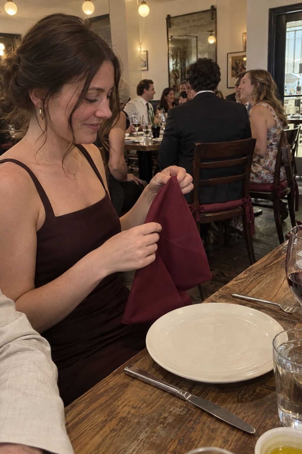
Put the strongest color where guests look for more than a second: napkins, menus, place cards, candles, cocktail garnishes. A deep red taper near every plate does more than a big arrangement across the room, and it costs far less.

Keep the base calm. Restaurants and private rooms come with walls, carpet and chairs you can’t change, and a steady ivory, taupe or soft gray base lets your palette get along with them. My Valentine’s Day wedding decor guide covers how to style that base on the table.
Then repeat each color three to five times and stop. Burgundy might appear in candles, flowers, envelopes and one dessert detail. Blush might be napkins, a few blooms and the menu card. Repetition is what makes a small room look designed.
Test the palette in February light
February light shifts color more than you’d expect, so check swatches at the venue at the hour you’ll actually be there.
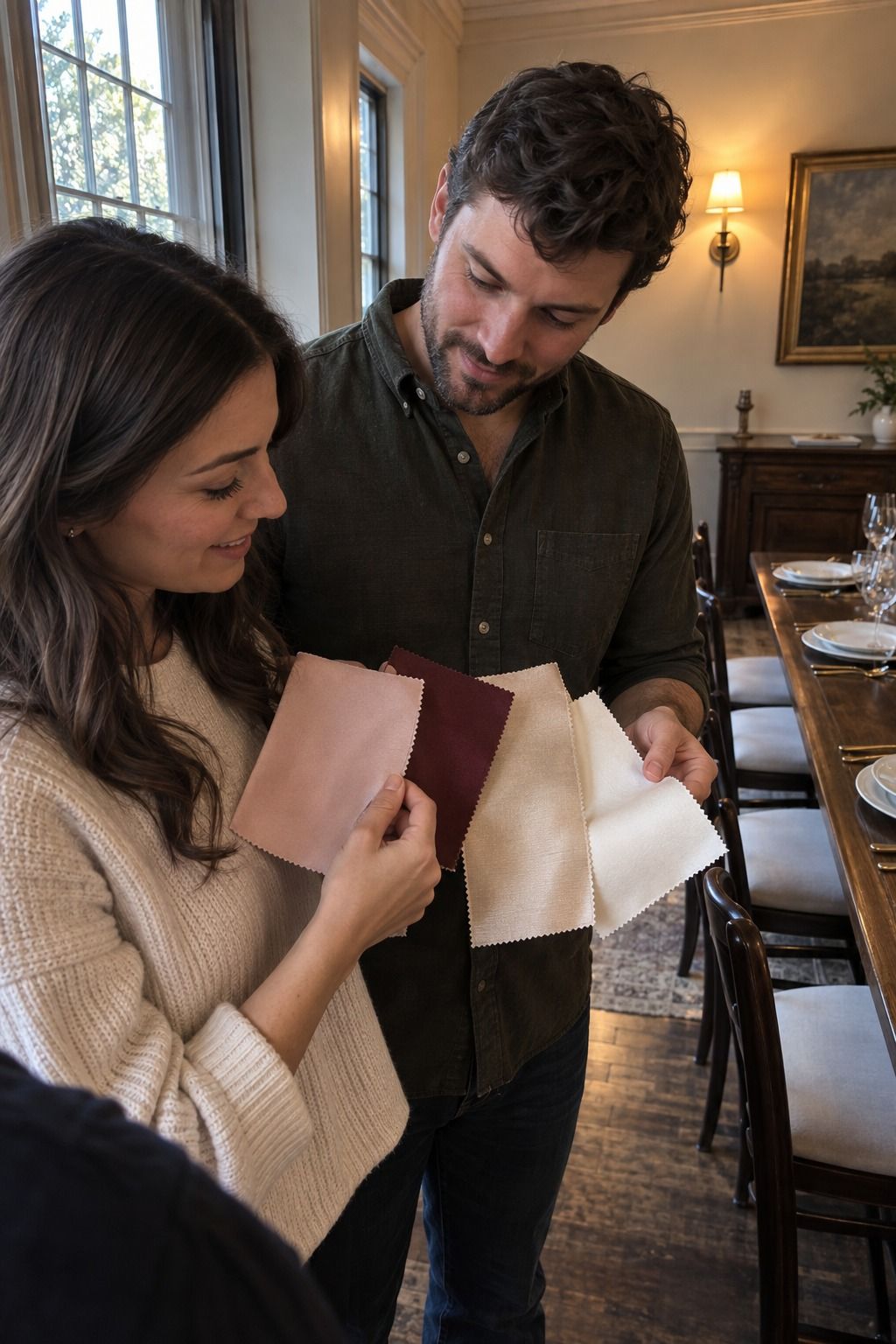
Bring fabric, ribbon, paper and a few flowers, and look at them together under the room’s real bulbs. Blush that looks right on screen can turn peach next to warm lighting, and burgundy can read almost black in a dim room. Photographs exaggerate both.
Screens lie about undertones too. Blush, mauve, champagne and dusty rose are the worst offenders, and at a small wedding there are fewer distractions, so a slightly off napkin shows.
Mistakes that make the palette look like a holiday
Most Valentine’s palettes go wrong in one of four ways, and all of them are easy to avoid if you catch them early.
- Bright red on every surface. Use it once or twice and let neutrals give it room.
- Building the palette around one exact flower. Red roses are in demand that week, so ask for a color family instead and let your florist substitute ranunculus, carnations, tulips, hellebores or anemones. My February wedding flowers post lists more options.
- Choosing colors only from a screen. Order physical swatches.
- Forgetting comfort. February guests need coat space, warm light and readable menus, and a room that’s too dark for the palette’s sake feels cold.
If you’re still deciding on the date itself, the LA Times has a useful piece on planning a Valentine’s Day wedding that covers the trade-offs. My Valentine’s Day wedding ideas post picks up from there.
Key takeaways
- Pick a mood first: soft, moody, fresh or bright.
- Split color roughly 60% neutral, 30% soft color, 10% deep color.
- Put the deepest shade on things guests touch: napkins, menus, candles.
- Ask your florist for a color family, not one exact rose.
- Test swatches in the venue’s real light before ordering linens.
Frequently asked questions
What colors are best for a Valentine’s Day wedding?
Burgundy, oxblood, blush, dusty rose, warm ivory, champagne and sage are the most reliable Valentine’s Day wedding colors. Pick one deep shade, one soft shade and one neutral, then add a metallic only if the venue needs it.
Can you use red and pink together at a wedding?
Yes, as long as one of them is deep and the other is soft. Burgundy or oxblood with blush or dusty rose works well, especially with cream or ivory covering the larger surfaces.
What colors go with burgundy and blush?
Cream, ivory, mauve, dusty rose, taupe, sage, champagne, copper and soft gold all pair well with burgundy and blush. Use cream or taupe as the base so burgundy stays an accent.
Do Valentine’s Day wedding colors have to be red?
No. Soft pink with cool gray, blush with champagne, or rose with ivory and silver all suit a February 14 wedding without any red. The date carries the romance on its own.
How do you keep a Valentine’s wedding from looking like a holiday party?
Keep bright red to about 10% of the room and skip heart motifs entirely. Neutrals on linens and walls, deep color on candles and ribbon, and soft color in flowers and paper read as a wedding first.
The short version
If you take one thing from this: a Valentine’s Day wedding color palette works when the neutral does most of the work and the red shows up where guests can touch it. Choose your mood, choose your three colors, test them in February light, and leave the paper hearts at the shop.
Last update on 2026-10-04 / Affiliate links / Images from Amazon Product Advertising API