

May wedding colors can be brighter, fuller, and more floral than early spring palettes, but the prettiest ones still have structure. Choose one grounding neutral, one lively accent, and one soft supporting shade, then repeat them through flowers, linens, candles, stationery, ribbon, glassware, and small reception details so an intimate wedding feels edited instead of crowded.
The sweet spot for late spring wedding colors is fresh without feeling random. May brings stronger light, fuller gardens, and more colorful flowers, so coral, peach, yellow, rose, blue, magenta, green, and even espresso can look right when every shade has a clear job. Build each May wedding color palette around flowers, tables, attire, paper goods, and small spaces so the whole celebration feels intentional up close.
Recommended Wedding Products


You Might Also Like These Blog Posts
- June Wedding Colors That Look Alive in Summer Light
- July Wedding Colors for Sun, Shade, and Spark
- March Wedding Colors With a Little Mist in Them
- April Wedding Colors for Rainwashed Romance
- September Wedding Colors for the Beautiful In-Between
- October Wedding Colors With Peak-Fall Backbone
May Wedding Colors With Fresh Spring Strength
Use these May wedding color ideas as working palettes, not rigid formulas. Each one gives you a main mood, a grounding shade, and a few easy places to repeat color so your theme feels intentional from ceremony flowers to the last dinner candle.
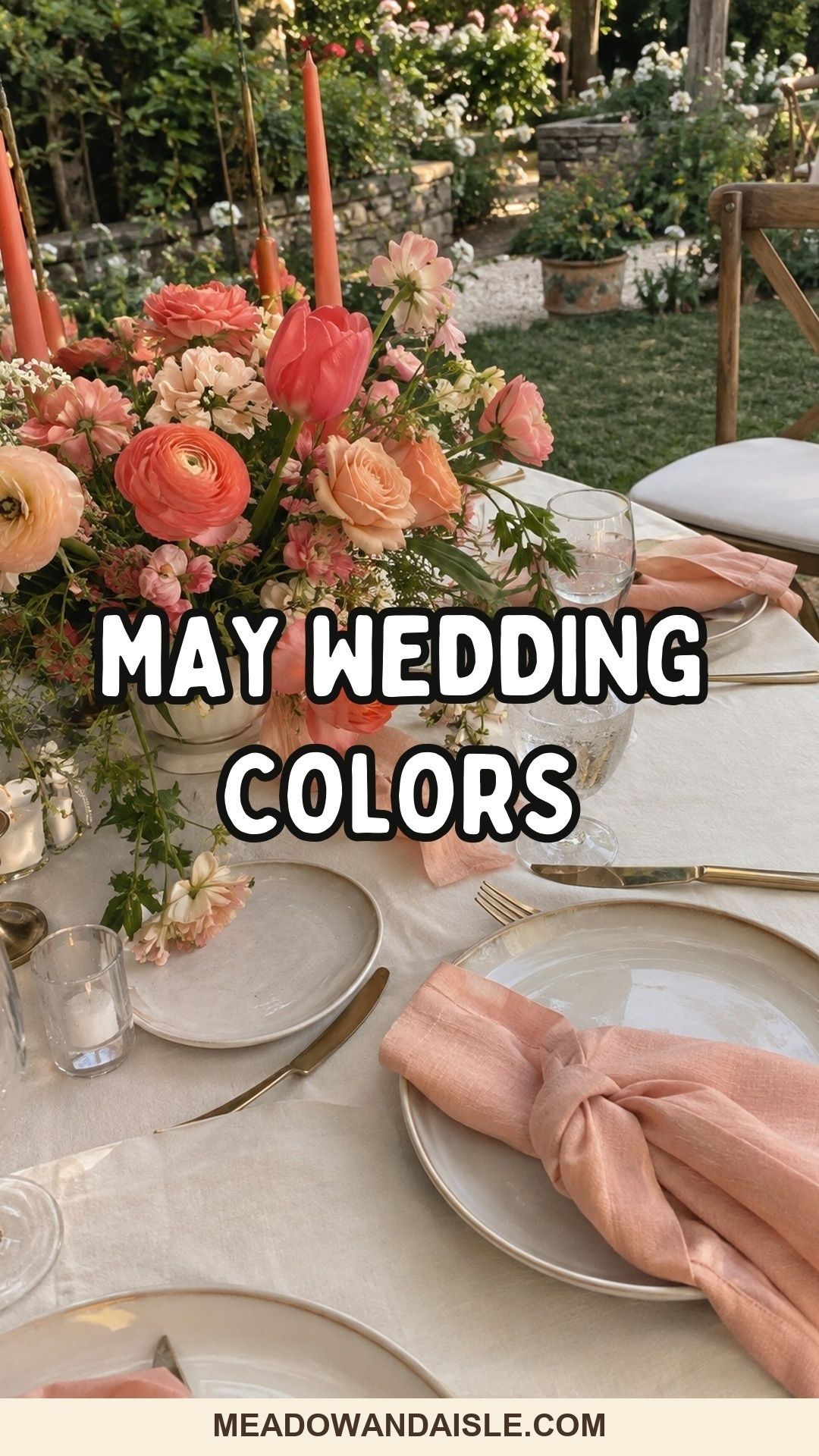
Coral, Peach, and Cream
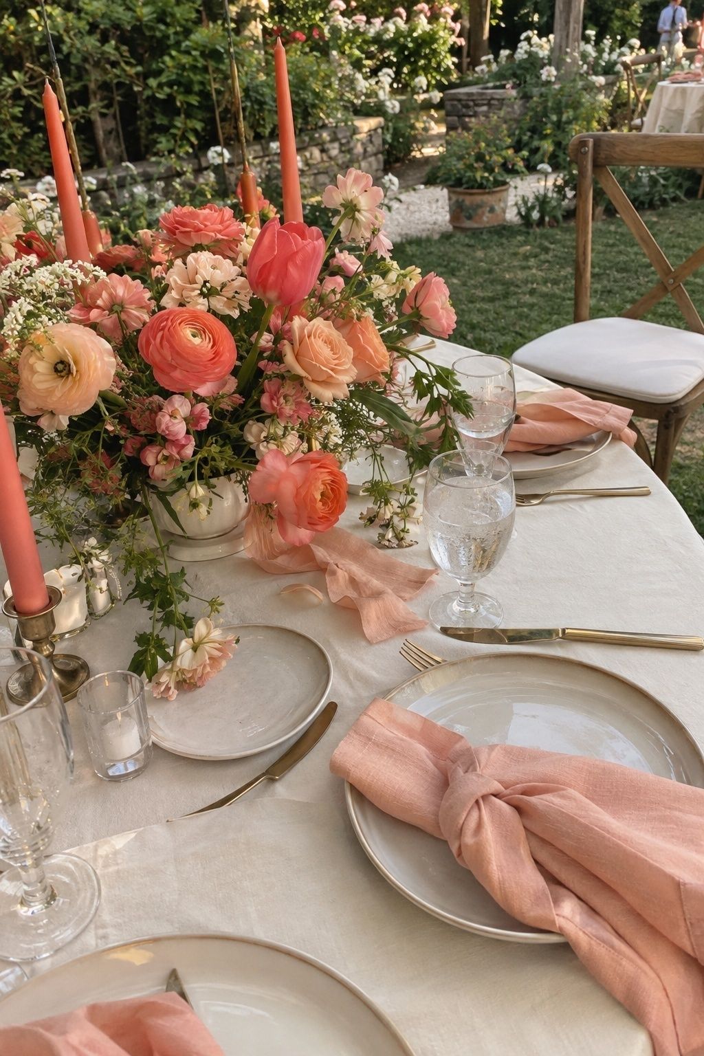
Coral, peach, and cream feel made for May because the palette has warmth without tipping into summer heat. Let cream carry the linens, invitations, and larger surfaces, then bring coral and peach forward through ranunculus, garden roses, tulips, or ribbon.
For a smaller reception, this combination looks polished when the brightest coral appears in only a few places. Try coral taper candles, peach napkins, cream menus, and a bouquet ribbon that ties both shades together.
Butter Yellow, Sage, and Ivory
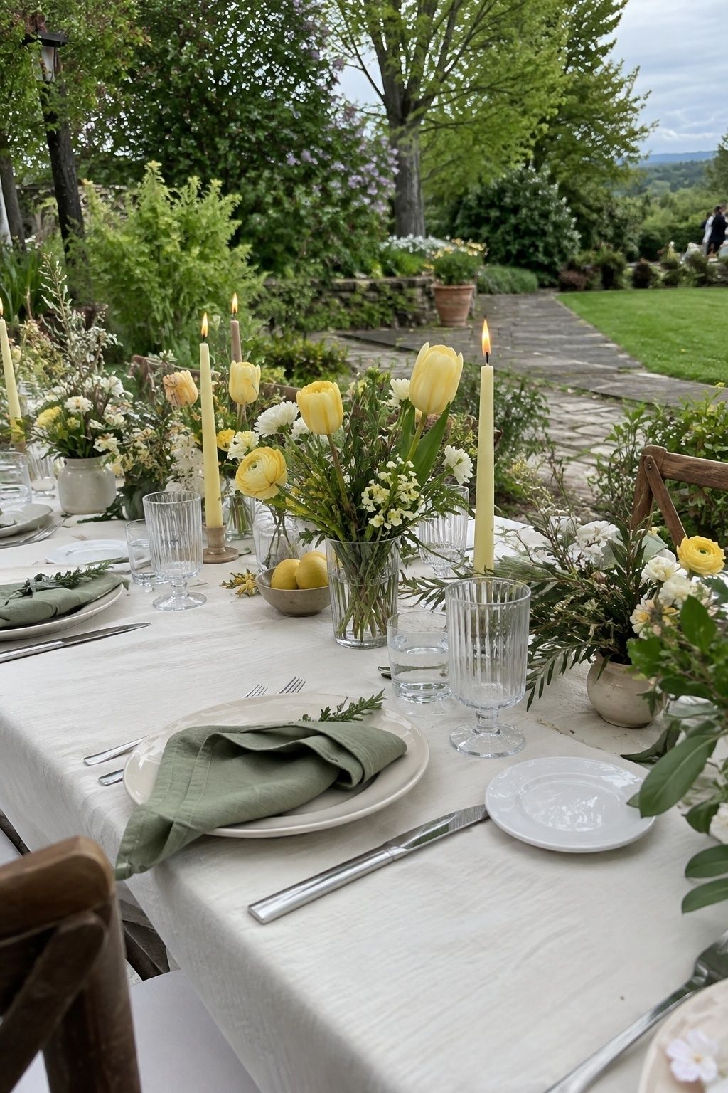
Butter yellow, sage, and ivory create a gentle late-spring glow. Yellow gives the day brightness, sage keeps it grounded, and ivory prevents the palette from becoming too sweet or too green.
This is one of the easiest palettes for an outdoor May garden wedding. Daffodil tones, pale roses, herbs, linen napkins, and soft ivory paper goods all look natural against lawns, hedges, and stone paths.
Magenta, White, and Fresh Green
Magenta, white, and fresh green are for couples who want bright spring wedding colors with confidence. The key is restraint: white gives the eye somewhere to rest, while green makes magenta feel botanical rather than neon.
Let florals carry the strongest pink. A white table with green glassware, magenta blooms, and simple menus feels joyful without crowding a small room. This palette also photographs beautifully beside climbing roses or leafy ceremony backdrops.

Blue, Rose, and Candlelight
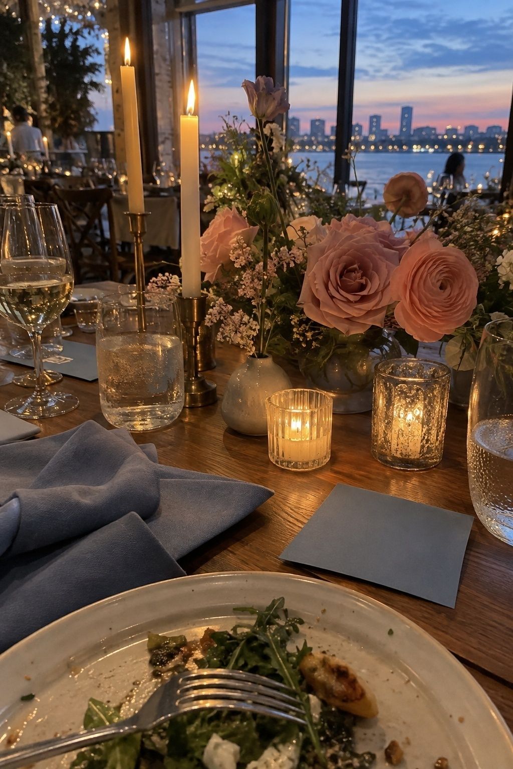
Blue, rose, and candlelight soften May color without returning to predictable pastel territory. Powder blue or dusk blue gives the palette air, rose warms the flowers, and candlelight adds a golden evening layer.
This combination suits restaurant weddings, garden dinners, and tented receptions. Use blue on paper goods or napkins, rose in bouquets and centerpieces, and warm candles on the table so the palette feels romantic after sunset.
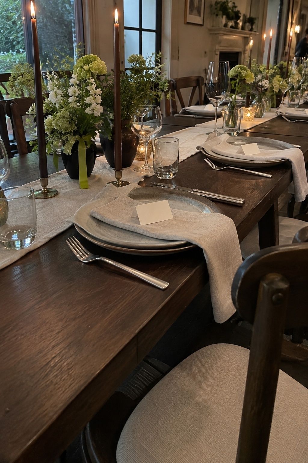
Lime Green, Espresso, and Linen
Lime green, espresso, and linen make a modern May wedding palette with real contrast. Lime brings energy, espresso adds backbone, and linen keeps the whole look from feeling stark.
Use lime in small, clean hits: escort cards, cocktail napkins, bouquet ribbon, or a few unexpected flowers. Espresso works well through chairs, typography, menus, coffee-toned candles, or dark wood tables, especially in intimate dinner settings.
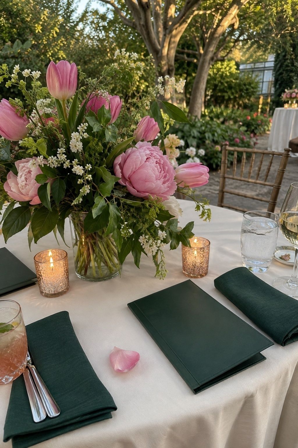
Hunter Green and Bubblegum Pink
Hunter green and bubblegum pink feel playful, but the darker green keeps the palette grown-up. It is a strong choice for museum courtyards, botanical gardens, hotel terraces, and chic spring dinners.
Keep the pink clear and repeated. Pink bridesmaid accents, tulips, peonies, or wax seals feel intentional against hunter green menus, velvet ribbon, or foliage-heavy arrangements. A little rose gold also warms the pair without taking over.
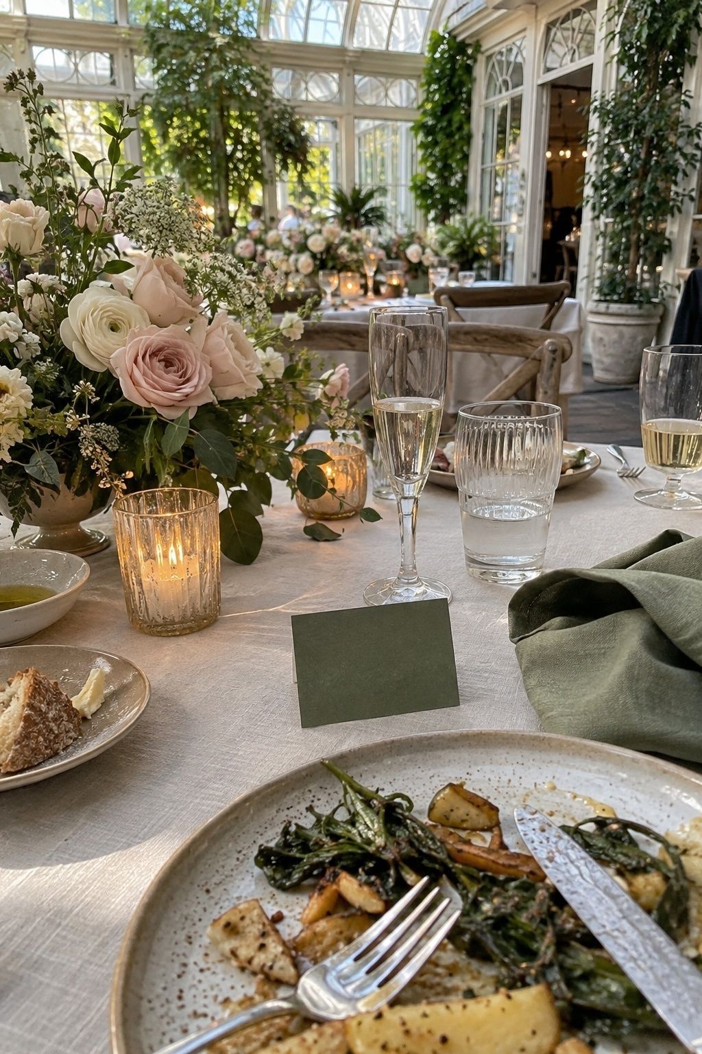
Blush, Champagne, and Leaf Green
Blush, champagne, and leaf green are soft but not sleepy. Blush keeps the wedding romantic, champagne adds a quiet glow, and leaf green makes the palette feel rooted in the season.
This is a lovely May wedding color palette for brunches, conservatories, and small estate weddings. Try champagne votives, blush flowers, leaf-green place cards, and natural linen so the details feel layered rather than overly delicate.
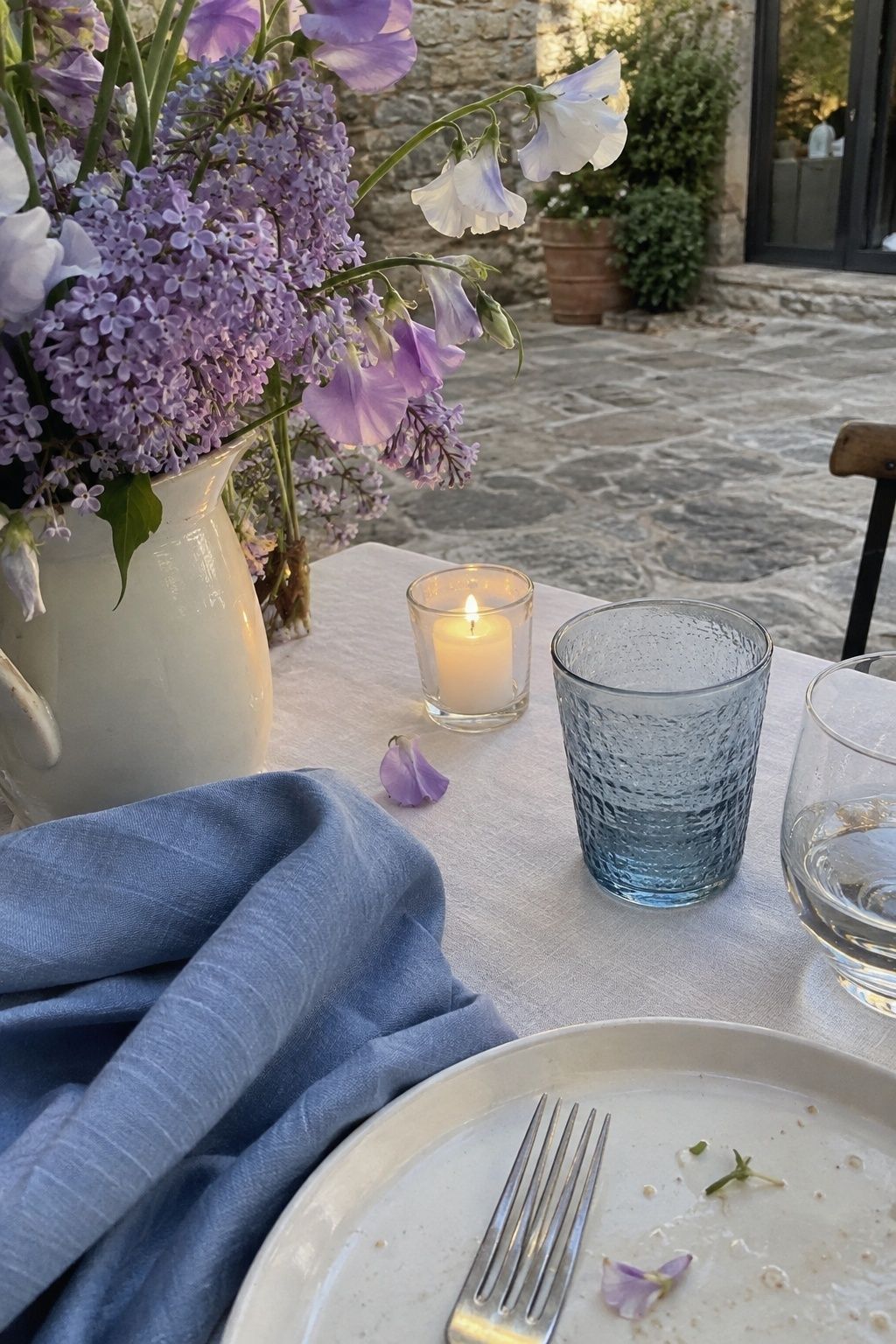
Lavender, Blue, and Soft White
Lavender, blue, and soft white suit couples who want a cooler late-spring May palette. Lavender brings floral romance, blue adds clarity, and soft white keeps the palette bright.
Use this combination when the venue already has greenery or stone. Blue stationery, lavender flowers, white linens, and pale glassware feel especially calm in garden ceremonies, courtyard dinners, and lakeside celebrations.
Golden Yellow and Garden Green
Golden yellow and garden green create a cheerful May palette with natural energy. Yellow feels sunny and celebratory, while green keeps the look connected to leaves, herbs, and outdoor settings.
For an intimate wedding, use yellow where guests will notice it up close: menu flowers, taper candles, bar signage, boutonniere blooms, or petite bud vases. Keep linens and plates simple so the yellow feels fresh instead of loud.

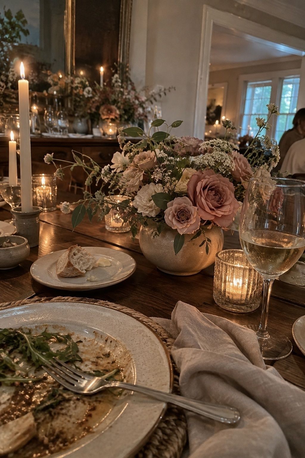
Dusty Rose with Warm Neutrals
Dusty rose with warm neutrals is a graceful choice when you want color but still love softness. Taupe, oatmeal, champagne, and ivory all deepen dusty rose without making the day feel beige.
This palette is especially good for restaurants, barns, private dining rooms, and older homes. Use dusty rose in flowers and paper details, then let neutral linens, wood, ceramic, and candlelight create quiet structure.
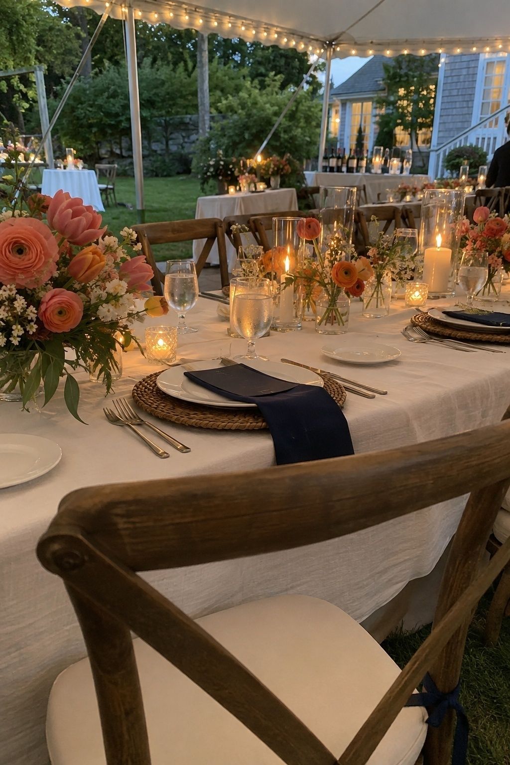
Coral, Navy, and Ivory
Coral, navy, and ivory bring a crisp late-spring wedding look. Navy gives coral definition, ivory lightens the palette, and the combination works well for coastal clubs, garden tents, and polished backyard dinners.
Use navy sparingly in a small wedding so it does not darken the table. Navy ink, suits, ribbon, or menus are enough. Let coral flowers, ivory linens, and warm candlelight keep the mood open.
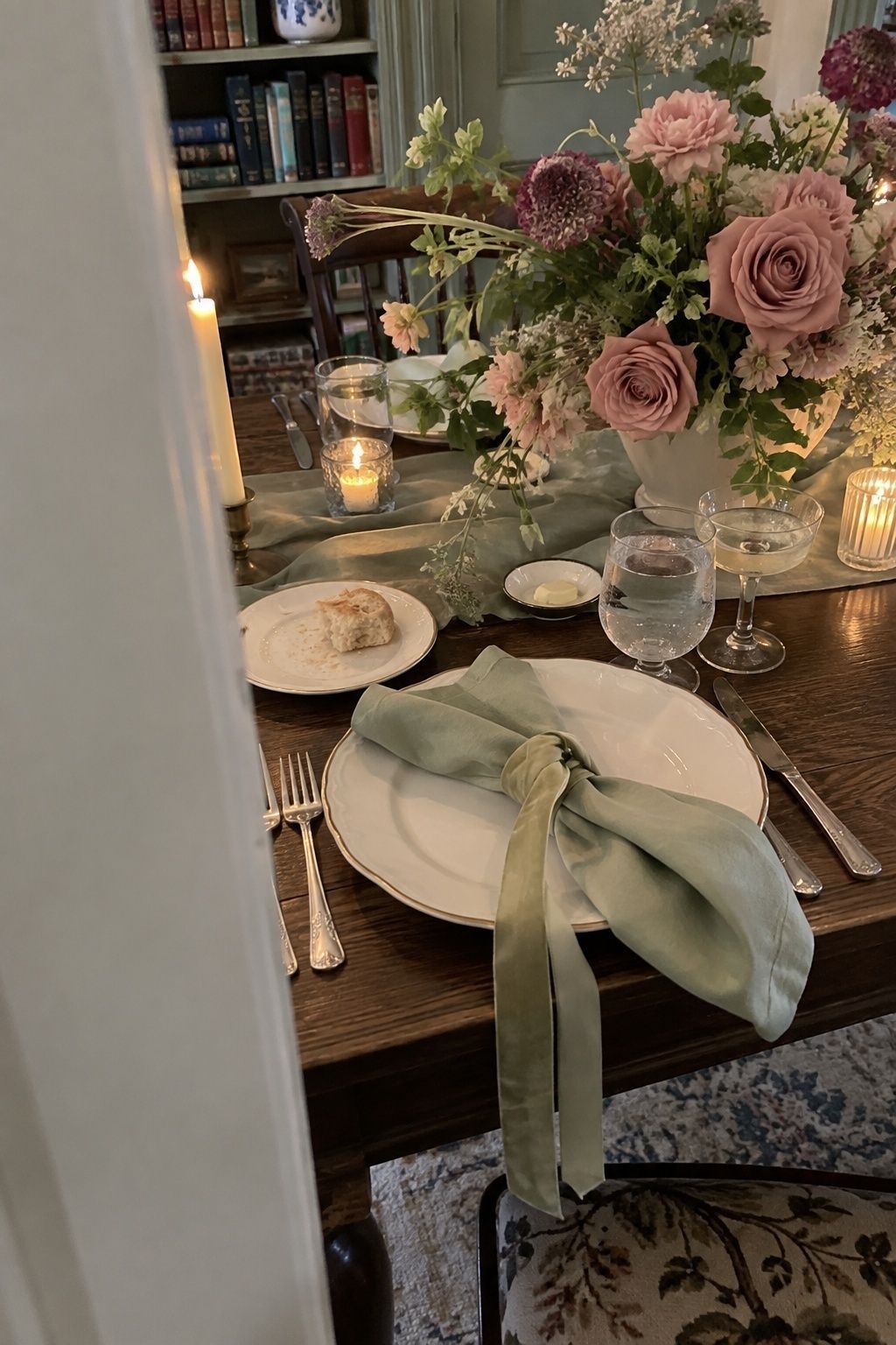
Pistachio, Mauve, and Cream
Pistachio, mauve, and cream feel romantic with a little old-world softness. Pistachio gives the palette a fresh green note, mauve adds depth, and cream keeps it from feeling dusty.
This combination suits historic venues, libraries, gardens, and dining rooms with vintage furniture. Use pistachio on linens or envelopes, mauve in flowers, and cream across stationery and candles for a balanced look.
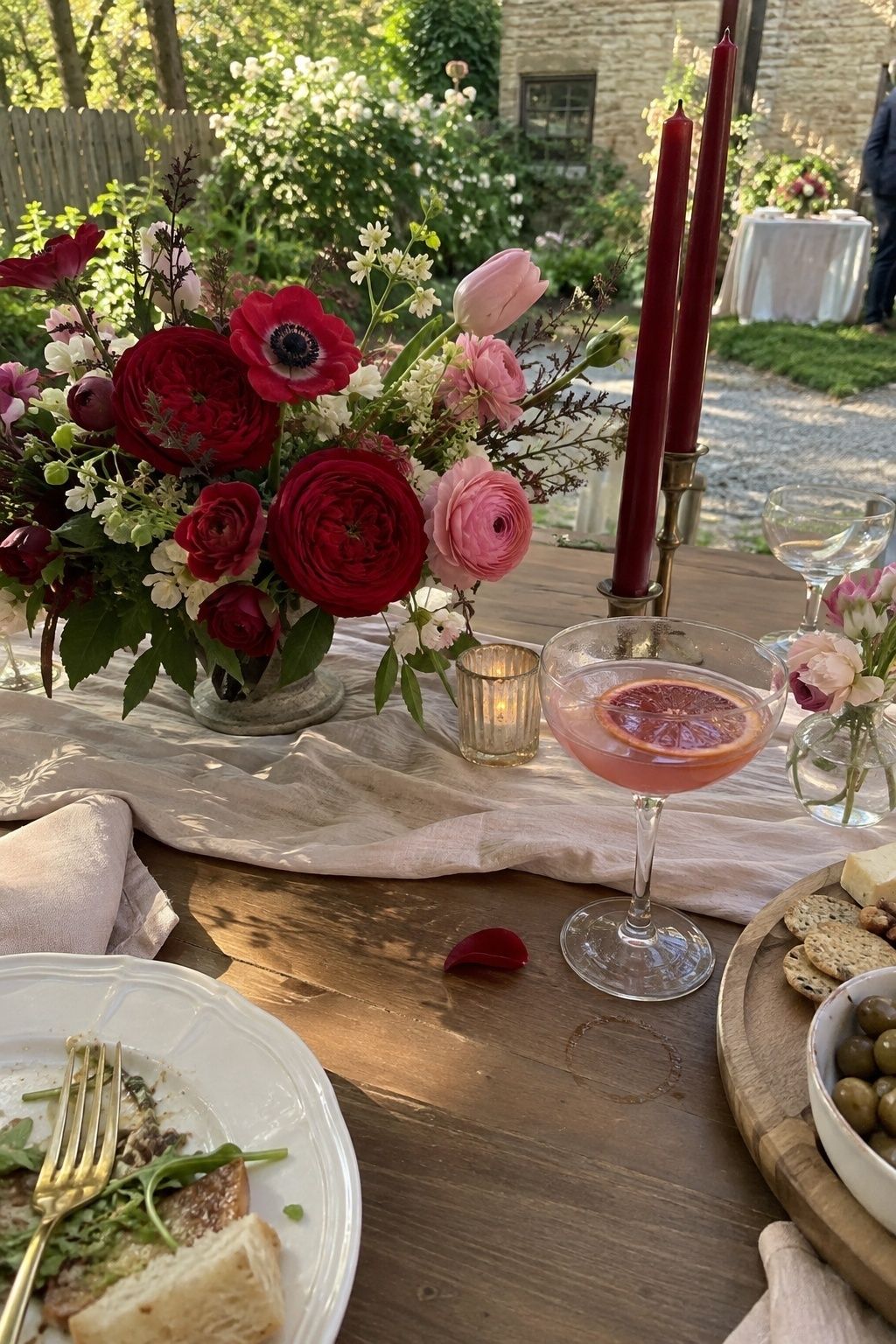
Rose Red and Petal Pink
Rose red and petal pink make May feel romantic without waiting for summer’s deeper color. Petal pink softens the palette, while rose red gives bouquets, lipstick, candles, or signature drinks a memorable edge.
Balance the two shades with white, ivory, or natural wood. This keeps the palette airy for a small wedding and lets roses, ranunculus, anemones, or tulips feel lush without becoming heavy.
Powder Blue and Spring White
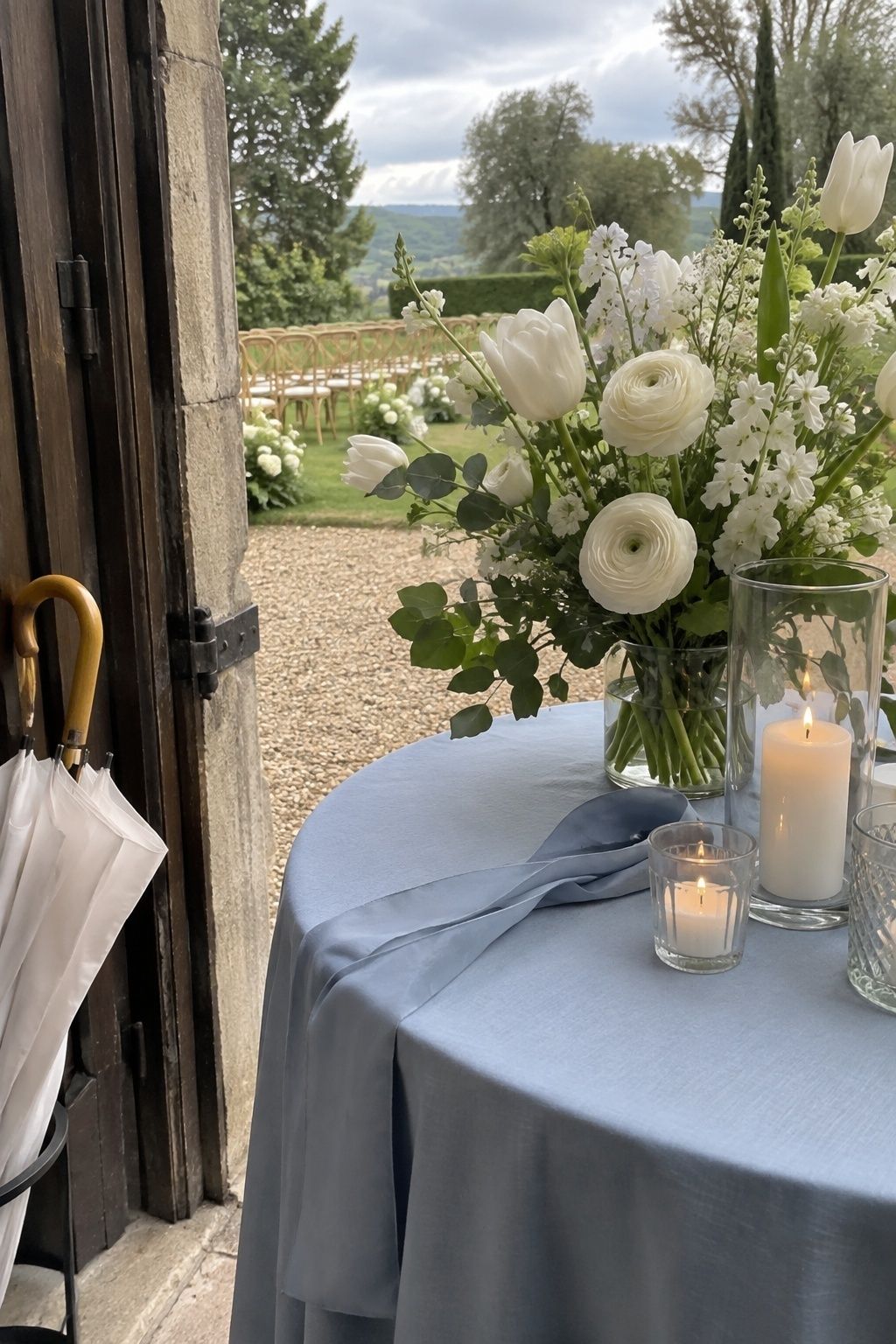
Powder blue and spring white feel clean, classic, and easy to adapt. Blue brings a gentle coolness to warmer May light, while white keeps the whole celebration crisp.
Use powder blue for napkins, stationery, cake details, or bridesmaid accents. White flowers, white linens, and clear glass keep the palette light, especially at outdoor ceremonies where the sky already becomes part of the color story.
Fresh Green and Soft Black
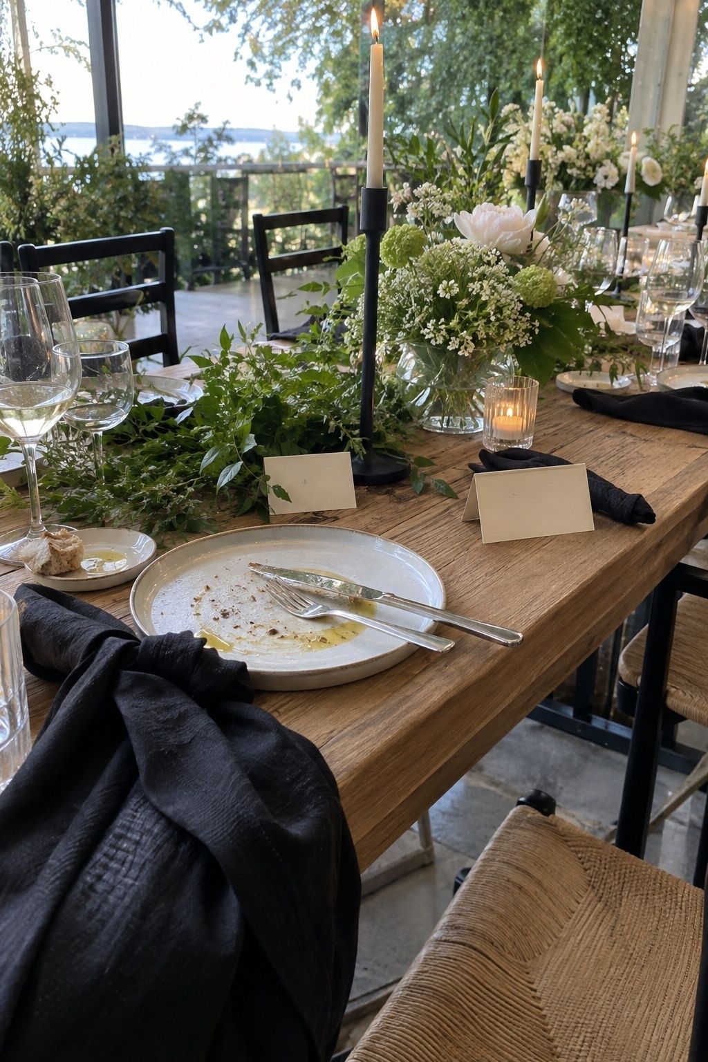
Fresh green and soft black give May weddings a tailored edge. Green keeps the palette seasonal, while soft black adds definition through typography, chairs, taper candles, menus, or attire.
This pairing works best when black is a line, not a wall. Think black ink on cream cards, slim black candleholders, green-and-white flowers, and one dark ribbon around the bouquet.
Terracotta with Spring Peach
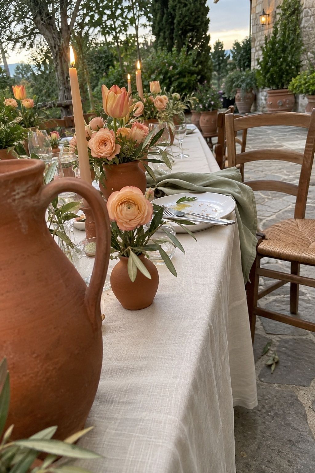
Terracotta with spring peach bridges the warmth of summer and the softness of May. Terracotta adds earthiness, peach keeps the palette fresh, and cream or pale green prevents the combination from feeling too autumnal.
Use terracotta in pottery, napkins, envelope liners, or taper candles, then bring peach forward in flowers and printed details. This is a beautiful choice for garden patios, ranch settings, courtyards, and intimate outdoor dinners.
How to Use May Colors Without Overwhelming a Small Wedding
Ground Bright Shades with Neutrals
Bright May color needs a place to land. Ivory, cream, linen, taupe, soft black, espresso, navy, and natural wood all give vivid shades more polish. Choose the neutral first for tables, paper, or attire, then decide where the livelier color belongs.
For a small wedding, this keeps close-up details from competing with one another. Guests notice menus, napkins, glassware, candles, and flowers at arm’s length, so repeated color feels more refined than many separate accents.
Let Florals Carry the Boldest Color
Flowers are often the most natural place for strong May color. Coral, yellow, magenta, rose, lavender, blue, and fresh green look alive in bouquets and centerpieces because they already belong to the season.
If the palette feels risky, put the boldest color in flowers first and keep linens quieter. This gives the wedding movement, fragrance, and depth while protecting the table from looking too busy.
Repeat One Accent in Several Small Places
A single accent repeated three or four times will look more deliberate than a new color in every category. Try peach in flowers, wax seals, and napkins, or blue in stationery, glassware, and ribbon.
This rhythm is especially helpful for intimate weddings because fewer guests means fewer tables and fewer large decor moments. Small repeats create the feeling of a designed celebration without asking every surface to perform.
Check the Palette against Venue Greenery
May venues often come with their own color story. Lawns, hedges, trees, spring flowers, brick, stone, water, and tent fabric all affect how your palette reads in person and in photos.
Before finalizing linens or attire, compare swatches at the venue or against similar outdoor light. A color that looks soft indoors can become brighter outside, while pale shades can disappear beside strong greenery.
FAQ
What are the best May wedding colors?
The best May wedding colors feel floral, fresh, and grounded. Coral, peach, butter yellow, sage, rose, powder blue, lavender, fresh green, ivory, and cream all fit the season beautifully. For more contrast, try magenta with white and green, coral with navy and ivory, lime with espresso and linen, or hunter green with bubblegum pink. The strongest palette usually has one soft base, one lively accent, and one grounding tone.
What color palette works for a May wedding?
A good May wedding color palette depends on the venue and time of day. Garden ceremonies suit butter yellow, sage, ivory, lavender, blue, blush, and leaf green. Restaurant or evening weddings can carry rose, candlelight, navy, espresso, or soft black. Outdoor brunches look lovely with peach, cream, powder blue, and spring white. Choose colors that match the existing setting, then repeat them in flowers, linens, stationery, and candles.
Can May wedding colors be brighter than pastels?
Yes, May wedding colors can be brighter than pastels because late spring has stronger light, fuller greenery, and more colorful flowers than early spring. Coral, golden yellow, magenta, rose red, fresh green, and bubblegum pink can all look beautiful in May. The trick is giving bright color a calm partner, such as ivory, linen, cream, navy, espresso, or soft black, so the celebration still feels polished.
What May wedding colors look good outdoors?
Outdoor May weddings usually look best with colors that respect the natural setting. Butter yellow and sage, powder blue and white, blush and leaf green, coral and cream, lavender and blue, and golden yellow with garden green all work well outside. If the venue has very strong greenery, add a grounding shade like linen, ivory, taupe, navy, or espresso so flowers and table details do not disappear against the landscape.
How do you choose May wedding colors for a small wedding?
For a small wedding, choose fewer colors and repeat them with more care. Start with one neutral, one accent, and one supporting shade. Put the neutral on larger surfaces like linens or stationery, let flowers carry the boldest color, and repeat the accent in small details such as napkins, candles, ribbons, menus, wax seals, or glassware. This keeps the design personal, warm, and easy for guests to take in.
What flowers match May wedding color palettes?
Many spring flowers match May wedding palettes, including tulips, ranunculus, garden roses, peonies, sweet peas, anemones, lilac, delphinium, iris, stock, and seasonal greenery. Coral and peach palettes look lovely with ranunculus and roses, yellow palettes suit tulips and spring branches, blue palettes pair well with delphinium, and pink or red palettes can use garden roses, peonies, and anemones. Ask your florist what is strongest locally that week.
Final Thoughts
May wedding colors work best when they feel alive but still edited. Let the month give you flowers, green backdrops, brighter light, and permission to use color with confidence, then keep the day grounded with calm neutrals, repeated details, and a palette that makes sense in your actual venue.
Before ordering flowers, linens, or attire, test the palette against the venue light, existing greenery, table materials, and guest experience so the finished celebration has room for fresh spring wedding color pairings and brighter late-spring color combinations.
Last update on 2026-10-03 / Affiliate links / Images from Amazon Product Advertising API