

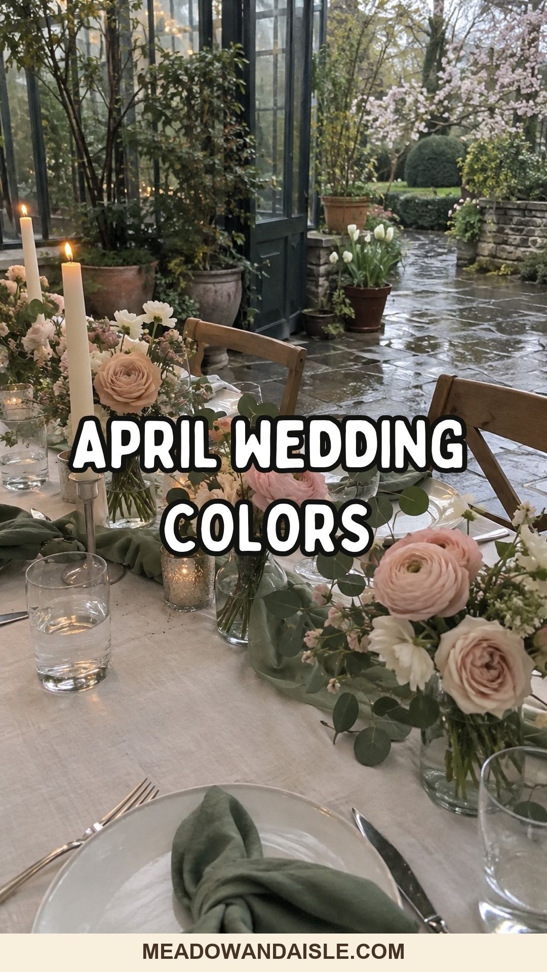
The best April wedding colors pair one soft spring shade with a fresh base and a deeper anchor, such as blush with sage and ivory, or slate blue with blush. That anchor (sage, slate, olive, moss, dove grey or mauve) is what keeps pastels from washing out under cloudy April skies and in indoor backup rooms.
Here’s my honest opinion on April wedding colors: an all-pastel palette almost never survives the month. Pale pink, pale blue and pale yellow look lovely on a screen, then go flat the moment the sky turns silver or the ceremony moves into a beige function room.
The fix is small. Keep the soft spring color you love and give it something heavier to lean on. Every palette below is built that way, with a lead color, a base and an anchor, so you can pick one and know it will still look like a decision in the rain.
For pulling your palette together
A few things that make it easier to test and repeat color across the day, from ribbon to candles.


How do you choose April wedding colors?
Choose one lead spring shade, one fresh or neutral base, and one deeper anchor tone. The lead goes into flowers and accents, the base covers linens and paper, and the anchor appears in a few repeated details so the palette has weight in photos.
Then adjust for the room. A garden can take more green. A restaurant with strong wall colors needs deeper napkins or ribbon so the palette doesn’t disappear. A ballroom under warm light usually wants cream instead of bright white.
Here are all 16 palettes at a glance.
| Palette | Lead | Base | Anchor | Suits |
|---|---|---|---|---|
| Blush, sage, ivory | Blush | Ivory | Sage | Almost any venue |
| Dusty rose, eucalyptus | Dusty rose | Warm white | Eucalyptus | Mixed weather |
| Rainy grey, spring pink | Pink | Pale grey | Charcoal grey | Rain-likely dates |
| Slate blue, blush | Blush | Ivory | Slate blue | Portraits |
| Powder blue, peach, cream | Peach | Cream | Powder blue | Churches, garden rooms |
| Dove grey, pastel blue, pearl | Pastel blue | Pearl | Dove grey | Historic venues |
| Baby blue, warm white | Baby blue | Warm white | Candlelight | Clean, simple days |
| Lavender, butter yellow, white | Lavender | White | Butter yellow | Garden parties |
| Pale yellow, garden green | Pale yellow | Ivory | Garden green | Daytime, outdoors |
| Soft lilac, fresh green | Lilac | Neutral linen | Fresh green | Greenhouses |
| Fern green, candlelight | Fern green | Ivory | Candle glow | Small dinners |
| Mint, ivory, pale gold | Mint | Ivory | Pale gold | Polished rooms |
| Pistachio, mauve, linen | Mauve | Linen | Pistachio | Editorial look |
| Peach, moss, champagne | Peach | Champagne | Moss | Stone and brick |
| Coral, cream, fern | Coral | Cream | Fern | Color lovers |
| Violet, ivory, olive | Violet | Ivory | Olive | Evening receptions |
Soft pink April palettes
Pink is the most requested April color and the one that most needs an anchor. These four give it one.
Blush, sage and ivory
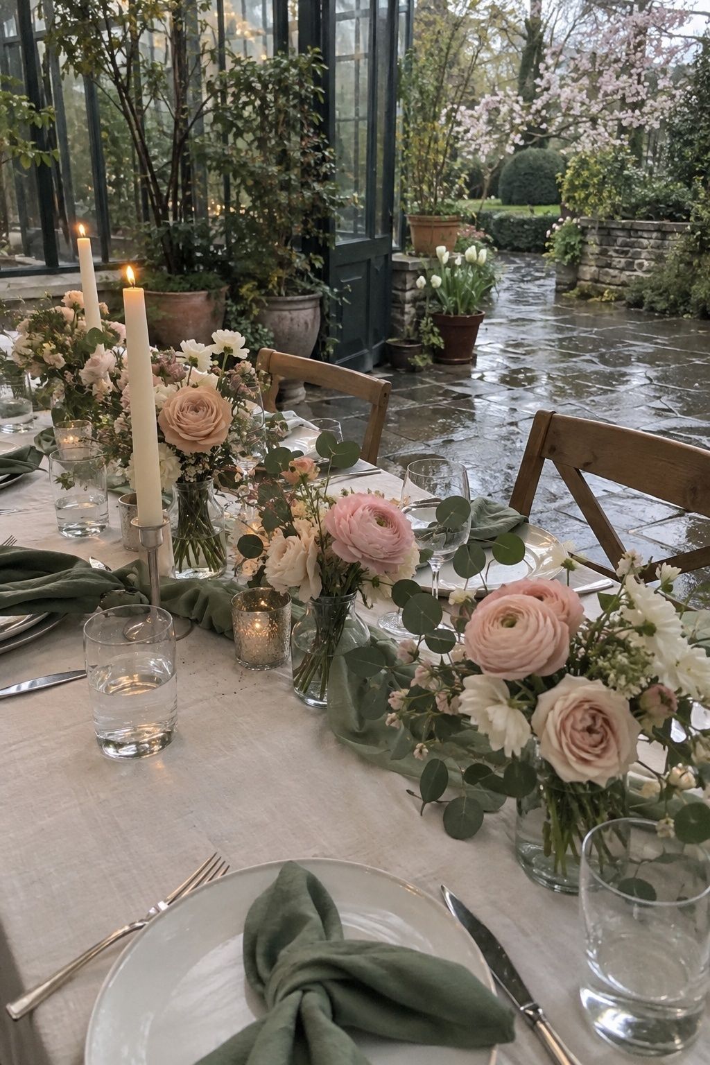
This is the safe starting point, and safe isn’t an insult here. Blush goes into roses, ranunculus and menu details. Sage shows up in napkins, greenery, bridesmaid dresses or wax seals. Ivory is the empty space: tablecloths, tapers, envelopes. If you can’t decide, start here and adjust.
Dusty rose and eucalyptus

Dusty rose has enough depth to hold up in dim light, and eucalyptus brings cool green movement to bouquets and tables. Add ivory if the room needs brightening.
Rainy grey with spring pink
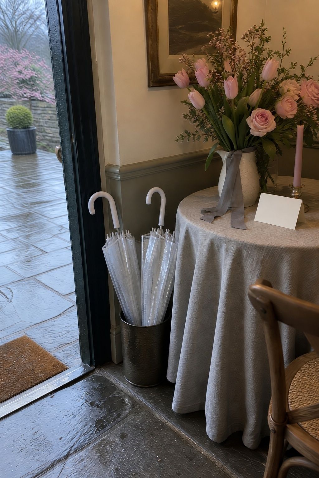
If your date has a high chance of rain, design with the weather. Grey in paper, linen, suiting or velvet ribbon, and pink in flowers, place cards and cake details. Wet stone and grey skies then look like part of the plan.
Slate blue and blush
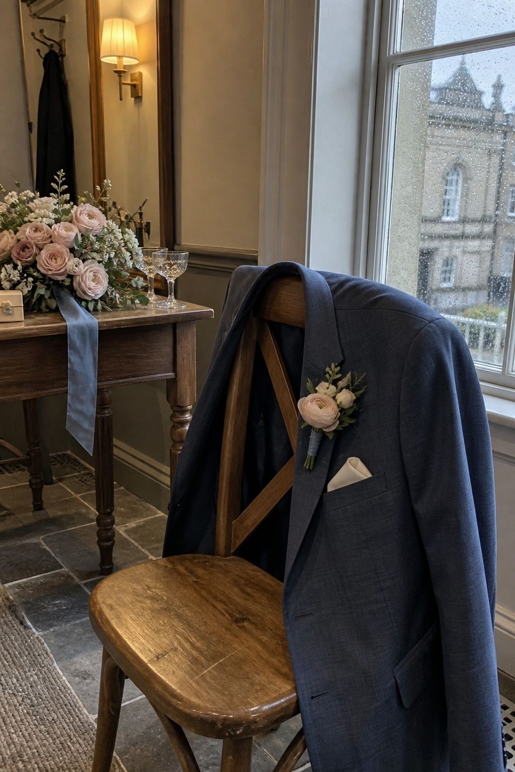
My favorite for photos. Slate blue suits, napkins or tapers give contrast, and blush in the bouquets keeps it soft. Portraits come out with clear separation between people, flowers and background.
Blue April wedding colors
Blue is the most April-looking color family, but pale blue alone reads cold under cloud. Each of these adds warmth.
Powder blue, peach and cream
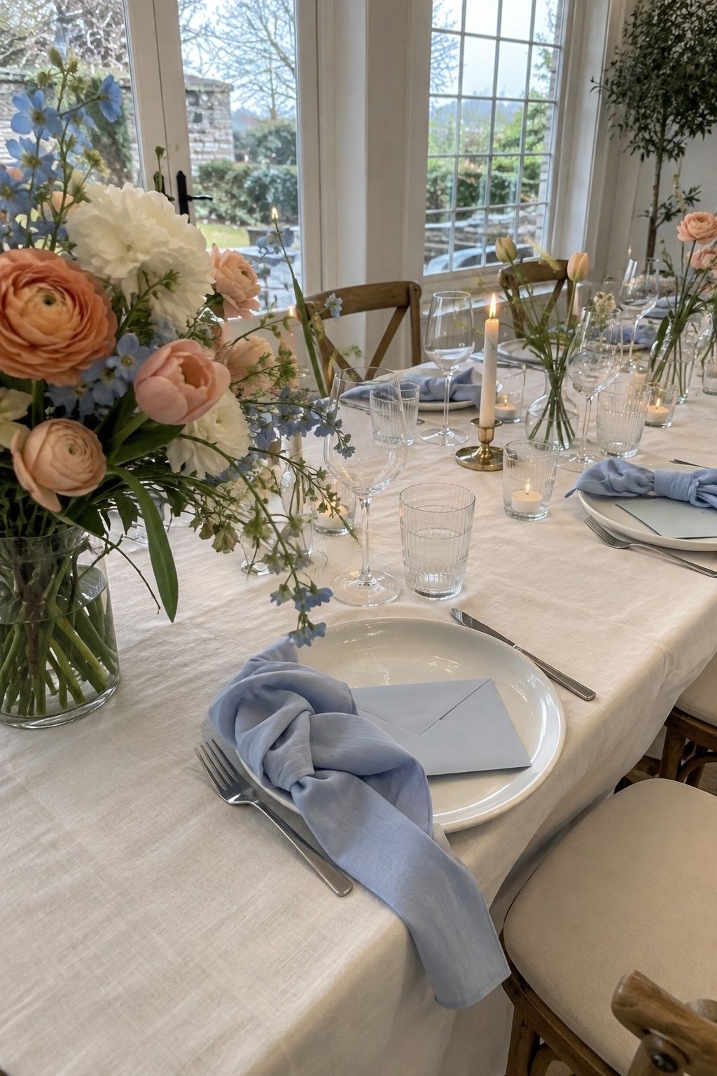
The warm peach is what makes powder blue work on a grey day. Try blue stationery and bouquet ribbon, peach-centered flowers and cream linens. It suits churches, garden rooms and tented receptions.
Dove grey, pastel blue and pearl
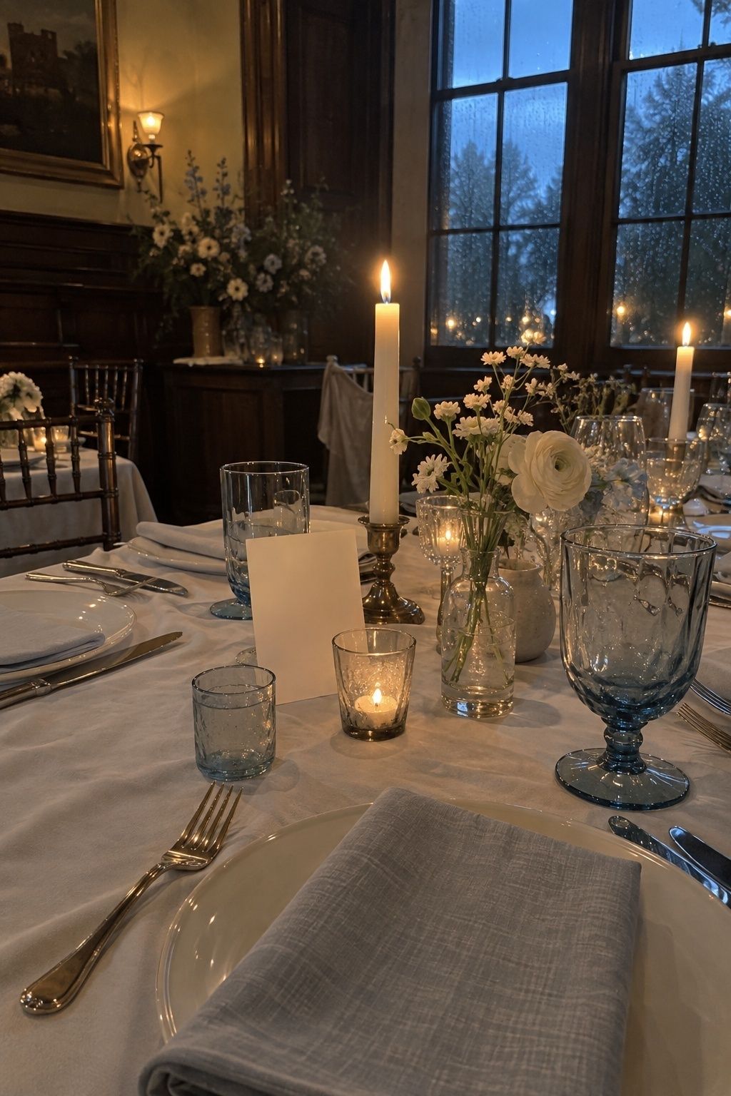
Quiet and polished, especially in historic venues and candlelit dining rooms. Grey goes into suiting, napkins and stationery, pastel blue into flowers or glassware, and pearl into candles and accessories.
Baby blue and warm white
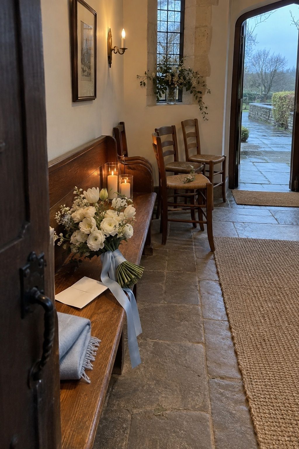
The trick is warmth. Pair baby blue with cream paper, mostly white flowers and real candlelight so the palette reads fresh instead of icy. Keep the blue to envelopes, menus, table numbers and a few stems.
Garden greens and spring yellows
These palettes lean into what April actually looks like outside: new leaves, daffodils and fresh lawns.
Lavender, butter yellow and white
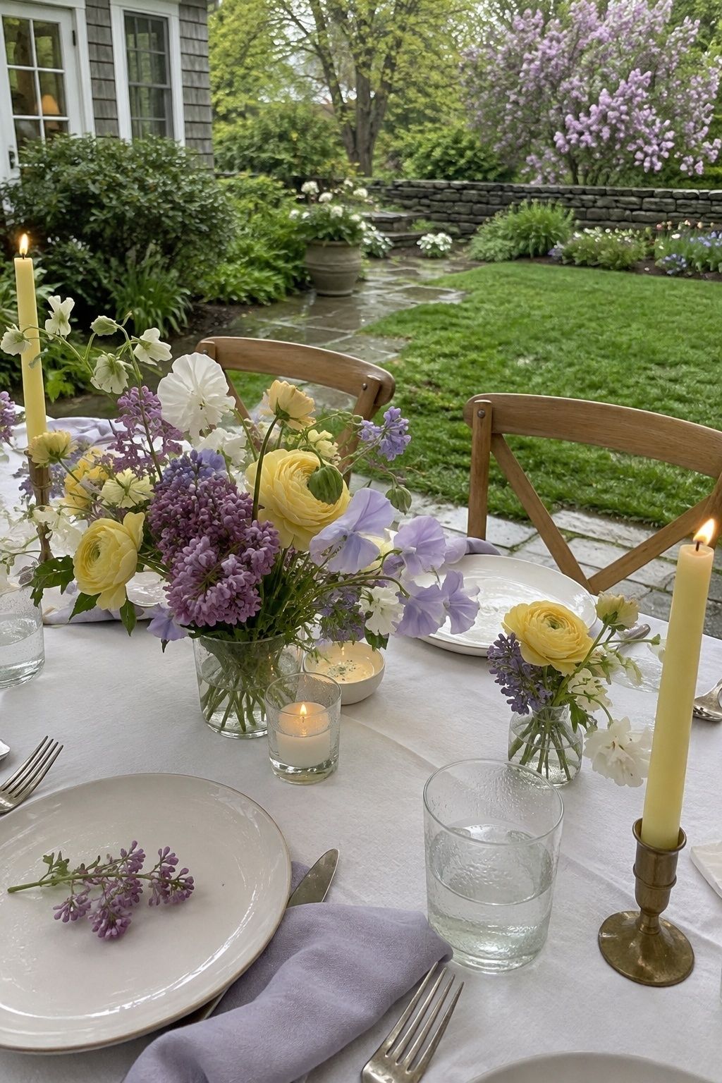
Cheerful without looking like a kids’ party, as long as the yellow stays buttery and the lavender stays soft. Lavender for dresses, lilac stems and envelope liners. Butter yellow for candles and ranunculus. White plates and flowers keep the table clean.
Pale yellow and garden green
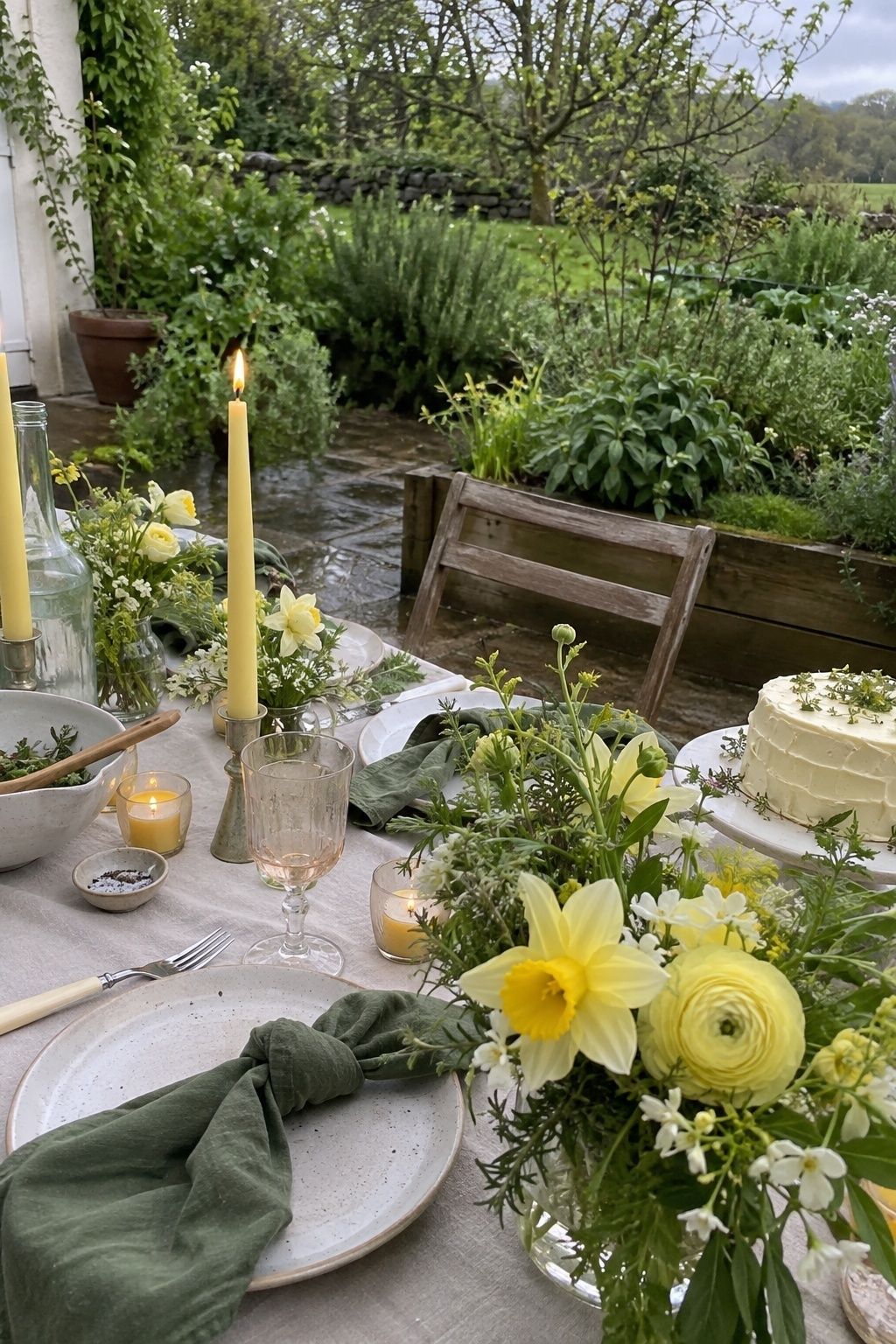
Green does the heavy lifting here, in linens, foliage and escort cards. Yellow stays pale and appears sparingly through candles, flowers and small cake details.
Soft lilac with fresh green
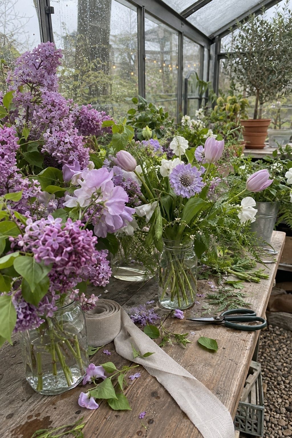
Lilac, sweet pea, tulips or scabiosa carry the color, and fresh green comes through stems, ferns and herbs. Keep the linens neutral and let the flowers be the brightest thing on the table. If you want help picking stems, my guide to April wedding flowers lists what’s reliably in season.
Fern green and soft candlelight
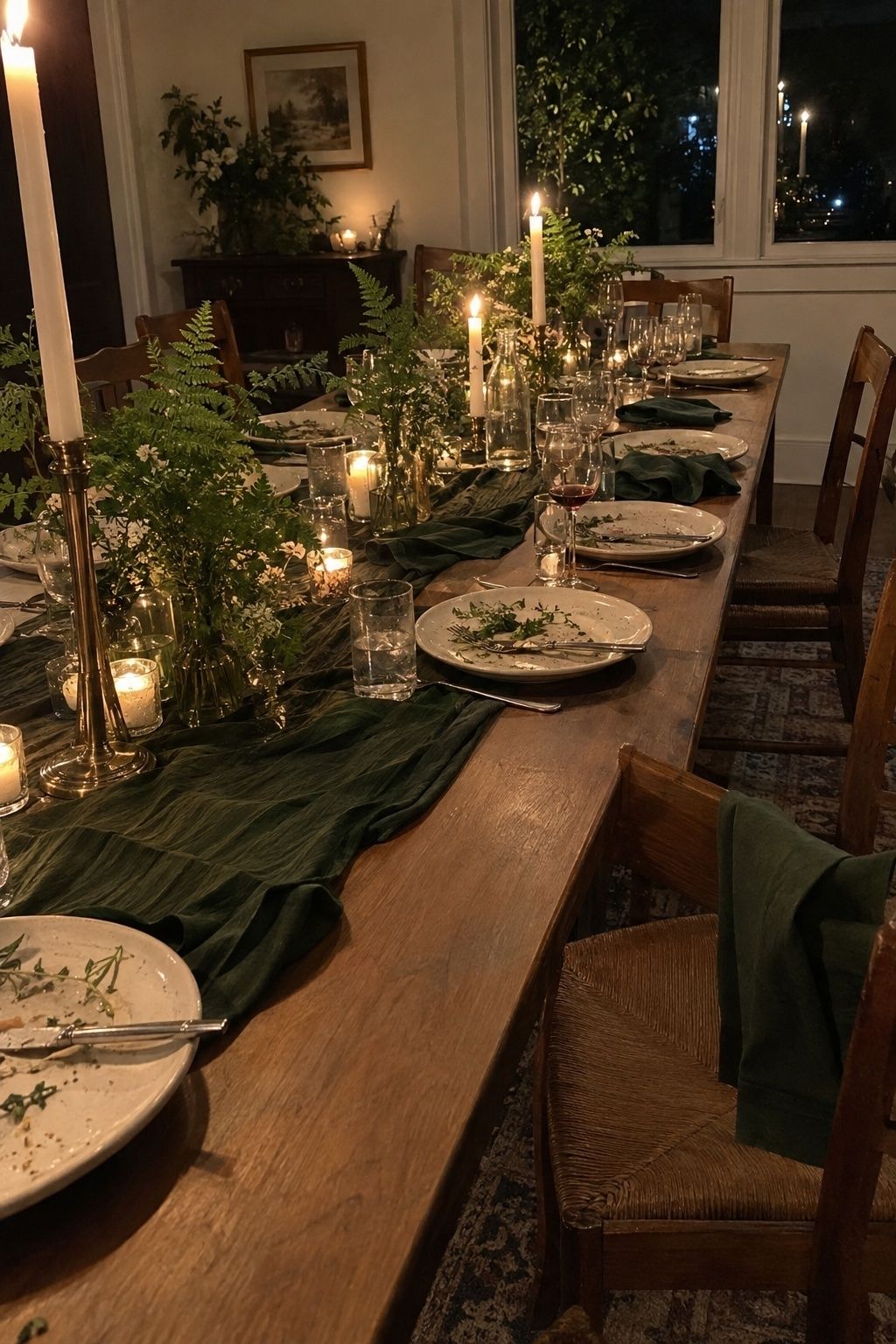
This one is more about texture and glow than a list of shades. Fern green runners, napkins and menus, warmed by plenty of candles. It’s my pick for weddings under 20 guests, where everyone sees every glass and ribbon up close.
Mint, ivory and pale gold
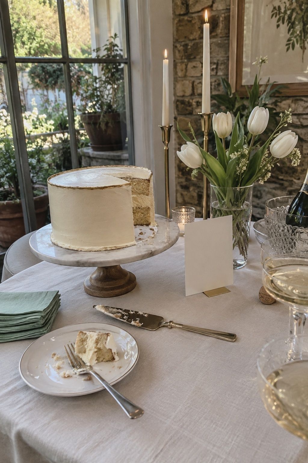
Mint is crisp, ivory keeps it bridal, and pale gold adds a little warmth through wax seals, cake edging and candle holders. Keep the metallic details slim at a small wedding so they catch light rather than take over.
April wedding colors with more depth
If pastels feel too sweet, these four palettes bring evening weight while still reading as spring.
Pistachio, mauve and linen
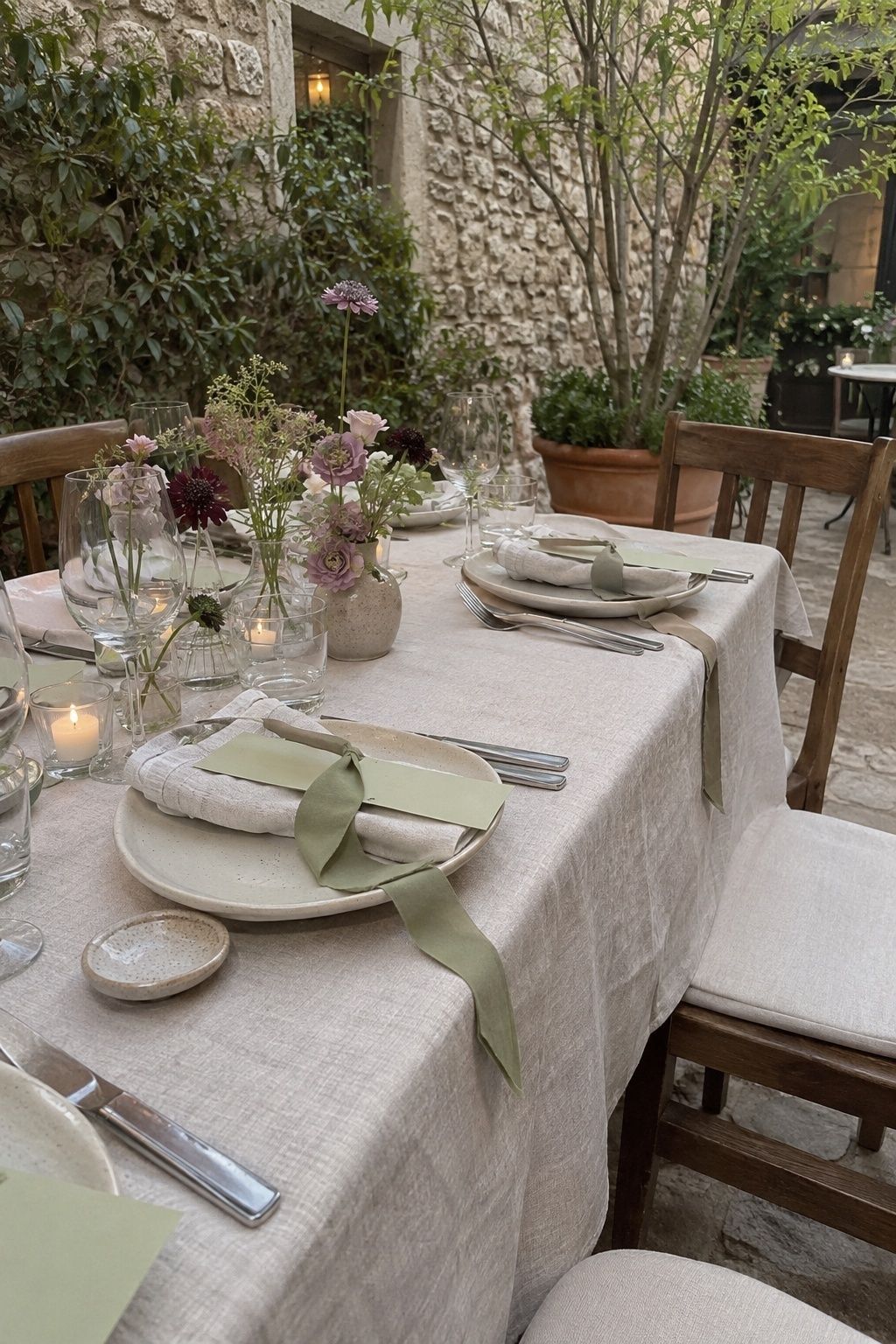
An editorial alternative to blush and sage. Linen napkins, pistachio ribbon or menus, mauve flowers, wood and stoneware. It rewards close-up details, which is exactly what small receptions offer.
Peach, moss and champagne
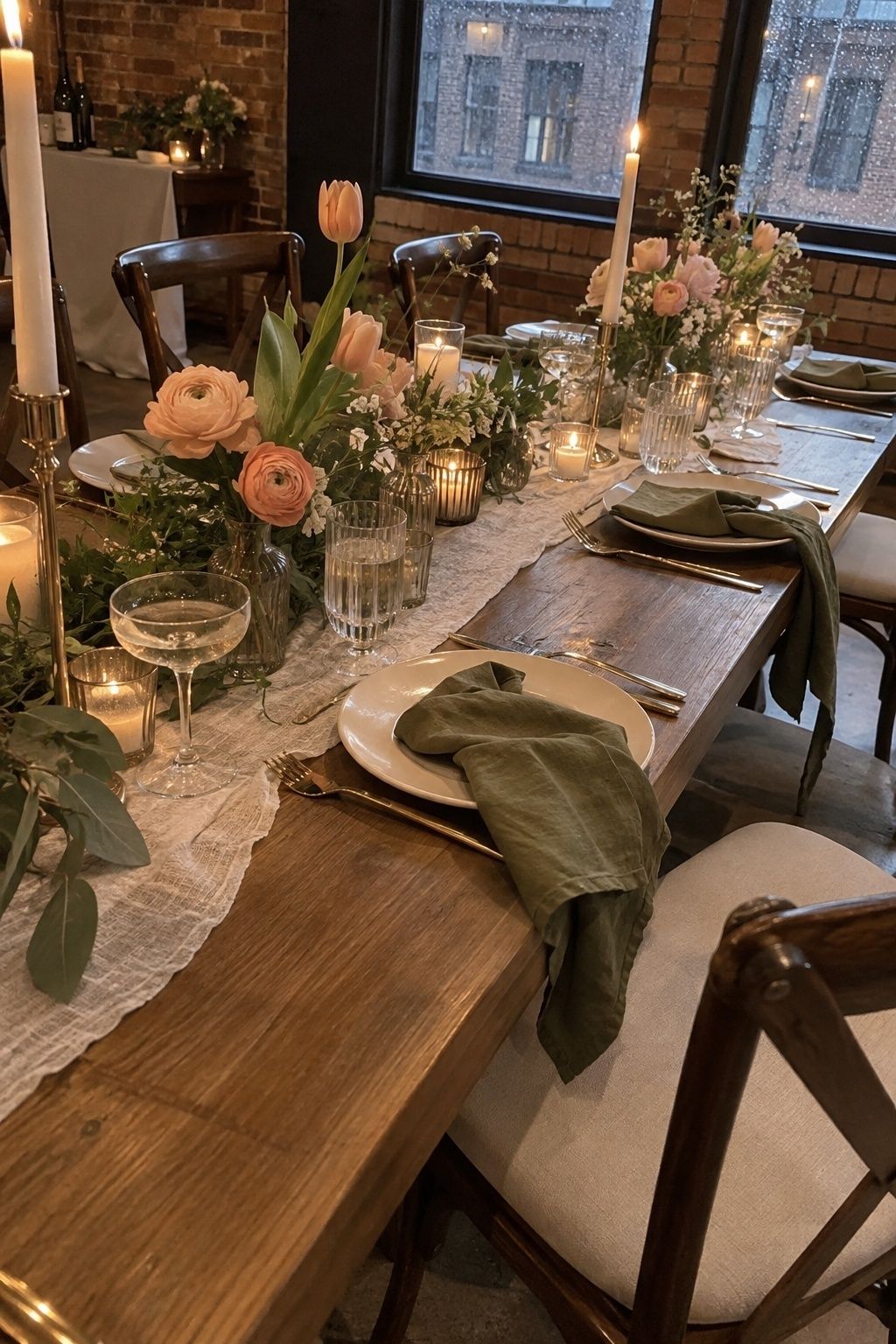
Made for venues with stone, brick or wood. Moss green grounds the palette in napkins and ribbon, peach flowers give it glow, and champagne candles or glassware finish it. It’s especially forgiving in indoor backup rooms.
Coral, cream and fern

The most colorful option here, and good for couples who want color to show in photos. Coral works in small bursts through poppies, ranunculus, tulips and drink garnishes. Cream softens it and fern ties it to spring.
Violet, ivory and olive
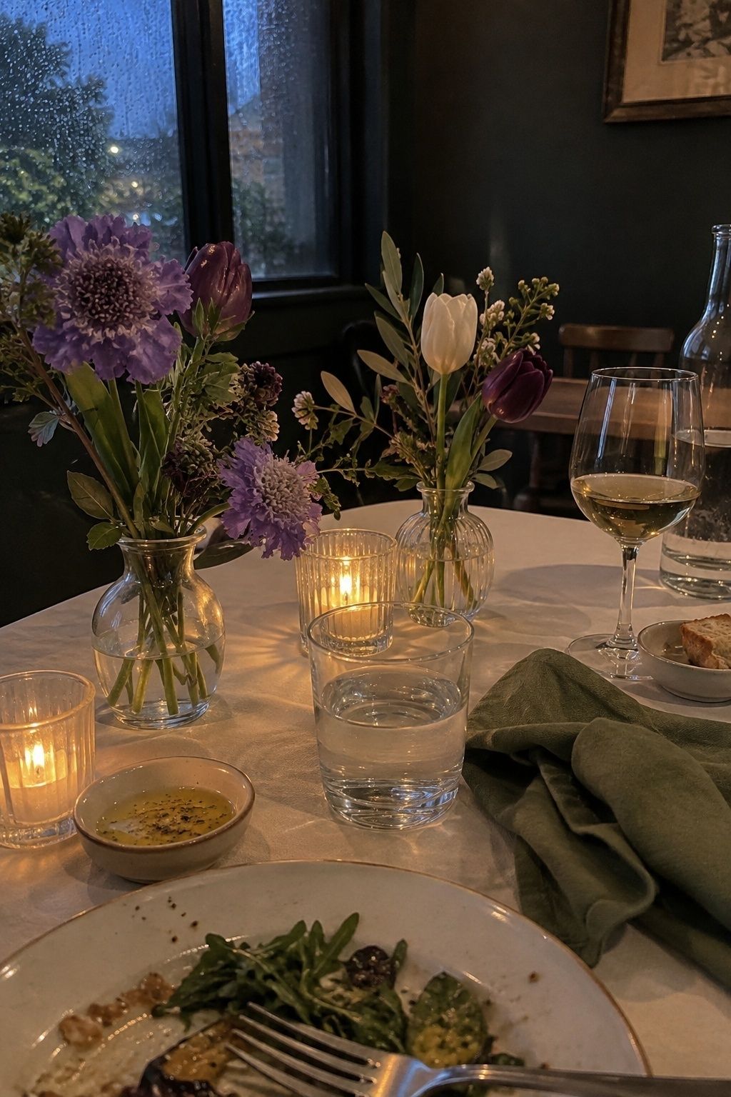
Moody in a spring way. Concentrate violet in flowers and stationery, use ivory to open up the table and olive in napkins or suits. It’s built for candlelit dinners and restaurant receptions.
How to use color at a small wedding
At a wedding of 10 to 50 guests, color shows up in details people touch, not in big installations. Repeat the palette in five or six small places and it reads as designed.
My rule of thumb is roughly 60 percent base, 30 percent anchor and 10 percent lead color. The brightest shade belongs in the flowers, where it looks lush, rather than on every napkin and dress, where it gets loud.
Good places to repeat your palette:
- Napkins and bouquet ribbon
- Place cards, menus and escort cards
- Candle holders or the tapers themselves
- Bud vases on the tables
- Wax seals and envelope liners
- Dessert flowers or cake details
Repeating the same shade across invitations, flat lays and tables also gives your photographer a clearer story. My notes on April wedding decor show where these details sit in the room.
Putting the palette on people
Attire is where palettes most often go wrong, because a whole dress in your lead color is a lot of that color. For a small wedding party of two to four people, I’d dress them in the base or anchor shade and let the lead color appear in their flowers.
A few combinations that work:
- Sage or dove grey dresses with blush or pastel blue bouquets
- Slate blue or olive suits with a boutonniere in the lead color
- Mismatched dresses within one family, like three shades of green, with matching ribbon on every bouquet
Skin tones matter too. Peach and dusty rose flatter most people in soft daylight, while very pale yellow and mint can look washed out next to a face under grey skies. Hold the fabric up near a window before ordering. My April wedding photo ideas cover how these colors read on camera.
Test your colors in April light
Before you commit, check your swatches in the actual light you’ll have. April light changes fast, and a color that looks right on a phone can turn flat under cloud or too bright in sun.
- Gather napkin, ribbon, paper and flower samples together.
- Look at them by the venue window, outside in shade and in the dinner room.
- Take quick phone photos in each spot. The camera shows whether there’s enough contrast.
- Check the backup room’s walls, carpet and chairs if rain would move you indoors.
- If the palette disappears anywhere, add more of your anchor color.
For a weather plan to go with it, see April outdoor wedding planning. Minted’s spring color palettes are also useful for seeing swatches side by side.
Key takeaways
- Build April wedding colors from a lead shade, a base and a deeper anchor.
- Sage, slate, olive, moss, dove grey and mauve keep pastels from washing out.
- Put the brightest color in the flowers, not on every linen.
- At a small wedding, repeat the palette in five or six close-up details.
- Test swatches in cloudy light and in your backup room before deciding.
FAQ
What are the best April wedding colors?
The best April wedding colors pair a soft spring shade with a deeper anchor. Blush with sage, powder blue with peach, slate blue with blush, dusty rose with eucalyptus and rainy grey with pink all look seasonal and hold up in changing light.
Are pastels good for April weddings?
Pastels work well for April weddings when they’re grounded by a deeper tone. Pair blush, lilac, mint or baby blue with sage, grey, olive or moss rather than using several pale shades together.
What colors work for a rainy April wedding?
Slate blue, dove grey, eucalyptus, olive, moss, mauve and dusty rose all suit a rainy April wedding. They keep pale colors from vanishing in dim light and make wet stone and grey skies look planned.
How many colors should an April wedding palette have?
Three colors is enough for most April wedding palettes: a lead, a base and an anchor. Metallics or candlelight can be a fourth note, but more than that tends to look busy at a small wedding.
What April wedding colors look best in photos?
Slate blue with blush, dove grey with pastel blue, peach with moss and violet with ivory photograph especially well. Each has enough contrast to separate people, flowers and backgrounds in portraits.
Pick one and test it
Choose the palette that made you stop scrolling, check it in grey light, and add more anchor if it fades. That’s the whole process for April wedding colors. For more ideas once the palette is set, try April wedding theme ideas or the month after in May wedding colors, and Wedding Forward’s spring color combinations are a good second opinion.
Last update on 2026-10-04 / Affiliate links / Images from Amazon Product Advertising API