

For May wedding tablescape ideas that feel seasonal without looking overly sweet, start with one soft foundation, one fresh floral note, and one grounding texture. Think ivory linen with sage glassware, blush peonies with woven chargers, or pale blue napkins beside garden roses and low candlelight. The best May reception tables look abundant, airy, and easy for guests to enjoy.
May sits between spring softness and early-summer ease, which makes the reception table one of the best places to show the season. The light is gentle, gardens are awake, and flowers such as peonies, garden roses, ranunculus, sweet peas, lilac, and lily of the valley can make even a simple table feel intentional.
The key is restraint. A May table does not need every pastel at once, or flowers spilling over every plate. Choose a clear mood first: fresh garden, romantic cottage, clean coastal, candlelit meadow, or polished brunch. From there, repeat the same few materials across linens, napkins, glassware, flowers, menus, and candles so the whole room feels collected.
Recommended Wedding Products


You Might Also Like These Blog Posts
- Spring Wedding Tablescape Ideas for the Sweetest Dinner
- March Wedding Tablescape Ideas for Fresh, Quiet Spring
- January Wedding Tablescape Ideas for Candlelit Winter Dinner
- April Wedding Tablescape Ideas for Rainy-Spring Dinner Magic
- February Wedding Tablescape Ideas With Soft Romantic Glow
- September Wedding Tablescape Ideas for Soft Fall Color and Candlelit Dinner Energy
May Wedding Tablescape Ideas for a Fresh, Flower-Filled Reception
Ivory Linens With Garden Peonies

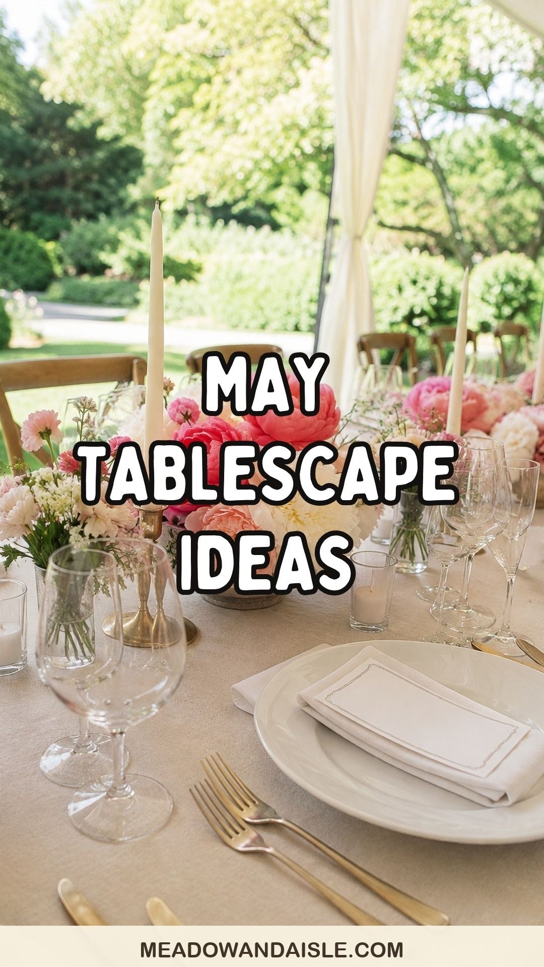
Ivory linens give May flowers room to breathe. Layer them with low bowls of blush, white, or coral peonies, then add smaller flowers around the base so the centerpieces feel loose instead of domed. Clear glass votives keep the table bright during dinner, while cream taper candles add height without blocking conversation.
This works especially well for estate gardens, tented receptions, and bright dining rooms. Keep the place setting simple with white plates, brushed gold flatware, and a small menu card tucked into a folded napkin.
Ask the florist to build the arrangements wide and low rather than tall and round. Peonies open dramatically in warm rooms, so a lower vessel lets the flowers relax across the table without tipping into guests’ sightlines. If the venue has strong afternoon sun, place the fullest blooms slightly away from windows and use sturdier roses or ranunculus near the brightest edges.
For rental planning, ivory is also forgiving. It coordinates with white china, patterned salad plates, vintage glassware, and almost every chair finish. If the table starts to feel too formal, add one relaxed texture, such as a raw silk ribbon around the menu, a woven charger, or a small ceramic salt cellar shared between place settings.
Sage Napkins and Soft Blue Glassware

Sage and pale blue feel fresh because they echo leaves, sky, and clear spring light. Use sage napkins as the repeat detail at each place setting, then bring in blue water glasses or coupe glasses for a quiet wash of color. White flowers and green stems keep the look from turning too cool.
This palette is especially useful when the venue already has warm wood, brick, or stone. Sage softens those heavier materials, while blue glass catches daylight and candlelight without demanding a large floral budget. Keep the printed pieces simple: black or deep olive ink on warm white paper will feel cleaner than metallic foil or heavy script.
If blue glassware is outside the rental budget, use the color in fewer places with more intention. A pale blue menu ribbon, table number, or escort-card wax seal can create the same seasonal cue. The goal is not to make every item blue; it is to give the table one cool note that balances the flowers.
Meadow Runners With Low Spring Stems
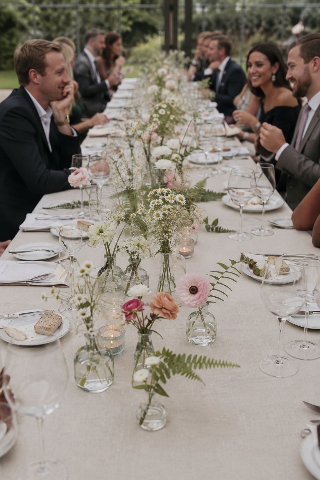
A meadow runner is a natural fit for the month. Instead of one long garland, ask for clusters of low stems placed in small vessels down the center of each table. Ranunculus, sweet peas, chamomile, fern, and airy grasses create movement while still leaving space for bread plates, wine glasses, and family-style dishes.
The trick is uneven spacing. Let some areas feel fuller and others quieter, as if the flowers grew there naturally. A linen runner in oatmeal, moss, or pale celery adds softness without overwhelming the floral work.
Meadow-style designs need a clear service plan. Before approving the sample, check where water glasses, wine bottles, bread baskets, and family-style platters will land. A beautiful runner can become frustrating if guests have nowhere to set a plate. Leave deliberate open pockets every few feet so the table remains usable during dinner.
For round tables, translate the same feeling into several small arrangements instead of one centerpiece. Three bud vases, two votives, and a low floral bowl can create a loose garden shape while keeping the center open. This approach also helps the florist reuse ingredients across different table sizes.
Pressed Flower Menus
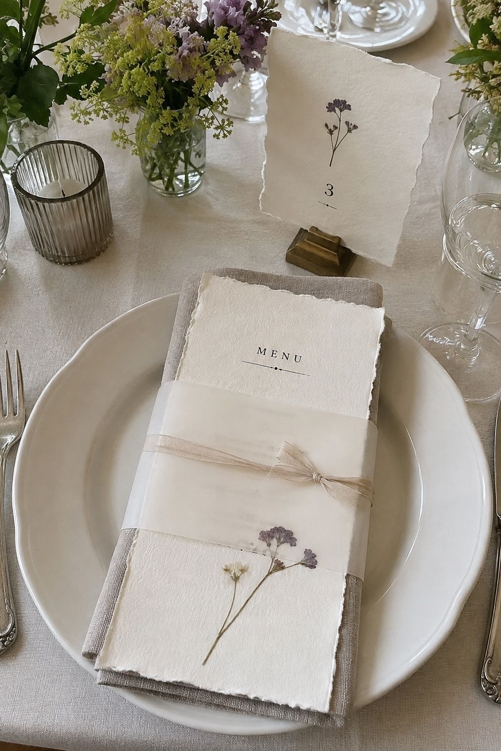
Pressed flower menus bring a personal, handmade feeling to a spring table. They are especially pretty with simple white plates and translucent vellum wraps. Use one small botanical detail per menu so the design stays delicate, then repeat the same flower on escort cards or table numbers.
This is a sweet option for brunch celebrations, garden parties, and intimate receptions where guests will notice the paper details up close.
Pressed flowers look best when the rest of the table gives them quiet space. Avoid pairing them with busy floral plates, patterned linens, and several ribbon colors at once. A plain menu card with one small bloom often feels more expensive than a crowded design. If you want extra texture, choose deckled paper edges instead of adding more graphics.
Lilac and Lavender Accent Tables
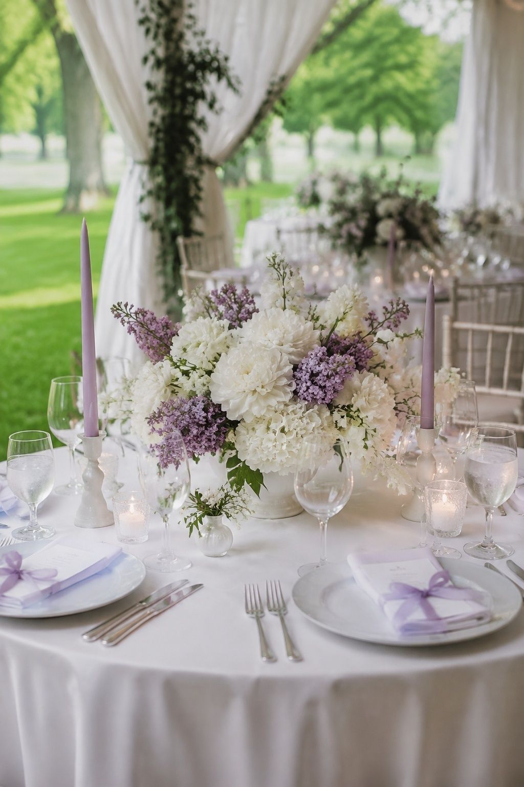
Lilac has a short seasonal window, so it feels especially right for late-spring celebrations. Use it sparingly because the scent can be strong near food. A few lilac stems mixed into larger arrangements, paired with lavender napkins or ribbon-tied menus, gives the table a nostalgic spring feeling without becoming heavy.
Choose matte white plates, clear glassware, and silver or nickel flatware if you want the purple tones to feel airy rather than rustic.
Because lilac can wilt quickly, use it where it will be noticed but not overhandled. Cocktail tables, the sweetheart table, escort displays, and cake tables are good candidates. On guest tables, let sturdier flowers carry the structure and tuck in a few lilac stems for fragrance and movement.
Lavender accents can lean country if they are paired with burlap or mason jars. To keep the look more polished, use lavender through silk ribbon, taper candles, or napkins, then ground the table with white ceramics and clear glass. The result feels springlike without reading as a theme.
Moss Details for a Garden-Grounding Moment

Moss adds an earthy note to soft spring flowers. Use it at the base of compotes, around table numbers, or under small clusters of bud vases. Keep it controlled and low so it looks designed, not messy. The texture pairs beautifully with cream candles, stoneware plates, and fern or hellebore accents.
The cleanest moss details are contained. Ask for shallow trays, ceramic dishes, or defined patches around centerpiece bases instead of loose pieces scattered across the linen. This keeps the table tidy and helps the venue team clear dinnerware without disturbing the design.
Moss also helps bridge formal and garden elements. If the room has chandeliers, polished floors, or a traditional ballroom feel, a little green texture can keep the design from becoming too stiff. Pair it with refined place settings so the contrast feels intentional rather than rustic by default.
Brunch Tables With Fruit and Bud Vases

A brunch reception can feel cheerful and polished with bowls of strawberries, citrus, or pale green grapes tucked between bud vases. Keep the fruit edible-looking and fresh, not decorative in a staged way. Small white flowers, butter-yellow ranunculus, and pale pink roses make the table feel sunny without needing a loud palette.
Use smaller centerpieces for brunch so coffee service, pastries, and shared plates can move easily. Patterned napkins are welcome here, especially gingham, tiny florals, or a fine stripe.
Fruit works best when it connects to the meal. Strawberries feel natural beside shortcakes, citrus suits spritzes and salads, and grapes make sense with cheese boards or a vineyard setting. Keep portions modest so the table does not feel like a produce display. A few small bowls are enough to add color and hospitality.
For morning or midday light, skip heavy candle clusters and use glass, ceramics, and flowers to create brightness instead. If candles are part of the design, choose short votives or slim tapers in pale colors. Brunch tables should feel awake, not dimmed down for evening.
Candlelit May Dinner Tables

May evenings can still feel cool, which makes candlelight especially inviting. Mix cream taper candles with low votives and skip overly tall floral pieces. The glow should sit close to the table, touching glass rims, menu cards, and the edges of plates.
If the reception moves from golden hour into dinner, test the linen, napkin, and flower colors in warm light. Soft blue, sage, butter yellow, blush, ivory, and muted peach usually hold beautifully after sunset.
Candle count matters more than candle size. Several small points of light along the table will feel warmer than two dramatic candelabras. Use sturdy holders, confirm open-flame rules with the venue, and choose unscented candles so the table does not compete with dinner.
If the venue requires flameless candles, test them in advance. Warm white options look much better than cool white bulbs, especially around blush flowers and ivory linens. Hide battery bases behind flowers, small vessels, or folded napkins so the glow feels natural in photos.
Rattan Chargers and Garden Roses
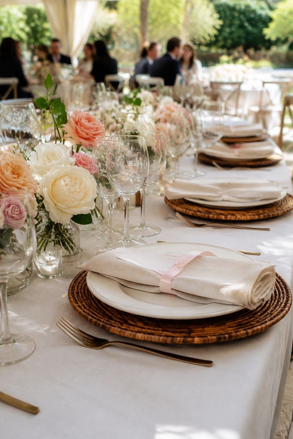
Rattan chargers give late-spring tables a relaxed garden-party texture. Pair them with garden roses, linen napkins, and delicate glassware so the look feels romantic rather than beachy. This is a smart choice for outdoor receptions where wooden chairs, stone patios, or sailcloth tents are already part of the setting.
Keep the rest of the table refined: simple plates, one ribbon detail, and centerpieces that stay below eye level.
Rattan is strongest when it is the only woven material on the table. If the chargers are textured, choose smoother napkins, glassware, and vases. Too many woven baskets, placemats, and cane details can make the reception feel casual faster than intended.
For a more elevated version, pair rattan with garden roses in cream, peach, or pale pink and add one tailored element, such as a monogrammed menu or a neatly folded napkin. That mix keeps the table relaxed but still clearly wedding-ready.
Single-Color Flower Clouds

For a cleaner table, choose one flower color and repeat it generously. All-white peonies, all-blush roses, or all-butter ranunculus can look modern when the vessels, linens, and candles are quiet. The single-color approach lets texture become the main detail.
This is also useful when the venue already has patterned carpet, busy walls, or strong architectural details. A calm table can make the room feel more expensive.
The single-color approach still needs contrast. Use different flower shapes, leaf textures, and vessel finishes so the table does not become flat. White peonies, white ranunculus, white sweet peas, and green stems will look more layered than one flower repeated in identical vases.
This idea is also helpful for couples who want an editorial table without using dark colors. A cloud of one pale shade can feel modern when paired with sculptural candles, clean menus, and simple chairs. Keep the napkins either matching or one step deeper than the flowers.
Garden Reception Tables With Mixed Heights
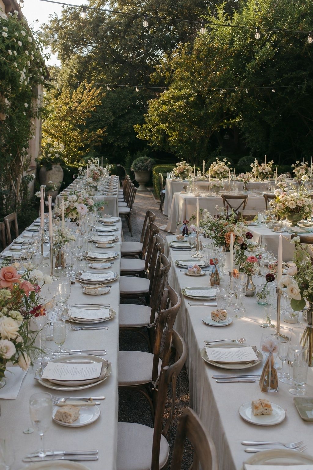
Mixing heights keeps long tables from feeling flat. Use low floral bowls, medium bud vases, and slim taper candles instead of one repeated centerpiece. Leave enough open table between pieces so guests can see each other and servers can place dinner smoothly.
Before approving the final layout, ask the planner or caterer to mark the table with actual place-setting dimensions. Chargers, flatware, water glasses, wine glasses, menus, favors, and bread plates take more room than they appear to on a design board. A quick tabletop mockup prevents overcrowding on the wedding day.
Mixed-height tables photograph especially well from the aisle between rows. Keep the tallest candles slim and the floral pieces low enough that faces stay visible. The table should have rhythm from a distance and comfort up close, which is the balance that makes reception design feel thoughtful.
How to Keep the Table Comfortable for Guests
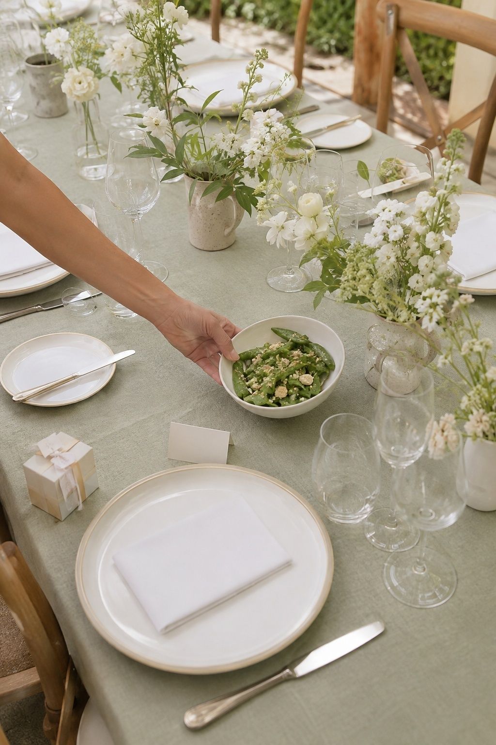
Comfort is the detail guests remember after the flowers are gone. Keep centerpieces below chin height, leave room for elbows, and make sure menus, favors, and place cards do not crowd the dinner plate. If the table includes shared dishes, ask the caterer exactly where serving pieces will sit before the florist finalizes the centerpiece footprint.
Think about scent, sound, and movement too. Fragrant blooms are lovely near an escort display but can feel intense beside a salad course. Tall taper candles need stable holders. Loose petals, moss, or fruit should stay contained enough that servers can clear plates without dragging decor across the linen.
How to Make the Design Feel Personal

The easiest personal details are quiet ones: a favorite flower from a family garden, a napkin color pulled from the invitation suite, a menu named after the couple’s first dinner together, or table numbers inspired by meaningful places. These choices do not need explanation at every seat; they simply make the reception feel less generic.
For a more collected table, mix one heirloom-style element with rented basics. Vintage coupe glasses, handwritten place cards, family candlesticks on the head table, or a single patterned plate at each setting can add character while the rest of the design stays easy to source and consistent across the room.
FAQ
How Do You Make a May Wedding Tablescape Feel Seasonal?
Use seasonal flowers, lighter linens, fresh greenery, and colors that look natural in spring light. Peonies, garden roses, ranunculus, sweet peas, lilac, and lily of the valley are especially fitting. One or two seasonal choices are enough; the table does not need to look like a flower market.
What Colors Work Best for May Wedding Tables?
Ivory, sage, blush, butter yellow, pale blue, peach, lilac, and soft moss green all work well for spring reception tables. For a more editorial evening look, pair ivory or oatmeal linens with berry flowers, smoked glassware, and warm candlelight.
Should May Wedding Centerpieces Be Tall or Low?
Low centerpieces are usually easier because they keep the table conversational and let delicate spring flowers feel garden-like. Tall arrangements can work in a ballroom, but use them selectively and balance them with lower pieces on guest tables.
What Flowers Are Best for May Wedding Tables?
Peonies, garden roses, ranunculus, sweet peas, lilac, anemones, lily of the valley, and fresh fern all suit this season. Ask the florist which blooms are locally strong during the wedding week, then build the table around the best available stems.
How Can You Decorate May Wedding Tables on a Budget?
Choose simple linens, fewer flower varieties, rented candles, and repeated bud vases instead of large arrangements at every table. Seasonal flowers can also stretch farther when they are mixed with greenery, fruit, or textured napkins.
What Should You Avoid on a May Wedding Reception Table?
Avoid oversized centerpieces, heavy dark linens in bright daytime spaces, strongly scented flowers near dinner plates, and too many competing pastel colors. The table should feel fresh, balanced, and easy for guests to use.
Final Thoughts
Check seasonal flower availability before locking the centerpiece recipe with your florist.
Last update on 2026-10-05 / Affiliate links / Images from Amazon Product Advertising API